**Preview only**
Be sure to submit your comment
This map gives me some problems. If i keep it, then in q3dm0 teleport glass doesn't work properly. It's completely black instead of how it should be (fogged from distance, showing teleport destination when approaching). Please fix this compability issue.
Agree (0) or Disagree (0)
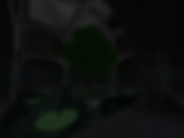
I found the abience of the thunder and the heavy rain very relaxing. Also the butterflies are a very beautiful feature. I think the bot play overall is poor but I do like the wide second story hallways with the guard rail. Also I had some fun on the lilypads during bot play when you and a bot hit a lilypad together and you have to trace their arc in the air. I'm glad the water wasnt too deep to walk in, that would have been annoying. Brush work and draped ivy very impressive ! The central tree, also with butterfiles draped around it is incredible! The hallways to plasma and rl are too dark. Playability-wise if the author had broken the upper story guard rail in a couple of places then you could rocket-jump from the ground up to there. It felt like a rail-gun would be fun on the roof. The bot play is poor as has been said.
Agree (2) or Disagree (0)
@Wakey: You should make a re-release of this map where there is also Autumn where the tree leaves are yellow/orange/red and are animated falling off the tree. And again, you should increase the brightness.
Agree (0) or Disagree (0)
Haven't gotten around to downloading this map yet, but the textures look heaps good! You don't see too many maps with graphical trees on Q3A. Also, the setting out of the house looks very good aswell. 8.5/10.
Agree (0) or Disagree (0)
Awesome.. I made this similar looking map but on UT2004 and it had 2,584 downloads XD!. I love the map 10/10
Agree (0) or Disagree (0)
SW12
unregistered
#11 07 Apr 2011
I had one complaint about this map pack: WAAAAAAAAAAAAAAAAAAAAAAAAAAAAAAAAAAAAAAAAAAAAAAAAY too dark.
...especially the winter map. In the winter map, I had to increase the bightness to the max. just so I was able to remotely see what I was doing. I really hate having to increase the brightness, because it makes everything white-ish and ugly. I hope there is a version of this that isn't this dark.
Agree (0) or Disagree (0)
Wow, thats really nice, thx ^^
Thats motivating, maybe i start really again :D
btw, if u like this map, you should also try Passing Uranus.
cheers
Agree (0) or Disagree (0)
Less than flattering comments not withstanding, I found this map visually enthralling. I enjoy the insects and other details that make this map an enjoyable place to blow the smithereens out of opponents, simulated or not. Please don't give up mapping for Quake 3 wakey. Thanks for your effort on this fun map.
Agree (0) or Disagree (0)
Anonymous
unregistered
#8 10 Nov 2009
This is absolutely gorgeous... What compiling switsches did you use, wakey?
Agree (0) or Disagree (0)
If there will be a next version, then it will be not for q3a.
Maybe a rebuild for Xreal or something similiar.
Edited: 15.Aug.2007 00:13 AEST
Agree (0) or Disagree (0)
xfactor
unregistered
#6 05 Aug 2007
Map looks very good but because of the size the gameplay is lacking.
Agree (0) or Disagree (0)
Nicola Marini
unregistered
#5 04 Aug 2007
No atmosphere ... sorry .... i run once in the map.
But a really cool start. I mean ...
The whater plants trapped me twice in the summer.
I do not understand why on the roof I cannot see the outer space(right well done) and after on the stairs i see all the mountains and the bottom of the map.
in winter try to adjust the lighting. More light does not mean no atmosphere.
try.
I wanna look at the next version(make the inside area larger with allmost one stairs).
Agree (0) or Disagree (0)
It's nice to look at, but playing on it isn't so good. I'm not really keen on the tele to the roof.... It's not playable because it's a very tiny map with alot of visuals squished together in it, which make fast movement terrible.
If you tried to make this into a ctf map, it would be even worse if the playercount gets high. Maybe a 1v1ctf map...It would be too much work to waste the time on it...imo.
Since you have the skills that you do, I'd be working on something new.. Like spirit said about wanting to see you focus more on gameplay, I agree. That wouldn't mean that you have to make an ugly map....just don't go overboard it on the looks department. A layout/floorplan is sometimes the hardest thing to pull off right....and if you get a great one made and make it look good on top of it.... chi ching
Agree (1) or Disagree (0)
I agree with Spirit, design is well done.. all elements led to consistent atmosphere. That was maybe for author more important than gameplay... But I understand you Wakey, I have quite often similar priority... :)
Agree (0) or Disagree (0)
thanks for the nice review spirit! :]
@ the anonymous guy: thanks ;)
i will maybe think about making a ctf version in future ^^
Agree (0) or Disagree (0)
Anonymous
unregistered
#1 28 Jul 2007
Awesome. Especially the summer map.
it should be edited into a larger sized CTF map..
Agree (0) or Disagree (0)