**Preview only**
Be sure to submit your comment
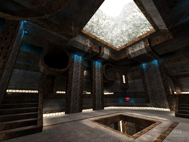
This just remembered me days I have played CPMA along :D I played this map a lot, more than the other in the selection, also this is the first map I played in CPMA 'cause I just looked on screenshot and decided "This is what I will play now". Well, this map got me, the texturing is really incredible, thanks to Lunaran and Swelt for that great map. Giving 5/5 as this map has no issue...
Agree (0) or Disagree (0)
@Mark: I know I am bumping an old comment but I must say that what you said is funny! I hope you are not saying
my reviews are too short and insipid.
Just kidding! I can take constructive criticism. I really enjoy reading your lengthy reviews when I'm a tad bored. Like what the others said, I'd recommend breaking your reviews & comments in small but detailed paragraphs so they are easier to read.
My thoughts on the map? I think the highlight is the opening on the roof there in the screenshot.
Edited 1.52 minutes after the original posting.
Agree (0) or Disagree (0)
Lovely looking map :). Im impressed. 9.5/10.
Agree (0) or Disagree (0)
all - thanks for the feedback. @ guitarman - you sound like my school teachers. My report cards always said "Mark talks too much" - lol. i'll shut up now!
Edited: 23 Sep 2011 AEST
Agree (1) or Disagree (0)
I like how he makes his reviews more "exquisite" than others. A hint of wittiness and cunning with a distinguished flavor.
Agree (0) or Disagree (0)
I think that you did a very good job for the review. At least it's not a 1 paragraph review. Maybe a suggestion, put a resume of your review in a small paragraph at the top for the people who have short attention span then go on with the full review after that. And like TheMuffinMan says leave a conclusion at the end, so that people who don't want to read the whole review, will still have do go down to get the bottom line of it and maybe at the same time they will read the whole review.. ;)
Agree (1) or Disagree (0)
Yeah, we all know Mark talks too much :D
Nah, I'm just kidding. I enjoy his reviews, many times I do not agree with his points of view, but I do enjoy the reading.
The problem with "quick overviews" is that often they end up being too quick and too overviews; which is as bad as a long review without a proper closing paragraph.
A concluding paragraph as TheMuffinMan says, would be a good idea.
Agree (0) or Disagree (0)
Well lengthly reviews can be good for those who have the time and patience to read it all. But one should end it off with a concluding paragraph about whether it is recommended etc. (basically put all the info that spirit is looking for into the conclusion), then people can either read the whole thing or skip to the end to get the reviewer's verdict.
Agree (0) or Disagree (0)
@ spirit - i take your point. even i struggle with this too much or not enough information. in that respect you may find my comments on here better than my reviews - because the pressure is off and i work alot more impressionistically then. but i do agree that could probably be more accessible and in this respect i will take this on board to a degree. here wasn't the best place to start but because the maps are so old and famous now i thought it might be nice to use the review space to give a greater overview of history and to have ..::LvL as a collective source of quake 3 custom knowledge and not just an empty space. but for me i have often read reviews and drifted on to the comments for more information because there was something lacking. and an individuals taste in gameplay is so different and personal i find it really hard to reach a properly critical and objective space. but more recent tdm's are usually going to have far better thought out gameplay than older ones because experience has grown over time as to what works and what doesn't. and i still find myself learning new things about old maps everyday - it can take weeks even years to get to know a map so even though i like writing and playing i hate how reviews can come off feeling a little insipid.
Agree (0) or Disagree (0)
I like both the map and the review as far as I can tell from the 1st half, but tbh I think the review really is too long. I want a quick overview of the map to decide whether I'll download it or not and if the review is like this I could as well download and test the map myself. ;)
Don't get me wrong Mark, I really like your reviews and I appreciate that you put a lot of effort into them. But shorter would be better for me. Maybe we'll hear what others think on this?
Agree (0) or Disagree (0)
It`s a good thing Lunaran took the initiative to redesign the map. Powahaus had interesting ideas (fan tunnels!) and a nice, vertical layout. But the looks really did not do it justice, with all the unnecessary colored lighting, pitch-black fans, and clan advertising banners. The underground rustic feel suits it much better imho.
Agree (0) or Disagree (0)
This version is better
Agree (0) or Disagree (0)
For me powahaus was always one of the more interesting maps in the cpm mappack. The geometry seems more solid and better conceived than on other maps. I especially like the choice of powerups for the map which made it different from most other tdm maps and set new standards in tdm.
Another great review btw.
Agree (0) or Disagree (0)

