
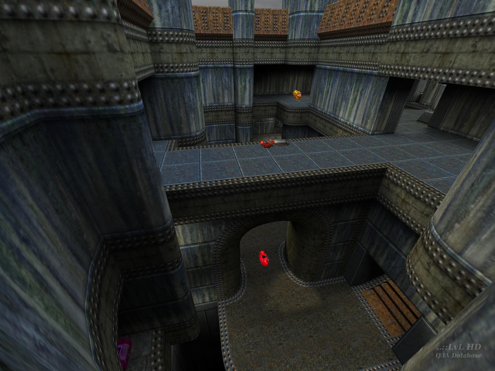


The .bsp and the readme both have Meatball Grinder as the title. To confirm you can also run: strings ik3dm2.bsp | grep message
My guess is there was a last minute title change by Fingers and the .arena was missed.
This map, like jul16, is an absolute marvel. Small with perfect weapon placement and powerups, you're never totally out of it or totally in control. The RA is perfectly placed and high-risk, high-reward if you managed to grab it unscathed. There's a decent amount of vertical play here although it lends itself to action on the same level or immediate area.
The areas interconnect seamlessly with multiple paths everwhere except at the rail.
All-in-all a superb map. Oh and it looks fantastic too.
The rail is useful but only sparingly; it's run-and-gun here from start to finish.
@Tig - the arena file calls this map "Twice the Tentacles". I don't see a reference anywhere to Meatball Grinder. ?
Edited 1.2 minutes after the original posting.


I've played this map since its release, and I still play it today. Simple, not too large, fast, it has everything for it.
If you don't have it on your HDD, then grab it, NOW ! :)
W.
Edited: 25 Oct 2010 AEST
IMO it looks like a Q1 as it would have been realized with the Q3 engine... the low ceilings and overall tightness remind me a LOT of certain Q1 maps. I like the grimy, minimal look a lot more than some of the overdone shader-fests that, say, Charon does.
Oh yeah, and what Johnny Law said.
The layout of the map is certainly cool. Perhaps we look at maps in a little TOO much detail? I know I do, but thats just me. Perhaps Fingers just "whacked" this one together? Is that the type of feeling we're supposed to get? Some maps do have that feeling, and while they dont make "serious" duel stages, for fun factors they really do rock.
Perhaps that is the aim for this one?
-Octovus
Great map!
While the level is no weak effort, impressions after playing certainly do not justify the "amazing" comments of the reviewer.
A very nice piece of work? Yes, it is. Aesthetically, it's a solid piece. The brown stairs are somewhat "out", but nevertheless, there are small touches everywhere which add to the map's high quality construction. I especially like the arch @ RA. Nicely done.
The gameplay is where I feel the map needed more concentration. The gameplay is far from weak, but it's overshadowed by the level's good looks, and, to be blunt, isn't very strategic. Ceilings are too low, which creates a very squashed feeling in several areas. Armours could have been repositioned for hard control of the map. I personally feel that the layout of the map doesn't warrant the inclusion of the PG. LG would've been a better choice imho.
Replacement of RA with YA would have also been a good idea. I (personally) do feel that the armours are a little close together. The RL placement on the walkway above is pretty neat though:-)
6.5/10 for me. A good map, just needed a little more attention to gameplay.
This map isn't amazing, and I didn't know who the hell Fingers was till I downloaded it (well I'd heard/read/whatever the name in passing), and it's good fun. That's all there is to it. It is still a game after all ;-)
-Octovus
Regardless, when I do occasionally map, I spend enough time to polish everything as good as I can... I can't stand texture seams / misalignments between curves and brushes, or curves "trimmed" by placing a flat-coloured box around them like too many people do, so I go in and tweak things until they blend together smoothly... Perhaps this is what Tig means by "beautiful" curve usage.
I'm quite sure a layperson couldn't care less about all this... But as with all my hobbies, I do this stuff to exercise my own mind on my own time, so developing a clever technique or making a few nice textures is its own reward. Releasing a level to the public is only incidental.
:)
I'm not sure if this style of map really caters to Q3's player movement and weapon characteristics quite as well as a larger, "looser" map would. Like StormShadow I think it's a bit small. However that doesn't make it a bad style; and given that we don't see much of it in Q3 I'm quite happy to see it in this map. If it feels odd at first, give it an extended try and see if the hunt-or-flee style of gameplay opened up by the intricate 3D connectivity clicks for you. If not, cool, but keep in mind that there are people who like it, and for reasons other than mapper idol worship.
As for the architectural design, the lighting, and the creation and use of textures -- all quite good, and some tricky construction is pulled off flawlessly. This isn't a magnum opus of detail and shader work, but a very nicely balanced and unique creation that is tasty on first sight, and not tiring to look at after you've played it a dozen times either. It would have been nice if this map actually had been "made by an unknown mapper"; we could always use another author this capable.
P.S. - Nimrod, dont be so bitter :P
Maybe after a few more years of mapping you will be able to tell the difference from 'effortless work' and 'making work look effortless'.
Okay. You are bitter, jealous, ignorant, or all of the above.
Funny how being an accomplished author automatically makes everything in your map a conscious and ingenius 'design decision', while the exact same brush arrangements would be considered asinine had they come from anyone else. For example had this been the first map of an unknown author, there is no way in hell the texturing in this map would have been labeled sweet.
I love this site, and all the effort you guys pour into. However you really are doing the community a disservice when you post a review that is comprised of nothing but unwarranted gushing.
Please review more responsibly in the future.
"The texturing is sweet..."
What a joke.
This map is fairly decent.
6/10
Accuse me of being bitter, jealous, ignorant, or all of the above. However this review is so far off the mark it even makes Alcatraz look objective.
I think the looks are actually quite nice. I mean they're not anything special per se, but the blue walls and the studded metal made for a change. Perhaps the only really odd bit was the rusted stairs in one section, the texture was very flat looking for that sort of architecture. Anyways, my aging system didn't have any complaints :-)
It played pretty well. Having the rocketlauncher up top created one large problem: you could be bounced into the wonderful pits of doom fairly easily by a well-placed rocket.
Now I don't doubt that was intentional, but it just adds to the value of the rl in a map like this. It's already fairly small and closed in (except on the top level), so placing it on a ledge where you can stop others from getting it is sort of iffy. However, grabbing a plasmagun or a shotgun can also help you out a great deal :-)
The railgun was basically unneccessary; I might have preferred to see the plasmagun get a twin over there than the seldom-used rail.
Played nicely in tourney and dm, 9 from me :-)
-Octovus
Kudos Fingers!!
This one's a keeper.
Loading...
Search for a map.
Results will appear here.
