Be sure to submit your comment
Edited 1982.37 days after the original posting.
Cool.
Maybe the over 300 target_location markers in this map causes this bug. :D
ЧЕ не работает??? ?
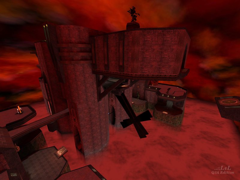
an interesting map. Perhaps a proper sky box would have been a better choice than the layered cloud shader (cloud shaders all end at the bottom of the environment cube). The overall vertical visibility of this map reveals far too much distortion in the clouds anyway.
The inclusion of the flight powerup is a cool choice in terms of play, but allows the player to see all the caulking textures under the floor. Clip brushes would have prevented
this.
The steel ribs on the side of the structure are flagged as non-solid in their shader and should have been fully clipped or swapped with the solid version of the texture. I tried to hide on these and fell right through. This is not an aesthetic problem, but rather a play issue and therefor more serious. These brushes also hide weapon hits, which is visually confusing.
The performance is reasonable on my machine and so I will not complain about that, but I do think a there could have been a few more optimizations. the swirling mist
shader on the surface of the fog could have been removed for a huge speed increase. Actually the fog could have been removed all together for a 5 to 10 frame per second increase. This combined with a skybox would probably make more visual sense anyhow (albeit floating in mid air).
I did have some frame drops in places, but nothing nearly as severe as some of you folks are describing...
but for team play the map is the best i have ever played
10on10 rulez =)
-5 for the, sorry, impossible architecture. It looks impressive, yeah, but it has really no function just decreasing FPS to hell and making it unplayeble. Also its to focussed on vertical action (opponents are often under or above you) and the distances are just way to big. Im not getting comfortable with this map - its, errr, I cant explain. It looks great but thats all. So I give 5 Points for the hard work.
not much else to say that hasnt been said below. :-)
these are the maps other mappers take little pieces from ,with or without knowing it
this in itself makes it a worthy contribution ,I love "different" its shakes things up a bit :-)
Loyd morris would be proud :-p
9/10 for the ideas and the balls to throw it out there.
This map kicks imho all other 'eyecandy focussed' maps Ive ever seen. What a work... unbelievable. There are hundreds of nice and well made custom maps but this one belongs to such maps which break through the 'quakish' style and creates their own. Therefore I love it.
Like I said below, I'm averaging 30fps on my 950/GeForce-GTS. That's pretty scary.
When I map, I set limits for myself. On my 400, if it drops below 30fps, there better be a GOOD reason and not often, otherwise people won't be able to play it on "normal" machines.
I haven't set a limit on my 950, but I suspect below 80fps will be the "danger zone".
I look forward to your next map Immortal.
Thx for your comments Finch .
Ok I agree that the r_speeds in that map are the result of amateurish in the design conception
I fact , there was no studies of the map before I built it , I just had a general idea and if I had to do it again , some stuff would change for sure .
For exemple , I would completely delete one of the lateral towers
The outside area is a kind of RL vs rail area , let talk about the gameplay , most of the time people are in this outside area , and frag frag frag , they move from there when they want to be more powerfull and win some items
A guy taliking the flight item makes the battle generally move from upstairs to downstairs , depending of the way the people play .
For naturally having played to it I ensure that despite of my poor Voodoo Banshee , FPS are not often under 20 (I accept , it's unacceptable ) but it stays playable , I believe that the q3 players generally have a better graph card than mine .
Hmm anyway , the map I work on now won't have sutch problems :)
The outside area is nice, but really how functional is it? Does it serve any purpose in terms of gameplay or does it just kill your triangle count, and present the biggest flaw technically speaking. If you were deadset on including that enormous outside area you could of at least found a way to correct the sky HOM bug. A huge outer perimeter wall towards the bottom, or maybe use a skybox behind those cloud layers. Both suggestions aren't complete solutions to the problems posed, and would probably butcher the framerate further. However it doesn't really matter how many times you beat something after it's already dead, as the framerate in this map is. This map is purely a concept, walk around in awe type affair. If you're going to totally abandon gameply for something like this, at least make sure you don't have any really nasty bugs.
And what point I ask you is there in insulting the people who have bothered to download and comment on your map. I assure you your conduct here will certainly turn people off from downloading and commenting on future maps from you. Because they know disagreeing with you means an insult because you put so much 'work' into your map. Grow up.
Sure, it has loads to be improved technically speaking, but the fun factor is surely there...Some great ideas worked out in this level.
7 for me
Full vis took 10days on duron650
192Mo Ram
I'm really leaning towards the "hole in your map" theory.
After flying around it, it looks like to me that you've got the fog extending past your "hull" on the bottom. Fog is a "Non-Solid". When the engine goes to calculate VISability, it will shoot a line out through the fog and straight into "nowheresville". After a while, QMap will give up and just not dump excess polygons, nor VIS (which is to set-up descrete zones/sections of polygons to draw).
Seal the fog at the bottom and you'll probably be okay.
Class is now over, you may return to your regularly scheduled mapping. ;)
(PS: Hey Peej, that's how you give "Constructive Feedback", dickhead)
-Twitch
There are some very good parts in it, but I think the author needs to practice his craft a bit more.
There's more to building a great level than great building.
There's flow: the ease of movement for the characters).
There's balance: the item placement and number.
And the most important that's been broken in this case: mass-market.
This level makes my A950/512mg/GeForce GTS run at an average of 30fps (A FIRST!) and many times "hiccup".
There's not THAT MUCH going on here. I suspect there's a hole in this level, and that it hasn't been VIS'd properly.
Also, the hall-of-mirrors(HOM) at the bottom isn't really a "Q3A bug".
I think (and this is just my opinion) you should loose the sky, relight the level manualy (by placing big-red-lights if it makes you happy) and fix the hole. It'll be a much better map and people will be able to appreciate your work (especially people who don't have monster-machines like I do).
-Twitch
only one problem, i seem to be missing a texture, the sky is pure white?
thoose who scroes low for fun and thoose who take care of scores... immortal.. do you like youre map.. yes.. then do you the favour and post a thread in the editing section of the q3w forum..
and hej who cares what they vote.. if the map is good no on cares what guys at lvl voted it.. everyone knows that voting here is bs.. cause lot of guys reconnect and vote again and again and again.. only to give a map a very high or very low result.. :)
What a lame * , i worked 2 months on that map for these kind of reactions
I could vote 10 and make this score better but i prefer take in consideration that this score give a mesure of your stupidity
Wall of mirrors isn't the only thing you can see when you look down , you have to flight hight to begin to see it
So what did i do ?
I used blacksky as soon as the fog begin , it reduced the hall of mirors to the maximum
Ok I can put a texture instead of the caulk under the lower floor
If you wanna send feedbacks on my future maps please email me at immortal_667@hotmail.com
I think i need feedback like that
And please don't use transparent textures on the lower floors when somebody can fly under them with the fly powerup. I couldn't see where the opening was, and died!
Make a few changes (THE SKY!!!), recompile, and people will play it...
