Added 12 May, 2019
Comments
Add a comment
**Preview only**
Be sure to submit your comment
Be sure to submit your comment
Submitting comment...
pretty awesome map. we play CA on this almost every day. Time To Kill The Pain is a bit better and even more often played. also Chronophagia and The Killing Machine
Agree (0) or Disagree (0)
"I can't quite get the thrill in terms of gameplay"
raspatan, oh man, I know that it's kinda selfish (it's just a remake tho) but I play this map for years VS BOT and find it veery funny! =) maybe it's mainly because of it's skill - it's cpma bot "Apheleon.100", I highly r3comm3nd! :D I play in vq3 physics ofc, it's hardly a cpma map :( but I'm close to finish some arches widening and so to make this map a little more playable. dunno I just like it )) sry for it's mine but I attribute all the credit to ZTN. =)
raspatan, oh man, I know that it's kinda selfish (it's just a remake tho) but I play this map for years VS BOT and find it veery funny! =) maybe it's mainly because of it's skill - it's cpma bot "Apheleon.100", I highly r3comm3nd! :D I play in vq3 physics ofc, it's hardly a cpma map :( but I'm close to finish some arches widening and so to make this map a little more playable. dunno I just like it )) sry for it's mine but I attribute all the credit to ZTN. =)
Agree (2) or Disagree (0)
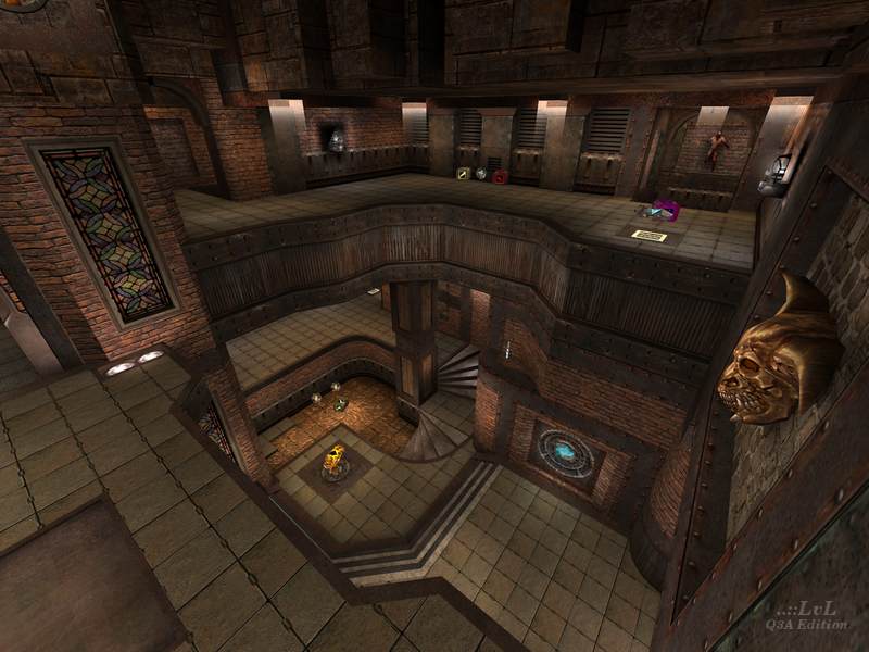
I am not familiar with the original or the other version. Maybe because of this, I can't quite get the thrill in terms of gameplay. It's ok but personally I won't keep it. It must be said though, the sfx in models and textures are amazing. The face where the RA is is particularly scary!
Edited 32 seconds after the original posting.
Edited 32 seconds after the original posting.
Agree (0) or Disagree (0)
Sorry guys, I'm very busy IRL (and with one another map) right now so will correct the arches and some stuff later )) As for me, my "original" was bright as Hell, so I can agree only with "q1 ztn's original was better" ))
Agree (1) or Disagree (0)
