Added 30 Oct, 2003
Comments
Add a comment
**Preview only**
Be sure to submit your comment
Be sure to submit your comment
Submitting comment...
I had recently a duel with bot in this map in Quake Live (training match). Despites being active community, there are not so much servers to play at :( Well they are, but always empty. Oh c'mon, really? What's the point in creating a server no one plays?
Agree (0) or Disagree (0)
My only suggestion with this map is to put some item_botroams near the jumppad to the plasma gun, and across the side platform so that way the bots can navigate that portion of the map. Maybe even get the bots to jump on the skull lamp. Otherwise, this map is GOLD!
Edited 55 seconds after the original posting.
Edited 55 seconds after the original posting.
Agree (1) or Disagree (0)
I love the Quake Live version of this map. When I play Clan Arena in server with that map, I am always happy :) Played also Infected here, it was kind of fast and fun :) id Software just know how to make maps for their own games :)
Agree (1) or Disagree (0)
In no way, shape or form, am I removing this map from my hard drive. This map has such a spectacular environment, and the weapon placement is superb. Play this map with any (reasonable) number of bots, it doesn't matter. Plus, you will always find new and creative ways to maneuver around this map. All in all, a crown jewel to any map collector's stash.
Agree (2) or Disagree (0)
It's kinda routine in the back of your mind. That may have something to do with it.
Agree (1) or Disagree (0)
@Euronymous: The layout and spiral stairs are kinda similar so I think that's the reason.
Edited: 20 Jul 2012 AEST
Edited: 20 Jul 2012 AEST
Agree (0) or Disagree (0)
This map is so annoying in quake live because if you join a match with a bad map, it is instantly changed to this or campgrounds.
Agree (0) or Disagree (1)
One of the best maps! I always play it on QL. When I get home I'ma download it for Q3A! 10/10
Agree (0) or Disagree (0)
This map + CA = WWWWOOO OOOOOOOO OOOHHHH OOOOOO!!!!!!!!o
Agree (1) or Disagree (0)
This is a good map, but I have to agree with MuffinMan that it does get stale. I also agree with him and many other people that the aesthetics just don't cut it as far as id quality goes. The screenshot really makes the map look better than it actually is. Take a closer look, and you'll find it's somewhat dark, the weapon spawn pads seem to hover over the ground and just look ugly and out-of-place, and the layout is awkward compared to the official levelset. Like I said before, it is alright, but it is understandable as to why it was left out.
Agree (1) or Disagree (1)
Not a bad map (although an aesthetic failure), but Quake Live has made me majorly sick of it.
Edited: 25 Nov 2010 AEST
Edited: 25 Nov 2010 AEST
Agree (0) or Disagree (1)
This map is alive and well on Quake Live. A truly fun map.
Agree (1) or Disagree (0)
generally id's q3 tourney and small ffa maps are symmetrical with a limited weapon scope (rail vs rocket, lightning versus rocket, plasma vs rocket, shotgun vs rocket etc) and this is what gets annoying about them after awhile. they also included the powerups other than mh (regen,haste,quad, battlesuit - which means absolutey nothing in a map with fog) where this is asymmetrical and carries a full compliment of weapons with balanced health and ammo clips. i think in this repsect id actually took its cue from the custom mapping community. it was obviously meant to be a larger ffa if it was a hommage to the edge so some simple rooms were tacked on the gaps and effort went into even and calculated distribution of weapons (ie the railgun in a dead end at lower part of map, the gl as spamming device in main room, plasma and mh accessible by strafe or rocket jump). if my memory serves me correct there isnt an item on an id map that cant be picked up without using these skills.
Edited: 26 Jun 2009 AEST
Agree (0) or Disagree (0)
@ headrot
no - it's not exactly the same map! I think there are some differences at the MH platform and the higher area where you can find the PG and the item placement is also changed but I believe you've noticed it already. :)
I would love it if someone would release the QuakeLive version of this map worried about no Linux support yet
Btw: This map rocks! Download it and you'll have a lot of fun with it (;
lvl is so great!!! <3 :D
Agree (2) or Disagree (0)
The first ever QuakeLive 1vs1 tournament at QuakeCon 2008 used this map? Saw the video of the final between ZeRo4 and cypher at quakeunity.com
What is Quakelive then coz I don't think they were playing in CPM mode...?
Edited: 30 Jan 2009 AEST
What is Quakelive then coz I don't think they were playing in CPM mode...?
Edited: 30 Jan 2009 AEST
Agree (0) or Disagree (0)
AWESOME MAP! To bad they took it out at the very last editing of Quake 3.
Agree (0) or Disagree (0)
This map rocks! (if you like smallish levels)
It's got open spaces for railing, tight spaces for rockets, trick jumps for days, and lots of ways to cut guys off in the chase. woot! great fun for lunch time dueling!
Agree (1) or Disagree (0)
I wouldn´t say that, this map is not as polished as the other id maps. Take a look at q3dm8 or q3dm0, they are visually great even by todays standards. Almost Lost has even the "broken jumppad shader" newbie error.
Agree (0) or Disagree (0)
Tetzlaff: polish-wise, the map design is pretty much on par with former id maps IMO. I guess we've been spoiled by all those great maps released since the early days of Q3. Not a bad map mind you, but seems a bit, well, mediocre. Maybe because it was meant to be played with VQ3, but I couldn't find the richness of gameplay I was hoping for.
Agree (0) or Disagree (0)
I gamespy reacons the file doesnt exist. anyone else having trouble? is there a mirror?
Agree (0) or Disagree (0)
Yeah, the first thing I noticed was the lack of polish. Fred Nilson probably hasn´t much experience with level design, after all he´s just doing the animations for Doom3. Would have been better if one of id´s level designers finished the map.
Agree (0) or Disagree (1)
Pure gameplay and little else... You can see why it was a q3 reject. It lacks so much polish, you almost wonder if it's really a professional map and not someone's first release.
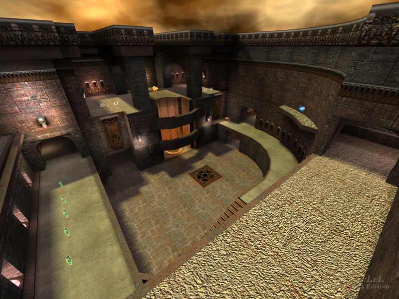
The main area that's pictured looks excellant, but everything else looks quickly thrown together in an attempt the finish it. Not to say it's horrible by any stretch of the word, but you wonder if it was worth saving in this day and age of maps with just as much fun, with better looks, and a lot more work put into them.
Agree (0) or Disagree (0)
I dont know if i like it. The layout is decent, but the aesthetics are below average. I had some fun playing this one as an FFA on a pub server, but i dont think its quite id quality. Maybe if i played it as tourney more..
The whacky respawn times aggravate me as well.
7/10 cuz im in a good mood :)
Agree (0) or Disagree (0)
Something about this map makes me keep coming back to it. Its appears very simply at first, yet the layout works so well. It has something for all types of players (so long as you like smallish levels)
Its a damn fine map :]
Agree (1) or Disagree (0)
