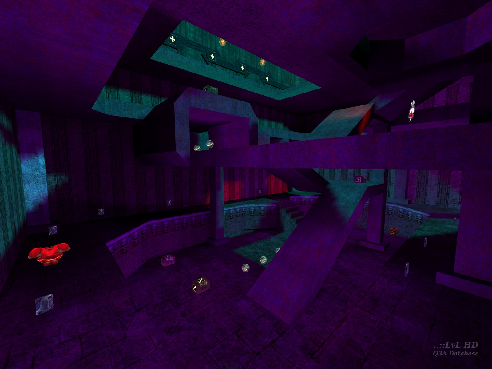


What did the mappers smoke when they were making maps with all those random lights?!?!?!

Btw: why did that guy said it looked like an unreal level? 0_0 ????? silly if you ask..
0_0 7 months later... omg.. omg...
Ok I exagerated a bit. Thing is, I didn't like the looks. Never really did. Gameplay was a bit... stale.
Nothing personal really 0_0 didn't mean to come across like that.
I don't wanna be a liar, that's .. well you know... :-/
blah
Don't get me wrong, I mean the layout is no nitemare, but the use of colors make me think of the maps you can find on cranky steve's site. Sure hope you'll take a good look next time. O yeah, originality is very important, but when I saw your map the first time, It hurt my eyes. Guess that's just the fact that I'm an artist. And that's what you've got to proove in your next map! Please don't make me find it on cranky steve's site! :)
Your work shows originality.
About the map... yes the lighting is way to smack-me-in-the-face. I don't like the bottom section with the ramps at all, just becuase it is more of an annoyance to get around in. I see some potential in your style though, Dross.
Also remember, it's not worth it to rush a map out, just to have map out. Test your shit, then test some more.
Probably all the unsourced lights and wack ass mixture of colors...which alot of UT/U maps have(the ones that came with the game) and the basic boring geometry of the level...which seems alot of UT/U maps have that too. The only one that I have seen that doesn't look like school kids bulding blocks is momento mori(i think) by matthias worch..that was an impressive level.
Forgot to enter my name,DOHH !!
Loading...
Search for a map.
Results will appear here.