Be sure to submit your comment
(On the ELITEZ Carnage server we play DM18 regularly with instagib/hook and that rocks).
I was always disappointed that DM18 was not used as a example for other maps with a similar style. One remarkable exception is AEON´s Timeless (aetime).
Now we see here a kind of remix of DM18. As the reviewer mentioned, it is simplified compared to the original. (The additional jump pads at the outsides, closed abyss, higher arches...). That was not a good idea, thats the thrill of DM18, adults only please...
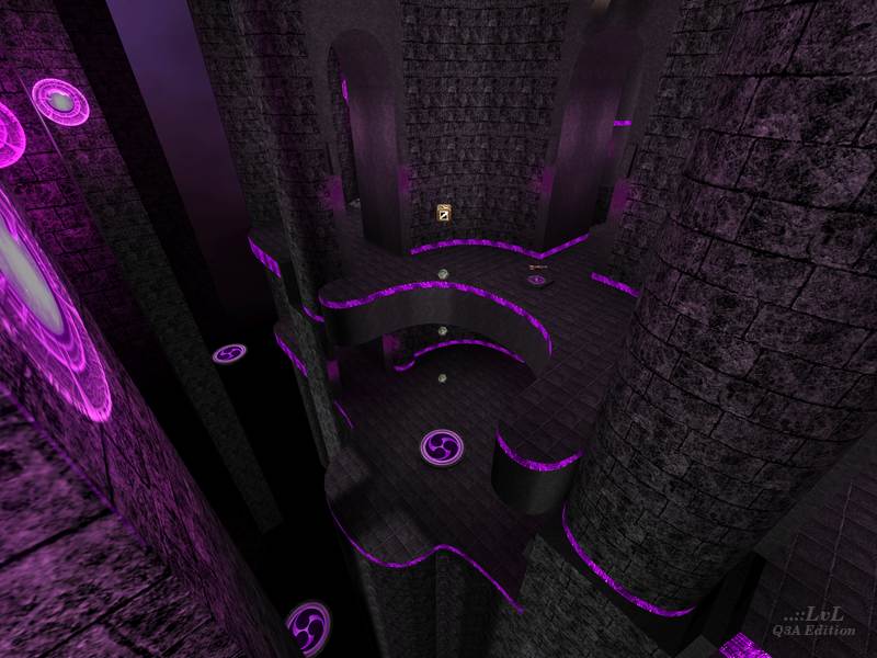
This also doesn’t help the gameflow, rather the opposite. The central open area is blocked by fat pillars left an right. This area got some additional jumping opportunities but it is more cramped than in the original.
My personal visual settings in Q3 are very bright. But also with this settings the map is much to dark in almost every places. The lightning is really bad.
I have no problem with the purple/grey texturing in general, its ok, but the texturing shades of the pillars from the inside to the outside are very poor and give in combination with the bad lightning no realistic architectural feeling.
The black lid or roof or whatsoever on top of the pillars is a total mistake. Also the skybox.
In the original map you can climb with the hook under the bottom of the map, below the pillars in every direction #8-O. Here you are killed when you fall.
So here is nothing new, but a lot of things worsened compared to the original.
I dont keep this map.
Edited 95.3 days after the original posting.
