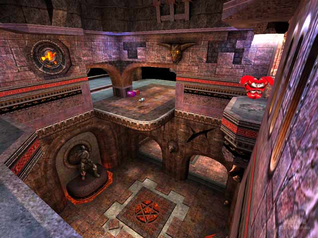
Blood Run tribute
Blood Run tribute by Obsessed
Comments
Add a comment
avatar
**Preview only**
Be sure to submit your comment
Formatting help
Submit
Preview
Cancel
Submitting comment...
avatar
FragTastic Rep. 2459
#9   12 Jul 2012
@SW12: I have to agree with you on that one. Blood Run was good but like you said had to little space. This one looks and is way better since there is more space and more features, areas to explore.
Agree (0) or Disagree (0)
avatar
KommissarReb (SW12) Rep. 2498
#8   12 Jul 2012
Better than the original. Problem is Blood Run was too cramped for me.
Agree (0) or Disagree (0)
avatar
FragTastic Rep. 2459
#7   23 Jan 2012
Textures are poor but great fun!. 9/10
Agree (0) or Disagree (0)
avatar
Obsessed Rep. 678
#6   02 Feb 2009
Yep, this map is pure subjectivity =) I made it for myself to play with bots (which playing I still dissatisfied with :-\) So if those, who got used to play on ztn's version strongly, will estimate this version negative.. I just don't care ;-) I need an opinions about map's defects to remove them. If someone will need it :-)
I mean: everybody is free to play of not at any map, and to express any opinion about it. But everyone is free to post his maps here to get an appraisal too ;-) Anyway, I cannot force anyone to play this map =) I just wanted to give some alternative to ztn3dm1, so many years have passed, someone might get tired of it ;-)
P.S. There was another opinion, that the lower tunnel is "the worst corner of the map".. yep, it's too simple..
Agree (0) or Disagree (0)
Mark unregistered
#5   01 Feb 2009
Swelt's version actually made me like blood run and would be in my top 100 if it was on here. download from promode wiki or q3a maparchive under nodm19 link as follows q3a.ath.cx/
Agree (0) or Disagree (0)
avatar
GuitarMan Rep. 518
#4   01 Feb 2009
I like the original one for Q3 (the dm and tourney versions), and this tribute looks and feels good.

I agree with the reviewer on some points; like the item placement and the weaknesses.

The idea of "improving" a map is healthy, although it's very subjective and if you do it you'll end up into very sensitive territory, because you're dealing with a map that's already done and, in this case, it's a very well known map that's even used by top level players.

Other point I agree with the reviewer, is the black sky. It looks way out of place, just does not fit the map. Although, from my point of view, I don't think another skybox would have been better; to me, it should have been built into enclosed space, within walls, no skybox. But it's just my opinion.

Anyways, besides the parts I don't like, it's a very well designed map; of course, I say this from a mapper's point of view. I just don't think that "rebuilding" someone else's map is a good idea, unless such map sucks big time and you can actually improve it a lot.

Agree (0) or Disagree (0)
avatar
headrot Rep. 178
#3   31 Jan 2009
Where is swelts version?
Agree (0) or Disagree (0)
avatar
Obsessed Rep. 678
#2   31 Jan 2009
Thank you all very much for appreciation =) Anyway, it was nice and easy to make something satisfactory on such excellent basis. But I definitely didn't plan to make some clone of Blood run. I DIDN'T like ZTN's Q3A version and wanted to "make it my way", because I'm still crazy fan of his Quake1 original map. Gameplay was my priority above design, so the items placed just so. I'm worrying only about RG room. And about Swelt's version.. his remix made me sure, that I'll be able to make bots to take Red armor ;-) I'm grateful to him too! =)
Agree (0) or Disagree (0)
avatar
v1l3 Rep. 1541
#1   27 Jan 2009
Yeah..the original map has been obsessed over by just about as many people as pro-q3dm6 has been(well maybe not that much =/) It's a pretty good remix though. Hell..Swelt remade ztn3dm1 also, and it kicked ass!
Agree (0) or Disagree (0)
Clear