Be sure to submit your comment
- Gameplay runs smoothly with no problems but does lagg in a few parts but no worries
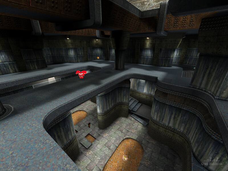
- Textures are finely brushed and not a missing texture in the map
- Weapon Placement was good but should be nearer to re-spawn points
- The number of bots added to the map should increase by at least 2 more since the map is only suitable to 2 - 4 Players. It should be 3 - 5 Players maximum.
#6 Foo : I'm a bad mapper. I just can't make good dm maps, even with highly qualified mappers' help. I have learned much in mapping, I mean technically. Just think of the official ones: how many people for how long work on a single map?! Ok there are many of "us" who are big talents, and can do anything perfectly alone.
This map was born from a simple floor plan. Ok, it doesnt' change my thoughts about galvanized, it is as is. But in the future I will be more wise. Even keeping the original layout (look at its base on my site!), I could have extended it in the same style; having a base, it would have not been a hard work... ok it's a real fault. But I can tell You a secret. I started to make a q4 version (god, I must be crazy!), and after laying down it's base, I stopped it about 6 months ago. because I feel that I have to make it bigger, so I will use the same kind of layout, but will make more rooms, corridors, arenas connected with even more exciting routes.
And about the items: my item placement was horrible. We changed it later completely (it had 2 armors in my version exactly ;-) Maybe You know who tested it and gave me advices (help: donkey, munyul, vondur...)? Finally we agreed that a simple map like this cannot handle more armors. What would it solve? If You get one You can get quickly the other too, so the opponent still doens't have more chances, maybe less. Ok now we are at the same problem: it's a small map. So we thought it fits the map the "less bad way". Of course, I highly appreciate your opinions, and will think more about it in the future. Other thing is the wall: I haven't got this idea. It sounds funny and exciting, maybe if You were a betatester I would have considered it and try out.
In the last thing You are right: in FFA maybe it would be better to insert more armor: that way it wouldn't be so unbalanced with more players. Thanks your words anyway!
PS: I have checked your portfolio quickly after seeing your post ;-) That map is a cute, very well connected piece, with also some nice visual thoughts. Beside that, I think... but it's my topic here, I won't tell You more about that!
#7 v1l3 : So You think that the set deserved its place in my map? Thanks! I think that this one is a real classic, coherent awesome set, with its simplicity it still has many many ways of new mapping ideas. And I agree with your words about the floorplan: the thing is that I just simply can't sit down and sketch out a great and exciting layout at last! I hate myself, I'm soo lazy! Maybe in the future... in spite of that I said I won't make any more map for q3... who knows?!
#8 J2KoOl63 : Hey man, what were You waiting for?! The pictures didn't sell the map? And the comments, the betatesters credits... Anyway, I'm glad You have tried it out finally! ;-)
The map is really open, almost one airspace (if we are really strict). It was intended. To avoid players to hide. Even this way, in tourney mode there ar many cases where You just simply can't find your mate ;-)
The teleporter was one of the final additions. The map was done for months, when we considered that it's still hard and slow to get upstairs. I didn't want more, and bigger jumppads (they don't fit this map I think), that only one is enough, but it was intentionally not one from the ground floor to the top. Se we needed another route to help the player to get upstairs quickly. Of course it's used frequently, I'm glad to hear that, so it was not uneccessary.
Thanks all of You guys to share your thought with me! For a mapper this is the greatest reward!
7/10
The top area feels too open, ideally cutting that into several rooms by something as simple as replacing the RA platform with a solid wall would solve this.
Works OK for FFA but that also has the problem of the RA dominating the game.
I didn't know what You were talking about, but later I have found information about that books by Rober Jordan, which had given the story to a game. One of the most beautiful game ever created, and also one of the most underrated too (archive.gamespy.co...d/index17.shtml). This game was I talked about. Your map reminded me to that game. I don't know if You have played it or not (www.planetwheeloft...me/screenshots/)? So the thing is, your citadel map is very original and unique, I love it!
Other thing: I didn't want to announce my invitation to designing levels for... Alientrap (www.alientrap.org/)'s next single player project! I don't know if I can put my creativity in the game, this is why I was so mysterious.
Anyway, thanks your comments guys!
I'm humble, but I thought people will like it, because this is my very first really fine work (my opinion). Of course I know that the mapper community accepted it, and me myself is also satisfied with it. So it feels good to read your comments guys, thanks Myth and dONKEY! Of course dONKEY has it for ages, he waas one official tester and adviser for it ;-) (I'm just downloading your latest geocomp map!)
But Myth, your words make me even more glad, because I knew dONKEY's opinion already. If I forgot to mention: your latest map is lovely, those huge castle areas remind me of Wheel of time for exmple and Unreal. Even my co-worker friend in the pharmacy (who is a girl) loved it, and stared at it: "It's like a tale!". (The thing is that s he is my best critic: she never played games, maybe even didn't see one, but her opinion is the most thruthful, because she isn't affected by anything) The thing is that I liked more the earlier Citadel, of course I know that these huges areas don't allow more detail. So both are great, and I already have it on a dvd archive.
I was really surprised when I saw my review here this Easter: this was my gift. Next day I received a letter, which invited me to map for one of the most exciting project lately. Of course I said 'yes' to it, I'll see if I can add something to its content in the future.
Thanks guys!
Edited: 25.Apr.2006 07:15 UTC
