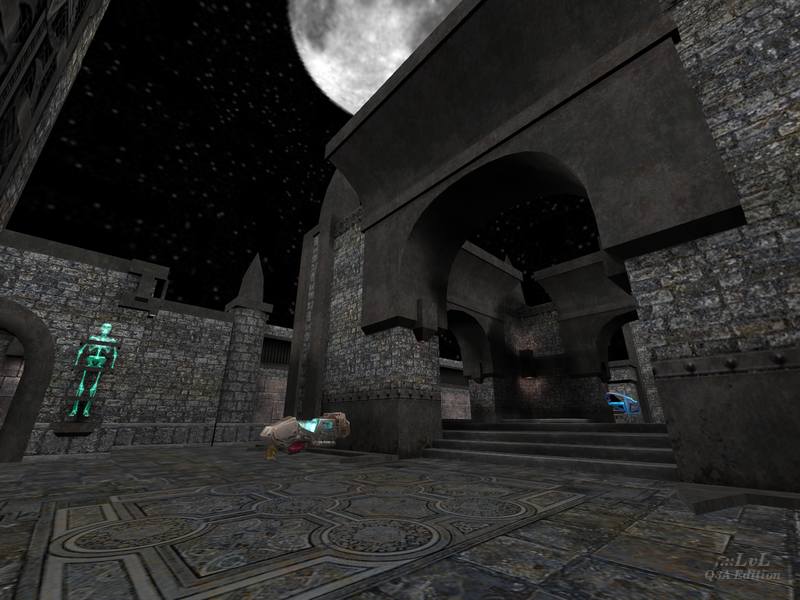
An old (2000) map from an experienced mapper, JonnyReds presents here an interesting arena in a Gothic style. The top floor has an open structure in the middle, reminding us of that in Uriel's Tourney level Fatal Instinct (q3tourney5).
The underground floor is, according to the readme file, an old mine with a few pits you can follow to your death. The two areas are marvelously connected. The design is well-done with a few nice elements like the trapped Bones in the wall. The map atmosphere is great. It would have been even better by having the sky dynamic rather than just black.
Just one thing feels entirely off. The ice rink (as the author describes it) in the middle of the top floor. Bots have a hard time trying to pick up the health and it is almost like they don't see the Quad. I other words, the Quad is there waiting for you. This detracts significantly from the gameplay. Plus, it's awful. I see no reason why that surface is needed.
I would have some items placed differently. Currently, incentives for players to use certain passages are very weak (some shards). Why not adding the red armor, currently missing? The map is definitively lacking more armor, particularly since there is a Quad Damage! Similarly, the MegaHealth and the Yellow Armor, the two key items of the map, are literally next to each other (one floor apart). Not good.
All in all, because of the connectivity, the gameplay of the map is great even with bots. A FFA with 2 or even 3 opponents is quite engaging (particularly if you voluntarily do not pick up the Quad). A 1v1 with a challenging enemy might also provide a great game (however, the Quad remains in a 1v1 match; much better to have it replaced with a red armor.)
For some, a keeper. For me it would be so were it not for that annoying ice rink.
Reviewed by raspatan
Ranked: 3.9 out of 5 (5 votes)
Download: THASLISETH! by JonnYReds
