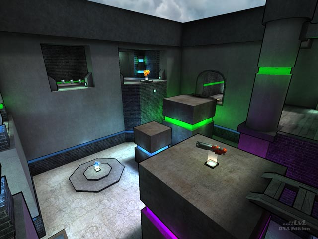
What a nice simple, small, clean map cityy has created. It is not an architectural wonder, but the cel shading suits this level of complexity.
The name of the map is "Colors", and you will get a lot of them. Actually there are 3 basic colors. Blue (3 types), green and purple. I have thought they are used in decided places, but they are a bit random. Yes, the ground floor has blue stripes in the walls and the upper level uses green. But the colors for the objects (boxes, columns) are pretty random. They are not just purple, but also green and the other types of blue. It is just a minor thing, but it was strange at the first sight. The rest of the textures are held in a greyish tone and do not distract at all. So the map contains a nice combination of colors and bricks/concrete.
The level is lit very well in the bigger areas by the color stripes, the sky and the light brushes, but the smaller corridors could have used some more light, or light images at the ceiling. Sometimes it was hard to see the enemy from the distance.
The gameplay is fine for a 24 hour map, but in my opinion there should be some more healthballs in the upper level, and I would swap the items a bit. Like deleting the upper yellow armor and moving the MegaHealth there instead. At the moment the big items (MH and RA and even one more YA) are all on the ground level. The broken glass at the red armor is a nice idea for escaping from the fiend, though. The Rail Gun room is way too big and kind of cut off from the map. Instead I would have put the weapon on the bridge before, advanced the jumppad and deleted the teleporter.
One more negative aspect are the boxes. They are some units too high. If you stand right in front of them it is hard to get up (that bug if you are too close to an object, you do not jump up as high as normal). The jumppads look pretty cool though.
The bots play good, but they never collect the Rail Gun or the upper yellow armor.
I've only played against bots. Some Tourneys and one Deathmatch (the recommended number of 3 players is perfect). Both gametypes were very interesting to play and because of the size of the map it is very easy to learn. Moreover thumbs up for cityy, that he could finish it within one day. Despite the things I mention above, I hope I can play this map some more times on a server against humans.
I suggest downloading this map unless you hate cel shading, although it is not used too much.
Review by Bliccer
Second opinion
This is a small Tourney map designed with CPMA in mind. It has got a cell shaded look and uses brick and gray textures combined with neon green and purple elements. The glass at RA, the lamps and the jumppads add to the futuristic impression.
The action takes place in three rooms on two different height levels and the map offers a good variety of weapons and lots of other goodies (RA, 2x YA + MH) for its size. Connectivity is very high due to the teleporters, jumppads and the lamps that allow you to ramp jump from the lower to the upper level almost everywhere (in CPMA only). The rooms are simple and contain cubes of varying size that allow you to get behind your opponent by going the other way around sometimes.
For my taste the layout is a bit too simple and the delimitation of the two height levels is too obvious. A third level or the usage of stairs to break this could have improved gameplay.
Item placements feels solid (maybe a bit too much armor) and bots play the map pretty good but will not do the ramp jumps of course.
According to the readme the map was built in 24h but this does not show, it's a good release. Grab it!
Reviewed by spirit
Ranked: 4.4 out of 5 (9 votes)
Download: Colors by cityy
