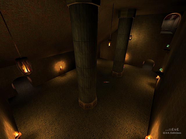
Texturing in this map is very limited. I have seen this time and time again that a scarce use of texturing in a lot of maps. It seems to be very wide spread. Now for an alpha layout this is fine. But among the many to pick from to break up the map to define its areas is more times left out then placed in. Being pretty is not everything, knowing where your at is.
Brush work is also very small in detail. For a first map though its not to bad and the author has a lot of room to improve. All of the archways look as though the texture is not naturalized on the patches. The curved stairs were designed nicely using an offset texture other than the floor to show its place kinda throws you off a little.
Lighting is bland and dark in a lot of places. It feels like the use of the light_entity was not even considered. But once again this is the authors first time out. Using a test map to get a general idea of this can really help out instead of relying on the light shaders.
I can not comment on the Item/Weapon placement due to the fact that there is no bot file included (see below). So playing with what the author has given really had no affect on gameplay. The author does state in the read me text that he/she gave up on trying to make a bot file. Well that's why there is beta testing and a lot of people to help you with this.
Overall on this map. More time with beta testing. Time to grow with the editor itself will show that this author can produce something playable in the future. Keep in mind that there are a number of places to help you with your mapping progression.
A quick peek, but you'll pass until the next release.
Reviewed by ShadowZombie
Bot file: Thanks to Mapsking for putting together a bot file for this release. 12th May, 2020.
Ranked: 2.5 out of 5 (3 votes)
Download: pr1ajp by WidowMaker
