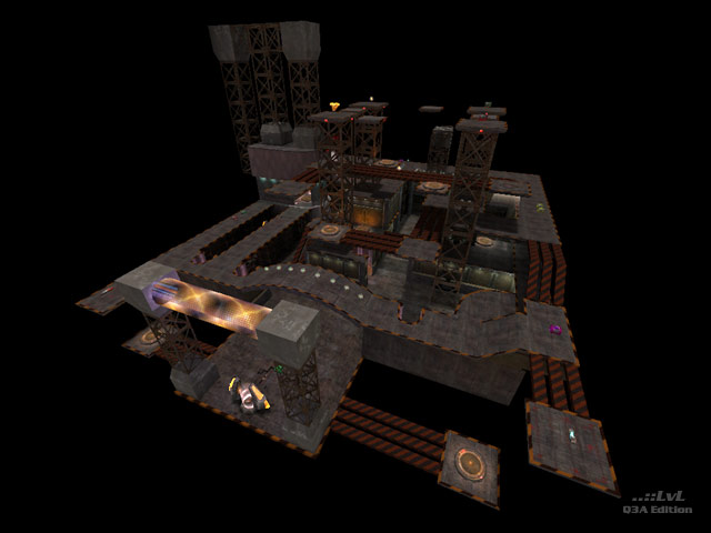
A space factory. This map is a huge disappointment. This map suffers from a number of serious flaws. There are quite a number of untidy brush placements, one "see-through" wall, with one or two misaligned textures. None of these affect game play but they do spoil the look of the map.
My biggest gripe with this map concerns the amount of pylons; there are heaps of them. All of which are see-through and none of which are shoot-through. The game play becomes close combat because of it. Item placement is unrewarding with effective weapons being found close to hand, leading to game play being restricted to the central area with no need leave it. This is exactly how bots play this map.
Under the Q3 "Lightmap" lighting option this map is too dark by far, whilst vertex lighting gives a workable light level. However, under both lighting conditions FPS levels are unacceptably low due to high r_speeds.
To improve this map I would suggest more stringent beta testing before release. More appropriate use of textures and shaders to improve game play and lot more thought into lighting.
One to miss.
Reviewed by sastrugi
Ranked: 2.6 out of 5 (5 votes)
