Be sure to submit your comment
Read. Comprehend. Post.
The sequence is not difficult.
"More appropriate use of textures and shaders to improve gameplay" == "Don't make large see-though pylons everywhere that use the grate texture, but make that shader solid to weapons fire so you can't shoot through them."
I tend to think they should be shoot through as well, but it's arguable, since you can't differentiate by weapon (e.g. if an MG can shoot through, so can a RL). Either way, it has a huge effect on gameplay and it's a shader, so please get over it and quit making silly blanket statements.
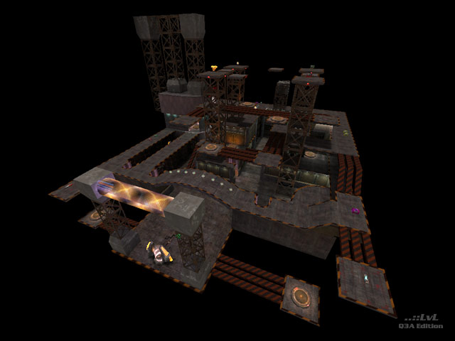
The things I like most about the map:
lots of over/under and vertical
nice use of visuals and lighting (although spots are a bit dark)
some interesting geometry and detail touches
The things I don't like:
lots of dead ends/poor flow
teleporter that pops you out on an edge so that you immediately plummet into the void if you have any forward momentum
pool of water around the statue that you can fall down into and get stuck and sit there forever waiting for someone to kill you
some iffy construction on the curved sections of wall above the RA, there are visible cracks in-game that allow you to see through the wall--perhaps this is the "see-through wall" mentioned above?
I think the map deserved to get
a decent review, not one that was just made stuff up.
The maps design was good, the texture and placement was flawed
Too many silly pipes with badly fitted textures. I seen no transparent walls, but i did get stuck behind the statue and couldnt get out.So there you have it.I agree with sat on one thing, this should have been beta tested
The review may not jive with you, but the final judgement and the position it holds in the update is very reasonable.
If you keep taking ppl's opnions on board when making a map, the map isnt yours any more
Fk what ppl say.I think theres a big hint of jealousy sometimes with these things and this map was given an unfair review
Uhm... textures and shaders doesnt help at all to improve gameplay, unless they ruin it due to excess...
