Added 09 Nov, 2010
Comments
Add a comment
**Preview only**
Be sure to submit your comment
Be sure to submit your comment
Submitting comment...
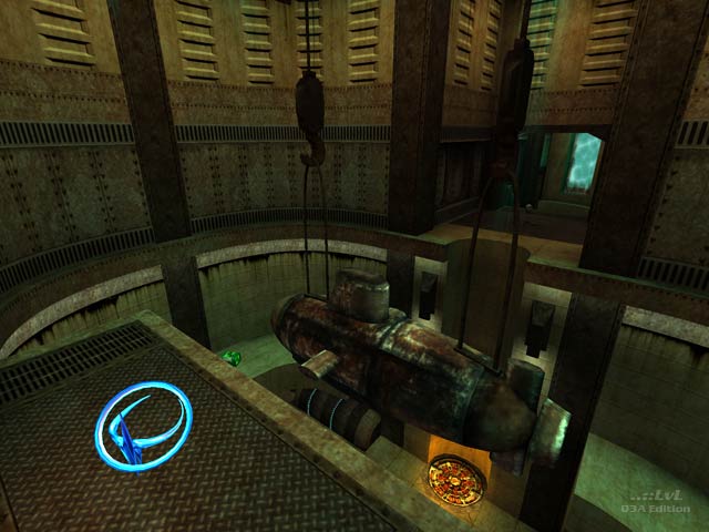
This is still, in my eyes, one of the best underwater-themed maps in Quake 3. Kaz did an excellent job of convincing the player that they're leagues under the sea with the cyan-tinted godrays coming from glass windows, complete with water caustics, along with the use of skyportals to display the ocean floor and the surface high above.
I can see why it only scored 4th place though in terms of gameplay - it still plays well, but it does tend to lack vertical action in several parts, and the submarine, as the reviewer mentions, is a detriment to gameplay as-is because it makes it very difficult to strafe across it. A possible way it could have been resolved while still keeping it would be to move the sail/fin toward the middle, lower the submarine so that the top of the sail/fin is level with the GL and the MH / Quad, and then widen it ever-so-slightly to give players more room to hop across it.
Agree (3) or Disagree (0)
probably everything has been said so start downloading boys ;D 9/10
Agree (0) or Disagree (0)
Great style and atmosphere. I ran through it for quite a while looking at those great windows into the blue. And that sub is cute. Get this map asap!
Agree (0) or Disagree (0)
great job on the review anthem and some useful comments cityy - regarding the map itself: talk about rocking it oldskool!!! Gameplay sometimes feels like a chore (hence it's fourth place?) but it did grow on me. the idea is fantastic - well-executed. it has that public server appeal to it and its neutrality will serve it well in xcessive mods and other mods where the base item stock is bypassed but as it stands in large player-load server set-ups there are a few areas where once a couple of experienced players have set up shop (you know the ones - smart enough to camp a good spot but not nice enough not to) the remaining players will merely serve as fodder while they're left to battle it out amongst themselves. But while gameplay leaves a little to be desired for those who don't like the public server ffa format to Kaz's credit the map really didn't hold any screaming flaws like the main place getters had. While the area housing the submarine comes across superficially as one-dimensional it is perfectly suited for the style of gameplay i believe it is intended for - take a look at Vondur's "Nemesis" and "Khaooos", Wiebo de Wit's "No Class" and "Overkill", Unitool's "Abandoned Crate", Nemix's "Third Encounter" and Aeon's "Pyramid" for example (and there are many others that escape me offhand) - you'll see what i mean. This style of room carries a purpose and tradition with it that makes me think Kaz has ultimately been very considerate with respect to the type of gameplay he was looking to achieve - i just don't think the judges were personally fond of this particular style despite the fact it has a strong following. While not to some people's taste, and i will admit to it not being my favourite style of play - i believe this map was totally underestimated - and we can thank orthodox thinking for that! A good judge of a map needs to be objective rather than subjective in his or her decison-making process.
Edited: 13 Nov 2010 AEST
Edited: 13 Nov 2010 AEST
Agree (0) or Disagree (0)
A beautifully designed map. Another one that fits more on a single player mission than on Q3A.
Agree (0) or Disagree (0)
The atmosphere you got in this map is amazing - IMO creating an underwater feel is really hard and you did it very well.
About gameplay: As I mentioned earlier there are a few things I do not like. The mid level in the quad room is certainly not making much sense as it doesn't give you much of an advantage or opens new routes to the major items for you. The submarine - it looks really awesome and it is a cool detail for the map but I still wouldn't have used it in that position. It feels a little bit weird and random to jump onto it. Other than that the map is working really well, IMO - maybe, in future maps, you could try to continue with the vertical style from the center room building your other rooms. The quad room has good vertical gameplay because of the 3 levels - you should try to build your other rooms vertical aswell, use the height that center jumppad gives you to make clever connections that open possibilities for high levels in other areas. Not saying the current layout is bad, it's cool and it works. I just recently figured verticalness really is one of the most important and usefull things in q3 maps because it can add more depth to the gameplay.
Anyway, good job, pal. I hope to see you more active again soon. :)
Agree (0) or Disagree (0)
