Added 07 Jul, 2010
Comments
Add a comment
**Preview only**
Be sure to submit your comment
Be sure to submit your comment
Submitting comment...
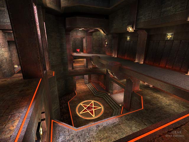
This is another map that makes it hard to believe you're looking at that id texture set. Not that there is anything remotely wrong with id's textures, it just takes me a bit by surprise when I can see something so well worn look fresh and new. This map manages to look amazing wearing the same clothes we've seen one-hundred times over. Which is really owed to the brush work and and the layout of the map. I love it.
Agree (2) or Disagree (0)
I remember reviewing this map a while back but still don't have this map on my list. It's strange because I added my reviewer details on my review. Tig, could you sort this out please..?!
Edited: 29 Jul 2012 AEST
Edited: 29 Jul 2012 AEST
Agree (0) or Disagree (0)
I like this map very much. It's really beautiful, looks totally classic. A lot on nice deatails, but ther's no overkill in it. Great colos scheme and lightning. Layout could use some tweaking, but it was a competition map, so that's explains it :). Anyway, I still enjoy this map very much. Tested it in ffa and tdm, and it was fun. You should really check this map, it's great reminder of old good times! ;) 8.5/10
Agree (1) or Disagree (0)
