Added 02 Dec, 2014
Comments
Add a comment
**Preview only**
Be sure to submit your comment
Be sure to submit your comment
Submitting comment...
Referencing the posts below.. I did end up opening an issue for the vertical columns on the Spearmint Q3 git, and I received a reply... github.com/zturtle...mint/issues/331
The jist is to use the console to set the following values.
r_offsetunits "-2"
r_offsetfactor "-1"
Again, this only applies to Spearmint Quake 3.
The jist is to use the console to set the following values.
r_offsetunits "-2"
r_offsetfactor "-1"
Again, this only applies to Spearmint Quake 3.
Agree (1) or Disagree (0)
Aye, I'm actually running the latest from the github page. But you're right I could make a bug report there. I'm slow to leave the Spearmint project behind because it seems to suit my 21:9 aspect ratio the best. Though I admit I haven't looked around in a while. Thanks for the reply.
Agree (1) or Disagree (0)
@Whatschizer - I thought Spearmint development had stopped, but there are a few recent commits on GitHub - github.com/zturtleman/spearmint - Your question about the render issue would be better flagged as a bug report on the GitHub project.
Or, switch to another game engine.
Agree (1) or Disagree (0)
I'm having an issue in Spearmint where the textures for the vertical columns in the walls are rending in as a dark black line when viewing them from a distance. When I approach they render in fine, its just when I am a certain distance away they go black. Wondering if anyone in here might have thoughts about why that is? Great map otherwise!
Agree (0) or Disagree (0)
Nice work! 10/10.
For vanilla Quake 3 (both ioquake3 and Quake3e), it is not listed in Team Deathmatch mode (unless you are able to change the value of type section in rustgrad.arena file under its scripts directory into "team ffa", rather than "tdm ffa"), although it can be loaded by CPMA flawlessly.
Edited 10.48 minutes after the original posting.
Agree (0) or Disagree (0)
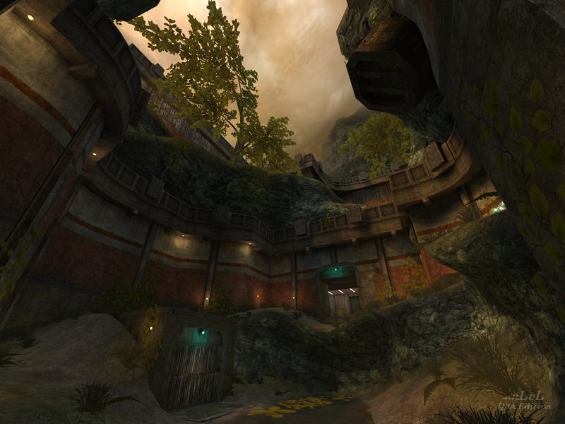
What a great map. Visually this is one of the most well achieved maps I've seen. Playing with modern computers and high quality texture add-ons it shines. Gameplay is quite fun too.
Agree (4) or Disagree (0)
visually it is quite stunning. As a tourney map it is a little too big with a fair amount of distance between sections. As a small-medium ffa/tdm it fairs better. A lot of tunnels and tunnel fights: not sure I like this, but that's personal taste. I like the item layout and most of the individual areas.
And PS: your idea for the teleporter - my favourite thing in the whole map, and best teleporter EVER! Also, the way you executed the sky was very clever.
Edited 1363.34 days after the original posting.
Agree (2) or Disagree (0)
simply GENIOUS! color scheme and details thoroughness - both are beyond praise! very atmospheric map! more I'm looking at this work, more I understand, what a poor designer I am. :D
Edited 1 minutes after the original posting.
Edited 1 minutes after the original posting.
Agree (2) or Disagree (0)
Great map, really impressive visuals here.
(It's worth noting that it only ran for me after starting Q3A with "+set com_hunkmegs 128". So if you get memory errors while loading it, add the latter to your Q3A command line / shortcut.)
Agree (5) or Disagree (0)
Damn, many people with the same thing in mind. HL2 was also what I thought at a first rush through the map, which is definitely a compliment to the author. Especially when thinking about the age of the game engine. The layout and feel of the map is the most impressive thing for me and I like the excellent work on all of the details. An excellent release!
Agree (2) or Disagree (0)
If you copied one of the screenshots for this map and showed it to a Halo 3 player, you could easily trick them into believing that Bungie released a new map for H3. Hard for me to believe that game came out 8 years ago, 'cause I remember well when that game was new :/
Its really amazing just how flexible the Quake 3 engine is.
Edited 31 seconds after the original posting.
Agree (4) or Disagree (0)
Amazing map Hipshot, I've spotted similar textures from your older map ''Solitude'' and well I love it. Atmosphere is amazing and the way you've combined nature and industrial together really does give that feel to it. Once again, pretty good work!
Edited 21 seconds after the original posting.
Edited 21 seconds after the original posting.
Agree (4) or Disagree (0)
Amazing map! Even the bots seem to enjoy themselves.
Agree (3) or Disagree (0)
I am impressed as always with your work Hipshot! I love the crenellated "nature taking back its territory vibe!" Please continue to be motivated, because your work is great :)
Agree (6) or Disagree (0)
I immediately recognized some of the locations in this map from some screenshots posted a few years ago on Q3W, so I was very excited to be able to see the map in its full splendor. Detail is top-notch, lighting is effective and provides great color contrast, and the terrain work is to die for. (I agree with 1v4n about it looking like a HL2 map!) And as usual the gameplay is accounted for as well, with an interesting layout that offers good vertical combat and trick-jumping. Far and away Hipshot's most outstanding effort.
Agree (6) or Disagree (0)
Thanks you guys!
Really motivates me to make more levels!
Really motivates me to make more levels!
Agree (6) or Disagree (0)
Pro visual quality and a blast to play. A bit more health would be nice but that's my only (minor) quibble. Outstanding!
Agree (4) or Disagree (0)
I had really great feeling while playing this map. Great atmosphere, excellent job, Hipshot :)
Agree (2) or Disagree (0)
The map looks honestly like a Half-Life 2 one... Very impressive, with high quality textures and everything. The main problem that I encounter is the gameplay. Bot's do not play like in traditional vanilla Quake 3. Anyway, great work Hipshot.
8.5/10
Agree (1) or Disagree (1)
