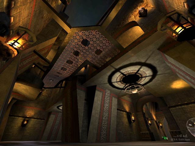
Added 10 Sep, 2006
Comments
Add a comment
**Preview only**
Be sure to submit your comment
Be sure to submit your comment
Submitting comment...
It's good overall. The beauty is that, er, robots sometimes don't move at some point
Agree (0) or Disagree (0)
very good work moses!
i just played your map in ffa and it was good fun!
i discoverd that some of the lamps in the lower hallway (where the quad is placed) are blocking the player like a clip-textured brush.
but nice map anyway
i just played your map in ffa and it was good fun!
i discoverd that some of the lamps in the lower hallway (where the quad is placed) are blocking the player like a clip-textured brush.
but nice map anyway
Agree (0) or Disagree (0)
There is always an element of personal preference with regards to liking or disliking a certain map. I'm happy to say that out of all of moses maps that are posted here this is by far my personal favourite. If you are looking for some solid FFA then this should be right up your street.
Enjoy folks!!
Fora.
PS: Never noticed any spawn sound bug whilst playing it and I've played a fair few games on it so far
Agree (0) or Disagree (0)
so has the spawn sound bug been fixed yet?
safe to put this in my baseq3?
safe to put this in my baseq3?
Agree (0) or Disagree (0)
Nice work Moses,
I like how everything is connected.
The hallways are a bit too wide IMO. but hey, I like things cramped... ;)
and they suit the intention of TDM very well.
Nice layout, cool use of textures.
I like the way you put the skull textures on the top-sides of some of the stairs.
Well finished, good detail. Just one little thing the dirt texture in the 'large outdoor' at the bridge is a little bit overused (see screenshot 2). A cool finishing touch could have been a little rubble or something to break the textures repeating.
Anyway Good Release!
Agree (0) or Disagree (0)
