Added 22 Jul, 2001
Comments
Add a comment
**Preview only**
Be sure to submit your comment
Be sure to submit your comment
Submitting comment...
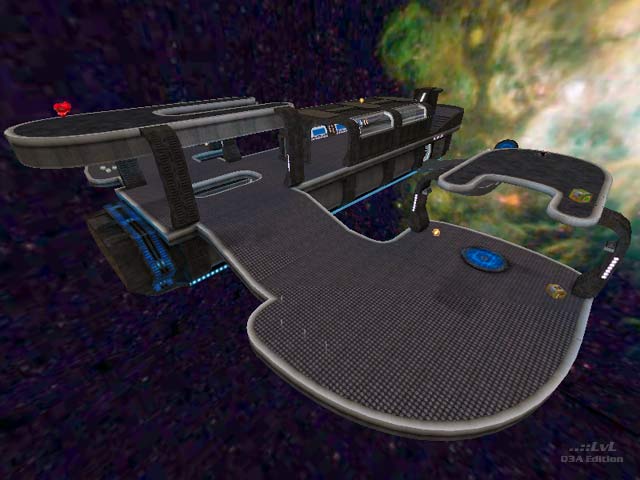
Floater with only one each of the weapons...most of which require you to take a jump pad to get to. Once your opponent has the RG and RL, you're toast as they can totally dominate.
It's therefore rather awful 1v1.
Agree (1) or Disagree (0)
Original layout, gameplay is good. Too bad the bots are orientated to the center of the level but with enough of them you can get a decent game with them. Thumbs up!
Edited 1.54 days after the original posting.
Edited 1.54 days after the original posting.
Agree (1) or Disagree (0)
The Laboratory The Mission Control Part 1
Agree (0) or Disagree (0)
The skybox is OK
But there are some curve-mistakes (sorry german-sucker...don't know how to write it)
But looks quite nice
A 5 from me
Agree (0) or Disagree (0)
The skybox is not good ,It look like you are in huge box.
Agree (0) or Disagree (0)
Looks real good. Brushwork and detailing is very good. Would like to see more maps in this style.
Lighting could be brighter in my opinion.
Like the layout, the map's enjoyable to play, the small size makes it so that it being symmetrical doesn´t matter. I think the item placement is functional at best though.
Agree (0) or Disagree (0)
nice place but too simple :|
a 5 from me
Agree (1) or Disagree (0)
