Added 11 Jul, 2022
Comments
Add a comment
**Preview only**
Be sure to submit your comment
Be sure to submit your comment
Submitting comment...
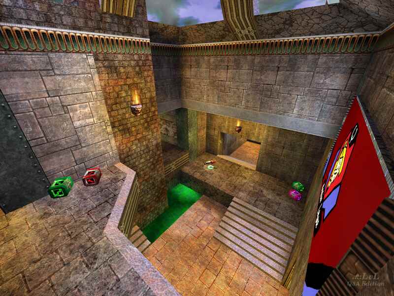
Heya! It's me. Haven't checked this out since the initial release, and in that time I have visually revamped the map and made a couple gameplay changes. Along with my other maps (only available on Quake Live under the names Wait and Bleed and Resnarkled) at the moment, but will be on ..::LvL very soon!), this will be updated as soon as possible! I will look at remixing the item layout for FFA, potentially swapping the rail for mega. Thanks to all those who reviewed, commented and played my map! Lots of love xx
Agree (1) or Disagree (0)
I agree with the review and comments so far: great gameplay let down by the visuals, but as long as it plays great who cares about the visual? From a rating POV, the looks do matter, but of the 3 new releases this month, this is the one I plan on keeping around. Would like to see the tourney layout juggled around. This level could have used a GL, and an extra armour could be added in, in lieu of the Quad. And like Whatscheiser said: the MH so near the quad was its biggest item problem in FFA.
Agree (2) or Disagree (0)
Bots play pretty well but don't seem to go for the QD. Didn't notice them display a difficulty in any other area though. They utilize the whole map. I thought the layout was great. Game flow felt really good. Only thing I could nitpick is the MH being so close to QD. I could see that being a good opportunity to cheese a bit. The look of the level... as the reviewer pointed out might be a love or hate thing. I managed to find it kind of charming. Reminded me of seeing adverts for different servers on base textured maps back in the day, but if you're not wearing those same nostalgia goggles I could see some not quite going for it. What I might point out as an actual issue is that the bottom of the skybox is frequently visible through the windows. Hiding that with some extra geometry outside might be a finishing touch worth looking at on the next map. Regardless its not a make or break issue by any means.
Again though... fun layout, good item placement = fun matches. I enjoyed this one and I plan to keep it around.
Agree (2) or Disagree (0)
