Added 07 Sep, 2010
Comments
Add a comment
**Preview only**
Be sure to submit your comment
Be sure to submit your comment
Submitting comment...
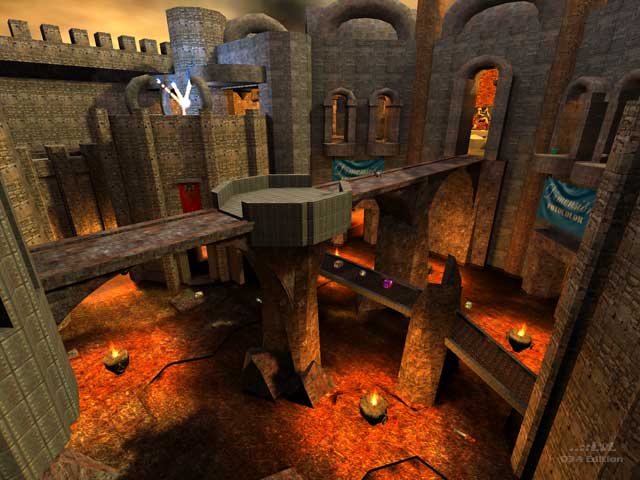
Interesting map, but my initial thoughts, were about the fountain and the dragon. Specifically, my intuition made me feel the fountain should regenerate health, but it did not, and I was also kind of disappointed to see that while cool to look at, I was disappointed that the dragon fire does not harm the player. In addition, I did not thoroughly explore the map, but I initially spawned near the two railguns, above the dragon and fountain. I ran right into two health regens, and in a map this size, two of them right next to each other does not seem like a smart decision.
Agree (0) or Disagree (0)
@FragTastic and Scorpion Tank: To be fair, it's a lot easier for us to translate the odd comment to English than for them to translate pretty much the whole page to their language.
Edited 1847.88 days after the original posting.
Edited 1847.88 days after the original posting.
Agree (1) or Disagree (0)
@All: Comments are welcome in any language. The Internet is in fact 'Global' and it is great to see ..::LvL and Quake 3 can transcend the limitation of English.
The only comments that may be removed are offensive or pointless ones.
Agree (4) or Disagree (0)
@Scorpion Tank: Thank you for saying this :). I've said it so many times but they just don't listen
Agree (0) or Disagree (3)
please comment in english or your comment might be removed!
Agree (0) or Disagree (3)
En realidad esta pensado para jugarlo en red con los amigos. para no olvidar de reunirse a una Lan Party. Ok Les prometo que realizare un mapa mas estupendo. la falta de comentarios me habia desanimado. Te prometo que al proximo le pongo Bots. Gracias por comentar !!!!
Agree (0) or Disagree (0)
Wow! Amazing Looking Map! The statuein the last screenshot reminds me of Pit from Kid Icarus. 8/10.
Agree (0) or Disagree (0)
This map has awesome architecture, great models and epic music. My only nitpicks are:
- No bot support
- Fire doesn't burn (solid as a rock)
- pass thru models (need to be solid)
a 7 from me!
Edited: 04 Jun 2012 AEST
Agree (1) or Disagree (0)
Sorry, I'd usually play a map with bots so it's a bummer that I can't here.
Edited 3112.15 days after the original posting.
Edited 3112.15 days after the original posting.
Agree (0) or Disagree (0)
the problem of putting models that when they are complex as in case of the basilisk and of the angels it is difficult to fit a brush cushion so that the bot not between in, that's why I decided to leave it how are you. In case of the flag, this one is a part of todop the time that I have invested in this map, and it could not stop of that it was there, also it brings referecia to my life, it is slightly personal.
Agree (0) or Disagree (0)
This map is 2 months ago, there are no comments yet :)
And you should have posted a real comment instead of that.
I played this map today. Architecture looks good; yeah, it's big, and that makes it look more like a single player map than a multiplayer arena. Good ideas are there, maybe some more work was needed.
Problems I found:
- Those winged statues are not clipped, you can walk through them.
- What's with those advertisements hanging from the walls? Not only they are completely out of place, but they also totally kill any atmosphere and feeling the author himself wanted to build into the map.
- The readme... if a map author is using someone else's readme as a base (which is ok), at least should do it properly (some parts were not edited and you can see it's from one of Tig's maps). And by the way, Google's online translator is of great help. Non-English-speaking mappers should check it out sometimes. ;-)
Agree (0) or Disagree (0)
