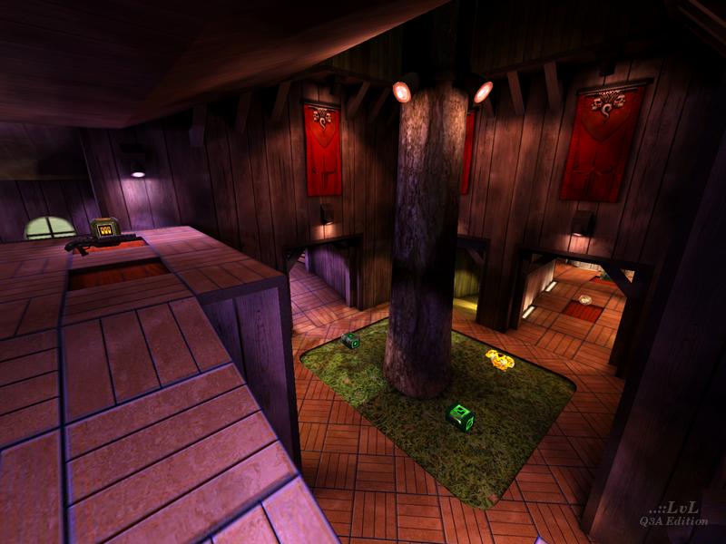
Added 24 Oct, 2008
Comments
Add a comment
**Preview only**
Be sure to submit your comment
Be sure to submit your comment
Submitting comment...
Thanks Tig! I really appreciate your help! Greetings from Puerto Rico!
Edited: 10 May 2012 AEST
Edited: 10 May 2012 AEST
Agree (0) or Disagree (0)
Hi i tried to play that map using \devmap weird_wood and it didn't work! what is the REAL name of the map? please help!
Agree (0) or Disagree (0)
I didnt like it. But, aside of reviewer's opniom, i liked that spiral stairs very much, because of the rythm sound they do
Agree (0) or Disagree (0)
I really wondered all the time why you see z-Fighting at the rails. When I read your comment I checked my *.map file and couldn't find any problems, neither there, nor in the map itself. You wrote, you can see it by setting the color depth down to 16Bit. I tried, but it didn't show up. Then I finally got it. I've set the geometric detail down to medium or low (I always play on high details, so I didn't think about it) and voilà, it appeared! It's caused by the reduced geometric detail of the simple patch mesh below the trails, which "cuts" them because there are less subdivisions in the mesh than in high detail mode.
Damn, I really have to make a second version of this map and correct some stuff :D The stairs have to be reworked, leaves on the tree would be fine too, some accessible terrain outside and the z-Fighting issue...
By the way - what do you think about the gameplay? Are the items placed in an acceptable way? Otherwise I will put them somewhere else or replace them.
Agree (1) or Disagree (0)
The only way to see the z-fighting is to change your color mode to 16 bit, in 32 bit you won't see it. I do all my reviews in 16 bit for that reason, then switch to 32 bit when taking screen shots as they make the map look best.
Agree (0) or Disagree (0)
The area of the map where there are two railroad tracks side by side leading nowhere. There is a very cool pile of wooden rubble lying between. The right rails of both tracks are Z-fights.
BTW- this map has a very cool theme idea, and I'de like to see more maps like it. The map has a lot of potential but it could use some improvements.
First of all, it seems like it has lots of potential secret areas which would be very cool, but u cant actually get to any of them; like the dark murky pit blocked off by planks and the high atrium-ish area over the center room. There are others too. Secret areas are awesome and they give the player something to look for.
Secondly (this one relates more to actual game play): the map is themed so similarly throughout, that you forget where you are. I can't speak for everybody, but I like maps that I can learn. Think of landmarks- maybe areas that look significantly different (and not just by color). Another idea(and I mention this one cause you actually almost did it): have and outside area thats borders one entire side of the map with many windows (or doors, depending on whether or not it will be reachable) to it. Then, suddenly, the map would feel like a wooden base with a front and a back, and I would be able to keep my orientation much better. Your outdoor area looked cool, but it was only visable through one tiny window. It almost seems like you could have not more out of the effort.
Agree (0) or Disagree (0)
Yay, thanks for the review =) What you said about the stairs is correct, unfortunately I wasn't able to solve this problem without changing the architecture, so I decided to keep it as it was. But please tell me where you found some z-Fighing so I can fix this - it seems I hid it so well I can't even find it :D
Greetings from good ol' Germany =)
Agree (1) or Disagree (0)
