
I've played this map from when it was released, nowadays I load it up to see the bots muck about. Pity though, that you can beat them so easily. It envolves a gl and quad. Cheap, I know, but it's tempting.
That's why I'm glad there are two Rl included!
Good map for gory screenshots, btw.

Shame bots don't go for the quad but ah well =-p =)
Ikka is my favourite level designer!
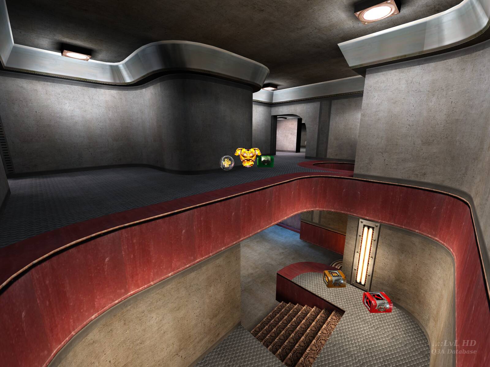
I think this is one of the most fun maps for 1 on 1. The textures on the map may seem a bit bland but the curves really give it a polished look. This is one map you gotta have!
I find it odd that people think this is a "gameplay only" map with no looks. I intentionally went for a clean, slick, 30's functionalism kind of style and theme, with all smooth polished surfaces, curves seamlessly connecting to straight walls etc... And I think I was successful; I like the way it turned out, looks-wise as well as gameplay-wise. It's a definite departure from the "regular" Q3A style, though... So I guess it may be hard to consume to some people.
As I look back, there's only a few things I would change... Mainly the lighting; it was rushed. I probably should've used the "damaged" version of the concrete in a couple of more spots as well, just to break the repetition a little. But I would never try to dress up a map like this in "gothic" textures. This is steel-and-concrete architecture, and that means steel-and-concrete textures. It doesn't get much simpler than that.
Oh BTW, I don't have Half-Life. =)
Saweet!
Great map
You obviously like your maps to be stylish as well as play well. That's fine, I've got no problem with that. What I was initially annoyed about in your post was the fact that you said that people ignored the style which looking at a map should 'do their homework'. As I said in my previous post, it's completely up to the individual, no one else, as to what they value more.
www.redchurch.com/levels/zdim1.shtml
I think its important to remember that diluting everything and turning everything down so you can play ULTRA-SUPER-GODLIKE-fast isn't always so important. Sometimes function AND style make a great map, not just one or the other (Don't get me started about the cough overrated-but-cool cough Japanese level... hi g1zmo =) You still rock.
The gameplay is fast and cool. I don't think the RG was paticularly appropriate, but it works I suppose. The bots like everything but the quad, which they can never seem to get to. But that doesn't stop humans :) It's cool, and fast, but I think those who said "better than any of the id maps" should do their homework. This map has function, but no style.
Thumbs way up!
Thumbs way up!
Yay for more textures!
But and there is a but after playing it (wich is what maps are made for)i really had fun lots of action and fraggs
job well done
Oh, and yes, I do call it a comment so go ahead, punk, make my day.
Bots never hung around in the same spot like they do in most of ids maps and I found the action was rarely centered in one place, wherever I went I could get frags. The item placement is pretty good, I was never far away from a decent item and never running around with no armour or health (obviously not with no health :)
A really great map overall, I'm glad I d/led it. Oh, and it runs bloody nice on my p200 so I'm well pleased :) (medium detail btw, not visual orgasm detail)
-Than
more mappers should follow keranen's lead. not all quake levels need to be dark and gothic. think different people.
Gonna go an play it now.
Including the id maps that came with the game.
Get it now.
Nice. Small, simple, and elegant. Very good playability as well, a facter frequently overlooked in the design of Q3 maps.
THE Q2 FEEL OF THE MAP LOOKS GREAT WITH THE CURVES..
PS ||||||||||||||||||||||||||...
[but..um..where are ambient sounds?]
Fast Gameplay
Good Design
What are you waiting for? Go and Get It NoW!!!!
XOXO
Great job!
Happy fragging!
Ted
I am soo happy that someone finally decided to get away from the "Gothic Look" that everyone is using. This map reminds me of a certain Rocket Arena 2 map that was a castle in the Medieval Times. Sure it was out of place but it was one of the best maps I have every played. Same thing goes for this one.
The map is the best one yet for Q3, and reminds me off good old Quake. The bots seem to play well on it, Its my stlye of play too. This map is a MUST!
But best of all its different, I have to say I am not too fond of the "Goth" look of Q3A, this just makes me wet myself with joy :)
DOWNLOAD IT NOW!
A FOR EFFORT!
The download size should be about 300k, not 450k like the first version. This is the best way to tell which version it is. (The newer version has a more compact optimized .aas file so it's smaller)
I think it's the textures and as the others also said, it's a bit to cramped when first you've gotten used to the verticalness of ID's Q3 maps.
But I'm looking forward to your new batch of textures, if they're as good as you're previous they'll rock my world :)
Quake on!!
Surprisingly enough this map is GREAT fun, I mean this one is actually worth playing, even against the bots (making it eons better than most q3 maps so far). When I first looked at it, I assumed it was going to feel too cramped, but no, it's "just right". The small size makes for a fast paced game, rather than the normally comatose q3 play.
BTW, I'm currently working on some textures, similar to my old ikbase stuff... So my maps might get a little more dirty and grungy in the future. I just can't stand the "gothic" Q3A textures... Too garish, oversaturated and busy. I prefer "out of place" over that :>
DOWNLOAD IT NOW!
Cons: bland, needs caulking.
Loading...
Search for a map.
Results will appear here.
