Be sure to submit your comment
The map appears in the Tourney section of the Skirmish menu. That is how the author...
I had gone through the Tournament section too, but ironically enough, I think I missed it everywhere, even though it always appeared there 🤦♂️ My fault, I suppose I just ignored the levelshot among the others. As a second possibility, I could've had some of the three versions (vanilla Q3, Spearmint and OA) undergoing the circumstances of being "soiled" with some other custom maps.
I can see it appearing in all the three versions now, thanks for pointing this out!
P. P. S. It's somewhat upsetting that this map does not appear in the map menu
The map appears in the Tourney section of the Skirmish menu. That is how the author wanted this map played. Does support small sized DM matches perfectly, you just have to load it manually.
The gameplay on this map is just genius! The author juggles the line of sight like sometimes the sun juggles chiaroscuro when you're on a route and are going by an international bus 😂 This is what pushes the player to keep an eye on the environment around them, control the speed they're moving with and remember the timing of the valuable items (MH, RA).
When it comes to the layout, this map has a really great, almost legendary interconnectivity, which is achieved thanks to the wise placement and joinment of all of the numerous staircases, teleporters, and the fact that the map consists of up to 8️⃣ (!) floors, which the number of varies many times in different parts of the level. In addition, you can often find yourself in a situation when you're able to see two or three floors at the same time, but so does your enemy, so there's a need to keep that in mind as well ;) This is allowed due to the combination of the fact that the staircases are narrow enough to not take too much place and the skill that Sumatra used to make this map not lacking the number of floors by any means. Such outstanding verticality characteristics are also achieved thanks to the fact that all the stairs are kind of "built in the air" because they switch with the floors that are represented by platforms, at that both the floors and staircases have an about optimal length and width for this feeling to come. It's especially impressive if we consider that the situation when two or three staircases lead to the same floor is common. The abundance of ledges and both-side-opened windows let elaborate things even further and somehow add even more interconnectivity to the map!
The number of opportunities regarding movement, as well as the potential speed on PUKKA3TOURNEY4 is pushed even further by the proper distribution of arsenal. Different weapons can be found all around the map, both vertically and horizontally, the same goes for the correspondent ammunition items to them, at that the weapons and ammo are mixed up and spread around very well. The level doesn't lack health or armour either, and has both the MH and RA. The two valuable items are placed in a very ingenious, maybe even innovative way: in regular Q3 the Red Armour is to be reached on higher levels by dint of a rocket jump, and the MegaHealth (as well as the Railgun) can be found on the ground floor in a tricky pit. While the RA requires some skill to get it, the MH needs you to watch out for enemies around; both items are to be picked up quickly. They are both really well timed, too. In the case of MH and RG, the water in the pit will serve as an additional challenge to make things even more interesting.
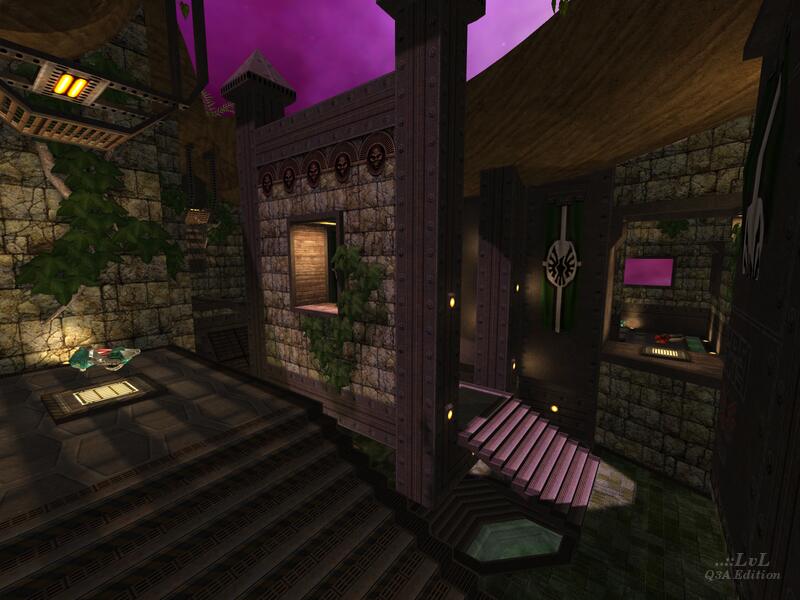
However, despite the map having an absolutely brilliant and top-notch gameplay, it has something even more to offer, which is its visual side. The theme reminds me of a strogg base, similar to those in Q2, becuase of the strogg flags and strogg logos. On the other hand, it also harmonizes in shades of brown and has its textures stoned and wooden, which is something that makes me think the level resembles Q1. The teleporters look like slipgates from the original Quake, too. Could it be that those demons that still follow Shub-Niggurath collaborated with stroggs to build a base in space? Who knows ;) Speaking of space, the dynamic cosmic skybox looks 100% resplendent, kudos to Cardigan for making this! The foliage is properly executed and is volumetric, and the cherry on the cake to make this level look fascinating is the cozy realistic lighting that brings this truly magical atmosphere and adds something new to your knowledge about talent! The spooky ambient doesn't feel out of place either and is, excuse my language, quakeoneish C:
All these factors is something that makes PUKKA3TOURNEY4 a great professional duel map, and it is one of those levels that you would like to see a remake of in Quake Champions! Chapeau, Thefury!
P. S. @v1l3 This review is just genious, it must be one of the most, if not the most creative reviews I've seen on ..::LvL so far! @Tig excellent choice of map to feature, it really deserves it!
P. P. S. It's somewhat upsetting that this map does not appear in the map menu, given it was a promotional level. I tested it in Open Arena, and it doesn't appear in the map menu there either, but other than that it plays and looks just as gorgeously as it does in Q3. In Q3 this is one of those levels that give me harder times even with Anarki 😅
7/10
Great job..
I still haven't downloaded the map, but I'll check it out soon... and I'll post my comments. For what I can see in the screenshots, I will like it.
i miss the skinz and idea of q3a at q4a
i havent anything against gay-people, but q4a and the skinz are silly and all that shit from doom3 to q4 look really gay at all ...
if i imagine how q3a can look with the new game-engine im nearly starting to cry about ,o)
an old q3a-excessive gamer
5ouL
nice...
10*
It's such a great level except I wish it could be played in NON-TOURNEY mode. It could happily support 3 players.
Should probably take the DM tag off the title.
Edited: 28.Mar.2006 10:42 UTC
Thanks for the review...
Just for your information:
This map is included in the Generations Arena, a modification combining Q1, Q2, Q3 and Doom gameplayfeatures, it's really fun!
You can d/l it here -> www.wireheadstudios.org/generations/
