Added 24 Mar, 2006
Comments
Add a comment
**Preview only**
Be sure to submit your comment
Be sure to submit your comment
Submitting comment...
This was my last map I ever made JADscratch and I put in a few tricks and stuff in from what I had managed to learn.My eyes are my enemy now as I get older so I knew this was my last attempt.I love to cruise this map when I'm in the mood for q3 and it is great to hear it has brought a few of you some fun after all this time.Thanks for your comments and a big up to you. I am gonna go have a play on it now to explore again as it has been ages.Have fun and ty for playing the old beast!
Agree (2) or Disagree (0)
At first, I didn't think this map was going to be of good quality, both of texture and build. After going thorugh it by myself, I was FLOORED at how difficult yet hilarious the map really is. The many tricks and treats littered throughout the map made me giggle a little, which I rarely do with these kinds of big maps. Plus, I had a blast getting that BFG, mostly cause you had to use your brain to get the right powerups and items to get to it. Love the sounds, love the structures, and most of all, I goddamn ADORE the gameplay. ROODOG, gimme a fistbump! <insert fistbump here> This map is dope!
Agree (4) or Disagree (0)
Why does everybody (including me lol) use the el_jumppad model from Tech Edge?
Agree (0) or Disagree (0)
There's too many maps with the common.shader to bother, because the fact is, most servers nowadays seem to only run UT4 maps and others. I'll just delete them out of the pk3's and use them offline.
-Ben
Agree (0) or Disagree (0)
Modifying a pk3 creates an incompatible version of the map. You can play offline (singleplayer), but you can't connect to servers running this map.
I think there's a kind of pk3 checksum that quake compares to prevent pak-cheating.
I think there's a kind of pk3 checksum that quake compares to prevent pak-cheating.
Do not modify and distribute pk3's without the authors permission!
I think, the best solution is, get in touch with the author. He should make a new "fixed" version with a diffrent pk3-name, because of his own fault.
Agree (0) or Disagree (0)
So if I delete common.shader out of the .pk3's, will that fix the problem, or break those maps?
-Ben
Agree (0) or Disagree (0)
I think it's the "common.shader" that should not be within the pk3s. Automatic pk3 genrator tools often make those mistakes.
To find bad maps search your quake folder for: "*.pk3" containing text: "common.shader"
To find bad maps search your quake folder for: "*.pk3" containing text: "common.shader"
Agree (1) or Disagree (0)
You were right. I found TWO maps which cause the gates to malfunction. The pk3 names are: q3map-moses_dm6 and storm3tourney6.
-Ben
Agree (1) or Disagree (0)
Try removing all the custom maps you've downloaded and check the intro level again. If it works, that means one of the pk3s in your baseq3 has a broken shader which is messing up the portal shader in all these maps (not the actual camera functionality). That's the only thing I can think of, let me know if it works.
-pat
Agree (1) or Disagree (0)
I checked the introduction map. The gate is messed up there, too. Anyone know what could cause such an occurance?
-Ben
Agree (0) or Disagree (0)
Truly odd. I saw this on another map, but I assumed it was intentional (using a gate, but you can't see where you're going). I'll have to check the two stock maps that use gates. :(
-Ben
Agree (0) or Disagree (0)
@Ben: I just loaded up this map and I'm not seeing any issues with the teleport windows (I assume that is what you mean by cameras). I did notice an issue with the leaves on the trees, but that was the only visual defect I could find.
Agree (1) or Disagree (0)
I have a problem, where you are supposed to be able to see through cameras, I get what looks like a "missing texture" instead. Is there some mod you have to have to see through cameras?
Thanks!
-Ben
Agree (0) or Disagree (0)
Thanx fKd great to hear from the talent that brought us the beautiful Sublevel 27. You got some talent that's for sure. You know I knew i was not in the same class as people like Sock(Twisted Palace of Hate) or Yourself for that matter but in fact I am blown away that i ever figured out how to map at all. The first time I installed radiant to have a look it just looked so complex to me and as I had never made a map for any game at all it was for me like looking at rocket science.I got scared off and closed radiant and went and had a frag instead.Eventually I decided to have another look and just started drawing lines and making blocks and shit.Then it happend it was like hey this is fun I wonder if i could make a box with a spawn and stand in a room i made lol. So that was how it started and I began making maps so my friends and me could have a few laughs.One of my early maps that I never posted here is called Waterworldv3 and if you grab some m8's or load up some bots it is fast and different and you can call it a box style map but it is so much more than a boring box. Grab it here if you want a look www.quakeunity.com/file=1954 Thanx for the feedback Mikko and I thought the lighting was ok the way i lit the level but i guess a few well placed light entities may have been an improvement.Hope you had a little bit of fun just the same. If i can find my map files and the time and inspiration then maybe i'll dust off radiant again :)
Agree (1) or Disagree (0)
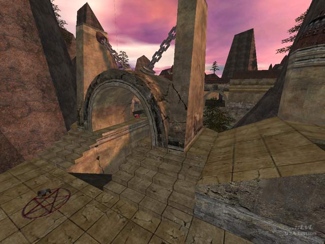
I found the overall look of the level quite good, especially the light brown concrete and rock textures against the pink sky. I also had some fun with all those traps and teleports helped smooth things out a bit. But what's with the lack of proper lighting? Especially the underground hallways looked quite bad without lighting.
5.5/10
Agree (0) or Disagree (0)
too bad you are not mapping anymore :( good luck on ya future endeavors mate
Agree (1) or Disagree (0)
Well it just shows you can't please everyone and negative feedback is fine as if you don't like something then you got to get it out as holding all the hate inside is not good for your health.I appreciate all feedback but i won't be updating or changing a thing as for me it wasn't a bad effort as i learned much about radiant but went as far as I could and gave it my best.I don't have time to map anymore and I am sure some of you are delighted.Well I am off to fight some of the undead in killing floor so take care
Agree (0) or Disagree (0)
"It is nice to see good maps being made. Did someone say other games are coming out? Oh there are? Oh... Bah!
Great map! "
lololololololol :)
Agree (0) or Disagree (0)
wow i dont think i'de ever be that harsh on any map the compiles
Agree (0) or Disagree (0)
Awful just awful, no sense of scale, texture use is pathetic, lighting blows hard and yuck, the decoration placement.
Not even fun for a second, like the messed up visions of a person high on drugs.
Not even fun for a second, like the messed up visions of a person high on drugs.
Agree (0) or Disagree (1)
Thanks so much for your input Hooyaah.As it turns out this was the last map I ever completed and it's times like this i think wouldn't it be fun to make another one.Great to hear that the many countless hours I put into this map has given a fellow fragger a bit of fun.I enjoyed bringing this world to life and as it's been awhile I am off to have a frag there now :)
Agree (1) or Disagree (0)
This map is one of those truly great offerings that DM fans will not want to pass up. Whether you revel in maps that allow for a large number of players, or you enjoy a hunt-and-frag extravaganza, where as few as two (or a few) opponents can show off their cunning, skill, and stealth as they flabbergast one another, this map is a real gem. There is so much that this map has in which one may relish. Such as: the pervasive sense that one is truly a part of the environ in which one has been placed. (A.K.A. suspension of disbelief) This realm has been fabricated with so much care and attention to detail, we who play inside it, find that we are relentlessly compelled to discover its many secrets. There is so much eye candy to take in. Diverse areas cause us
to draw appropriate weapons and employ them in the areas to which they are best suited which makes for an alluring variety our in game-play.
The file size may have been an issue in the past, but newer systems should have no difficulties or remarkable issues.
My recommendation is to download and frag on brothers and sisters.
Edited: 25 Apr 2009 AEST
Agree (1) or Disagree (0)
Thanks for the review v1|3. I am pleased you enjoyed your stroll through Tribal and your comments on the map are most appreciated. Thanks m8! Just to let others know that the valley will sound a bit quiet on your own but load it up with bots or humans and the birds will be stirred from their slumber and Tribal will come to life. Have fun and see ya on the Australian servers where i frag as ROODOG.
Agree (0) or Disagree (0)
