Added 11 Sep, 2003
Comments
Add a comment
**Preview only**
Be sure to submit your comment
Be sure to submit your comment
Submitting comment...
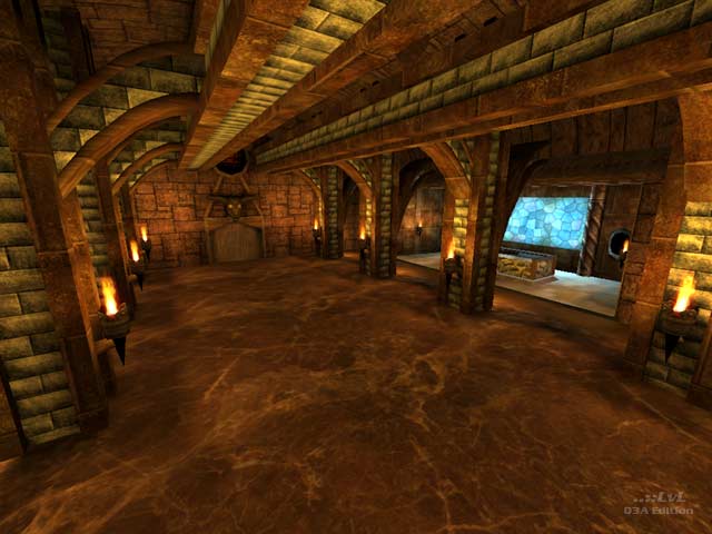
while this level is way too flat for Q3 deathmatch, it does show a lot of potential as a single player mission /puzzle. I think the author would have been better off taking it in this direction.
Agree (2) or Disagree (0)
Ahh takes me back to me UT99 days. The layout remind me of the classic UT99 map, DM - Neptune By Chris ''AlfonsoX'' Collins. I found missing floor textures around the map which did quite annoy because I thought the map would be perfect. Then it just got worse when I walked into a room where it was raining and the skybox wasn't programmed properly making it all fuzzy that got me a bit more annoyed. The item placement was just horrible, seeing rocket ammo just chucked everywhere isn't quite accurate is it..?! Sorry about this but it's a 3/10
Edited: 29 Jul 2012 AEST
Edited: 29 Jul 2012 AEST
Agree (0) or Disagree (0)
Wicked cool. A Strong ambient theme is present, but problems are present. I forget most of the map but I should download it again to remedy that...
Edited 1146.71 days after the original posting.
Edited 1146.71 days after the original posting.
Agree (0) or Disagree (0)
A solid map with ambitious layout. Attractive overall. Despite being one of Chaos' fans, I have to say he's dead wrong on his analysis of Reaper's baby.
Agree (0) or Disagree (0)
Messy. Yeah, that's it! Messy! Messy would've been more appropriate for this overbloated piece of horrific mess of interior design. But we'll give him an 8 for technical for trying to pull this off. Now, what's with the locked doors? Is there an elephant sitting against it on the other side? This is like a mansion waiting for major renovation.
Dear mapper,
Go to interior design college, come back in 3 years and remap. And as Stone Cold Steve Austin would say, "that's the bottom line!"
Wait, I just read the review...uh...7 months? 7 months you say? What the?! More than half a year and Liberace came up with this?! Bloody hell?! Don't quit your day job! 7 (bleeping) months!? I can't believe it! 7 months?! Oops, did I say that 7 times?
Agree (0) or Disagree (0)
Well, I did say this map looks like it's at Beta stage, meaning it still needs a lot of work, but I thought the layout was reasonable, if not exactly exciting.
My comments about the numerous errors stands, though.
Agree (0) or Disagree (0)
i must sadly disagree with Foebane. the layout is a disaster, and was hopefully put together more as a reconstruction of a castle than a serious attempt at creating a gameplay-worthy environment, because the scale and room sizes are horribly, horribly off for a q3 map.
the lighting is ugly, the architecture is repetitive and uninspired, there are countless little errors, and the whole map adds up to one big mess that has just been removed from my hard drive.
Agree (0) or Disagree (0)
