Beasty Twist
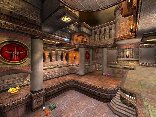
Beasty Twist by Obsessed
Comments
Add a comment
avatar
**Preview only**
Be sure to submit your comment
Formatting help
Submit
Preview
Cancel
Submitting comment...
avatar
Obsessed Rep. 689
#5   13 Jun 2018
damn! this is the best level I've ever seen! ;D
Agree (1) or Disagree (0)
Obsessed (author) unregistered
#4   10 Sep 2003
Hmm.. Guys, I wanted to tell that a)In Q2 this level was really one of the first attempts of mapping and b)First things, that I thought about were fps & gameplay. So that's why I left these crates initial - as they were in Q2 :) Anyhow, now I know, what you all want, and will try to make a comromise between your looks at design and my aspiration for making very simple, battle levels. Thank you very much! This was the first level I could put into Internet. If I'll have some free time, I'll fix these "bugs", and give you a final version. But I consider non-squishing elevator to be real bug. And "the face", of course. :) Mail me, if you want to, but it would be nesessary for you to write the theme of the letter - something like "Hello Obsessed, seen your level". Or I could delete your message. %)
Agree (0) or Disagree (0)
Octovus unregistered
#3   18 Aug 2003
Neat! I love the quad gimmick, sure it's a gimmick but it's cool. Bots do quite well in a 3 player FFA. All the areas are used, though the RL hallway is busy. There is vertical as well as horizontal play; the main MH room with the (AWFULLY UGLY) crates reminds me fo q3dm7's main RL room (the open gray one, not that one with a walkway and personal teleporter) in the sense that it is a neat open room to fight in. Being forced to either tele or RJ to the MH was a bit annoying.

And, of course, the textures are quite ugly, large garish ones that you can try to ignore and those awful crates that you can't, plus a missing texture on a large face in the main room. If you stay under the elevator, it won't squish you but just jam up (however you can get out and it starts working again). Um, hard to decide on a score...meh...8/10

-Octovus

Agree (0) or Disagree (0)
not entered unregistered
#2   16 Aug 2003
Very nice map! The effort the author has put into this map shows very well. I feel there are some things he has to work on, however I do believe he has more than potential to become a excellent mapper. If he can focus on getting a more cohesive theme going(less is more), instead of trying to shock people with his raw creativity, achieve more subtle lighting(learning how to use darkness to make your strong areas stand out), and work on technical aspects(r_speeds hit 16,000 in one corner where there was way more being drawn than could be seen, r_lockpvs 1 is your friend), then he could certainly be a mapper to keep an eye on.
Agree (0) or Disagree (0)
Kell unregistered
#1   16 Aug 2003
Fascinating layout - very dense with lots of different features.

The use of the gothic wad is near-psychotic in its embelishment, as though the author vowed to use every last texture in the wad...but I kinda like it. The industrial elements look hideously out of place though - the crates especially, I would have liked to have seen wooden crates there instead.

The elevator is an odd feature; I guess it works, though I personally don't like complex moving parts in a DM map.

My biggest criticism is the lighting: garish and overbright, I had to drop the gamma to protect my retinas :P

Still an interesting tourney to play, dl and give it a whirl.
Agree (0) or Disagree (0)
Clear