LDAQ3A06DM
LDAQ3A06DM by Lee David Ash
Comments
Add a comment
avatar
**Preview only**
Be sure to submit your comment
Formatting help
Submit
Preview
Cancel
Submitting comment...
avatar
gooball Rep. 1161
#6   27 Jun 2019
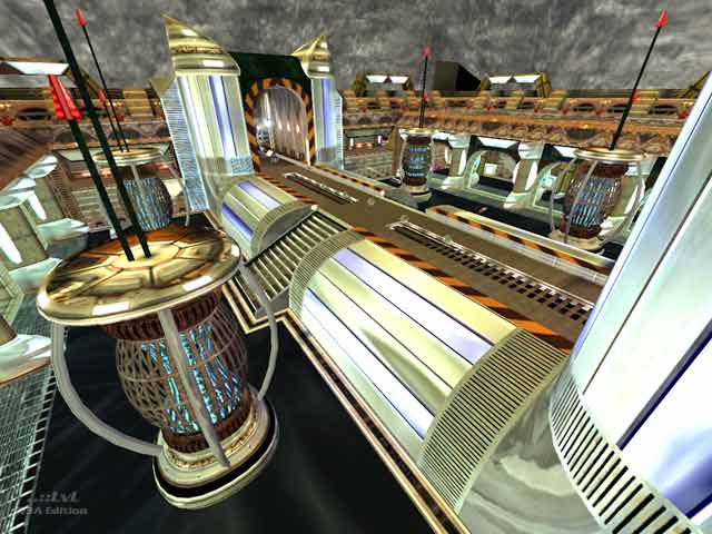
Really good map, though the lighting is a bit too washed out for my taste. I liked the somewhat unconventional use of vanilla Q3 textures, and the bots played well.
Agree (1) or Disagree (0)
avatar
Szaman Rep. 138
#5   02 Jul 2015
Brilliant map! all weapons, BFG not hidden,"but hard to reach place", plenty of ammo. Great environment. One of the best sf-fiction theme map:)
Agree (3) or Disagree (0)
avatar
FragTastic Rep. 2459
#4   06 Feb 2012
I got to say, Your maps are very large and have huge amount of space. Textures look futuristic which is fine by me. I haven't tested but i will as soon as possible :).
Agree (0) or Disagree (0)
avatar
AEon Rep. 810
#3   25 Aug 2009
Looks likes the author tried to cram the ideas and styles of several maps into one map to get it all in there. The ideas are quiet creative and in several areas beautiful, but placing all this in one map is quite a visual assault. Plus the "shader overkill" seems to be bringing down the FPS significantly, reducing the "fun"-factor significantly, IMO.
Agree (0) or Disagree (0)
Madan unregistered
#2   22 Nov 2002
A fantastic map.

Obviously, we could rehash the same old design paradigms:

"crampt", "gothic", "hyperconnected", "grounded"

But this map doesn't fit any of those conceptions.

It's open, bright and almost nauseatingly...strange. The strangeness is derived from a carefully controlled explosion of techno dreamscapes that is obviously more frightening than most of the hackneyed gothics we see out there.

The amount of polished metal textures, combined with rusted highlights and yellowed forms yields a great aesthetic that you simply won't find anywhere.

It's VERY original and that's why I give it such a good score. It shows ingenuity and a desire to break convention.

The brushwork, which is both voluminous and spectacularly detailed, should have been lauded by the reviewer but probably wasn't because the map didn't fall into the category I listed above. Additionally, the map is quite large.

A strange dreamscape is Ash's last map submission and, personally, I don't think it gets much better.

The only problems are a slight bit of sloppiness on some of the seams on texturing and one missing texture within the open atrium. Other than that, the weapon placement and connectivity are excellent.

Great job. If he can somehow find and add the missing texture, this map is a keeper, if only for it's new aesthetic and wild experimentation.

Mad.

Agree (0) or Disagree (0)
Banal Terror unregistered
#1   16 Nov 2002
I'm a huge fan of LDA's custom weapons, but I found this map overwhelmingly stale. The use of textures is garish and often seems nearly random and without reason. Architecture is uninspired. Game play seems ok but with so many maps available that both play well and look beautiful, this map falls short. Avoid it unless you have extra hard drives to fill.

Agree (0) or Disagree (0)
Clear