
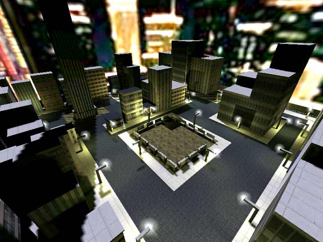


BUt it's one of the early maps so =)
Lots of weapons and ammo, my kind of mayhem. Railgunners tend to take advantage of the tower, but hey that's life.
The streetlights and benchs were deliberatly blocky and made of brushes.. I have map models for both, but chose to make them simply for game speed reasons. This is a very fast map, and may not appeal to everyone.
This is not the worst map in exisitance. According to Tig, my other map is worse, but at least that has real gameplay.
It has now become very obvious that this really is a love/hate map, but obviously a few more people love it than hate it.
Ignore the problems, as they don't affect gameplay, and you actually have not a bad map.
It's a very typical "first" map which looks like crap and has no gaemplay other than being a box with some other boxes (roughly buildings) in it, and some very awkward and blocky-looking structures such as benches and lightposts. There have been dozens and dozens of virtually identical city maps (such as the fragtown series), usually none of which are any good, and this one is no better than the rest. Not particularly imaginative, not particularly well make, not particularly attractive, particularly fun to play, poor item placement, etc. There's really not much to say, other than that it deserves about a 4 rating, not nearly an 8 (you can tell someone with an interest in seeing the map do well has a dynamic IP address and gives it regular "10s"...)
Now, that is what I am looking for :)
Actually, that Bottom ten list is not a bad idea. We all like to see the best maps, but I think it would be funny to see the most shite maps ever made that people dare to send to lvl.
(I mean, sorry Bauul, but it almost belongs more on the BOTTOM 10 list.)
I mean, kudos to bauul for doing the work to make it in the first place, and I realize it's a first effort and everyone's got to start somewhere (meaning I wouldn't normally say anything out of the way about it, except that it's now showing up on the top 10 list...), but...it isn't really any good at all and doesn't even come close to deserving the score it's getting. So why is its score so high? Do people really have so little taste that they actually LIKED this map???
This map is Great I really loved the layout. Nice textures...all the usualls. Keep up the good work!
2nd point
The lighting is of two types, moonlight (white) and streetlight (orange). Moonlight is white and streetlight is orange (the sodium hydroxide that glows orange when electricity is passed through it)
3rd point
The scaling is perfect. I find nothing wrong with this.
This map looses 2 points for not showing up on the menu, 1 point for horrible lighting. 1 point for poor scale. 6 from me
Happy Fraggin! Octovus
Tge areas of the map that are very dark have little or nothing in of value, but I LOVE that bit with the medi-kit, in the beam of moonlight. That was cool.
PS:
Has anyone found the flight artifact? There is on in there, and so far, no-one has told me about it, not even Tigger-On.
I wish more maps of this theme were put out b/c this one and SiNCity are currently the preferred practice maps of my roomates and I. I can only complain in one area of this map. Some parts are just too dark and it is frustrating seeing an area that you just can't squeeze through =(. Overall though, I give this an 8 of 10.
<whinge>What's the bloody point in releasing a map when you KNOW it's buggy. And why the hell do people insist on releasing their "first map" all the time. Take some time and get some skills and release something that's WORTH downloading.</whinge>
I have previewed about half of the current queue and a lot have technical bugs / flaws that bring down the maps potential. Put it in the Beta section and find out what your friends wouldn't tell you about the map.
Loading...
Search for a map.
Results will appear here.
