**Preview only**
Be sure to submit your comment
I agree mostly with what's been said here in the comments and review. It's an unusual and creatively built map, very different from the usual fare.
Unfortunately navigating the map can be a real chore, and when you have the fight the map as well as your opponent, at least I find that frustrating and disappointing.
A decent map; one that you'll probably give a handful of rounds to and maybe revisit from time to time, but won't be a regular in your rotation.
Agree (1) or Disagree (0)
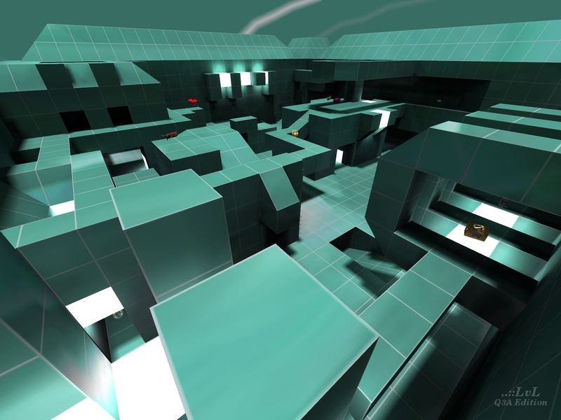
What a positive surprise! I must confess the original screenshot put me off in the first place, but I gave it a go and it's actually very fun! It is clearly not optimised for competitive games. Moving around some places is cumbersome, like the regen room. It is evidently no strafing friendly. With some minor tweaks it could have been a totally brutal map! Still, as it is it's very enjoyable. I'm keeping it for duels with humans! (I play sometimes).
Edited 32 seconds after the original posting.
Agree (0) or Disagree (0)
@raspatan it's surprisingly not, at least not for me, although many have commented on the looks. although i include aesthetics in my overall scoring, i generally don't care what a map looks like if it is fun to play on.
@Tig thanks for updating the screenshot. the previous one was really ugly
Edited 9 minutes after the original posting.
Agree (1) or Disagree (0)
@HS Looks dizzying!
Agree (0) or Disagree (0)
while a fairly simple level in terms of construction and detailing, the item placement works really well. even the regen doesn't seem all that out of place; certainly for death match but also for duel. Due to the frame-based jumps I've included cpm in the game type as the routes available only enhance the game play, making for extremely fast paced and strategic matches
Agree (2) or Disagree (0)
This map gives me a "Training Simulator" vibe. the fact that MATADOR used this texture tells me that he (or she) probably wanted the players to focus more on the shooting and less on the scenery.
Agree (1) or Disagree (0)

Zod Rep. 202
#9 11 Nov 2013
Os recomiendo este mapa si queréis acabar con epilepsia ^^
_ _ _
Looks pretty puzzle :P
Agree (0) or Disagree (0)
Looks like a disco themed map :P.
Agree (0) or Disagree (0)
This reminds me a bit of Isoball.
Agree (0) or Disagree (0)
Tron Style... XD
Remembers me something ^^
Agree (0) or Disagree (0)
nbendezu1@yahoo.com
unregistered
#5 19 Mar 2002
pure imaginary, you aughtta be ashamed of the uninspired review you wrote... (or else the map was since updated and i take it all back)... this is actually a highly original level both because it uses a large monotonous tile to surprising effect, and because it has such an interesting, tight and geometrical playfield... Q3A badly needs more original and playable ideas like this!!
Agree (0) or Disagree (0)
Octovus
unregistered
#4 24 Feb 2002
Yes, those white dots were not present in my game, much to my (happy) surprise. Silly q3 eh?
Agree (0) or Disagree (0)
MATADOR
unregistered
#3 24 Feb 2002
!!!I HOPE THE MAP DOES NOT LOOK LIKE THE SCREENSHOT!!!!!
... all the white balls on the seem to be in the alpha-channel of the texture but never showed off on my PC !?! I regret it for myself and the people who had this bug to play with... but i guess it's one of the errors you'll NEVER repeate
as i said... i have this error from time to time but since it i couldn't find out that it was the alphachannel before release , i can just pray you don't have it at your game...
-thanks for reviewing and
-thanks for comments :)
Agree (0) or Disagree (0)
Octovus
unregistered
#2 23 Feb 2002
Agreed Blade. The gameplay is quite cool and the concept is just neat :-) However, after playing a fast and furious game I started feeling like I was in a gigantic bathroom...oh well. For a first offering it's amazing, so I'm going to go whack and score it a 10...like I have any credibility left anyways :-p
-Octovus
Agree (0) or Disagree (0)
Blade Plazma
unregistered
#1 22 Feb 2002
See, this is the kind of level I want to see put into more detail. I love the whole "Matrix Arena" sort of feeling, but the size of each "digital" tile in the texture used is too big. This level would be perfect if the tile size for the texture had been shrunk to maybe half it's size. I don't like it when the tile's are bigger than me, and although making the tiles smaller will rack up the frame rate, it will make this map perfect.
Agree (0) or Disagree (0)

