Drift Away
Drift Away by wviperw
Comments
Add a comment
avatar
**Preview only**
Be sure to submit your comment
Formatting help
Submit
Preview
Cancel
Submitting comment...
avatar
HelterSkeleton Rep. 6751
#9   22 Jun 2020
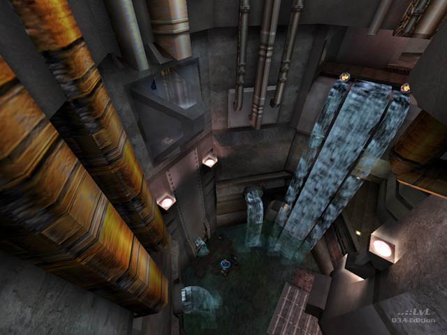
Complicated and eclectic geometry that while amazing from an aesthetic and design standpoint makes for disorientating gameplay, with snags and pitfalls it becomes often difficult to track opponents and sustain melee combat. Combine this with low ceilings and cramped corridors movement is more irksome than satisfying. There are enough platforms to qualify this level for inclusion in cpm based on the author's other offerings. For example one can double jump from the rocks to both the rg and ya. The water features, steam, and other details makes for an atmospheric and well-realised theme. It is worth the download just for the looks alone.
Agree (3) or Disagree (0)
not entered unregistered
#8   08 Apr 2002
I love this map and have used it twice on my server(as yet to find anyone with it but me). It is kind of remniscent of Hidden Fortress, but much much prettier. I thought it played well and moved fine side to side and up and down. Took me awhile to find this map as I tried getting it from Quake3World, but the link is down....this isn't a tourney style map, but it works great with DM.
Agree (0) or Disagree (0)
Octovus unregistered
#7   15 Feb 2002
Nah author's comments are never boring :-) But don't knock yourself so much (you're your own worst critic, eh? Yes, I'm Canadian)! It definitely looks very nice with the water running everywhere and ending in gorgeous falls, terrain meshing with the buildings is certainly one of the prettier parts too (as you mentioned, and it's true in many maps). The indoors aren't "ugly", unless you're setting your sites way too high (i.e. the very very best of custom maps or the ID maps in general, though you might say some IDs r kinda ugly). Certainly working with the dc texture sets is a great idea, one more mappers should use...I have a map rotation cfg of just DC maps.

-Octovus

Agree (0) or Disagree (0)
wviperw unregistered
#6   14 Feb 2002
thanks again for reviewing my map PI!

My personal view on my map:

Started as an idea for a Q2 map. The outside RL/MH area was originally my mimmick of the q2m1 area, and than the inside area was supposed to be small. It was supposed to be a tourney map.

But then I started it for q3, and i added rooms, and added more rooms and more rooms until it was a big complex mess. This method also created some weird areas w/ weird scale (mostly the indoor areas). For some reason though, i didn't really realize the map's scale was off while working on the map. But now I realize that its off in a few areas. But the most annoying thing is all the things that get in the way of movement. For me atleast, it makes the gameplay not very good at all. It was much better in the gameplay alpha I had of the level. I still need to improve on my sense of scale. I think I'm getting closer w/ every new map though.

As far as the looks go--never intended it to be a great looking level, and it isn't really. I originally intended it to be a q3dm11 style map, but then I found the dc_map07 texture set and thought it was cool. But as I went along I kept straying further and further way from the style of dcmap07. Also, the rocks/terrain in there give it a distinct look. I went w/ more of a stylistic approach to the rocks sacrificing "realism" for coolness IMO. And it seems like the best looking parts of the map are the terrain parts that mesh w/ the structures. And its funny--that was the easiest part to make. If you look at the indoor areas, you'll notice they're really quite ugly. Right now i'm really bad at indoor areas and indoor texturing. The outdoor areas are fun to do and come easy though.

(that went a bit long, sorry for boring you all w/ that mindless babble :))

Agree (1) or Disagree (0)
Octovus unregistered
#5   14 Feb 2002
PI, I agree it's fun for TDM because that's supposed to be slower and more strategical, neways in which case this map can work nicely.
Agree (0) or Disagree (0)
nitin unregistered
#4   13 Feb 2002
I know wviperw doesnt agree but IMHO this is the most beautiful q3 map to date. I like the sometimes weird texturing that's clashy and the brushwork is excellent. Pity the gameplay isnt that hot, although I still find it fun in FFA.
Agree (0) or Disagree (0)
Pure Imaginary unregistered
#3   13 Feb 2002
There are some things I didn't notice right away like the fact that a bouncepad leads to a yellow armor. However, if you do learn the layout, the map becomes considerably more playable for the sake of TDM. I tend to be blind to crampiness in maps unless it is more obvious.

It is a very good map, and you still won't hear that from me very often. :)

Agree (1) or Disagree (0)
elendeNATTER! unregistered
#2   13 Feb 2002
yes me again viper ;0)... well I tried this one before it was released here... it's an interesting map to me.. lots of rooms floors jumping possibilities.. lots of talent lots of eyecandy...but if ya ask me.. it's too much stuff too many different places locations.. I found this Map quite CONFUSING. I don't like to learn layouts of maps that are that complex like this.

keep it a just a little smaller ? like hub3tourney1 ?

Agree (0) or Disagree (0)
Octovus unregistered
#1   13 Feb 2002
Hm. It seems PI has gone sideways from his pickiness, or I'm being more picky than normal. But I really didn't like this one too much. It has atmosphere, sure. But the corridors are all so tight that combat becomes annoying quickly. There are ammo boxes and health all over the place, meaning you never really run out. The fast flowing tunnels of water, while interesting, make for horribly one-way combat and the bots just go whacko over them. It functions best in the more open areas, that's for sure. Still, it is worth a download for the atmosphere and the still perfectly passable gameplay :-)

Gets a 7 from me.

-Octovus

Agree (1) or Disagree (0)
Clear