Added 01 Sep, 2001
Comments
Add a comment
**Preview only**
Be sure to submit your comment
Be sure to submit your comment
Submitting comment...
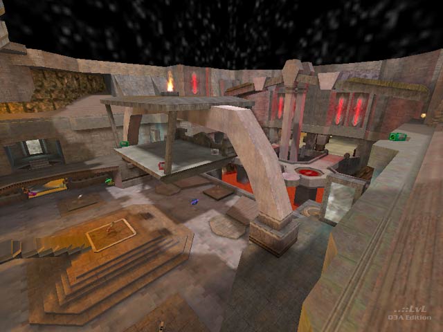
The author says in the comments that he hates this map and I can see why; because it is so asymmetrical, and all but lacks a middle area (a small two-tiered atrium that houses the RA and flag/harvester in TA), as Tetzlaff suggests it would have made a better death match. I agree that this map would have worked fine in this game type, removing the frustration. Forcing it into the TA mould feels a little like trying to put a square peg in a round hole. There are a few things that bug me about this map but it is always a bad idea to have the harvester and white flag spawn over things like lava pools (or death pits). If you are not going to provide a way out or place a trigger that resets the flag straight back to the original location then block the lava off. Either way, none of this saves harvester from all the wasted frags.
Agree (1) or Disagree (0)
well this being my first CTF map I have two more. One of them is The potato and the other is Artemis temple and all 3 are pretty damn off beat..
Agree (0) or Disagree (0)
I know one of the previous versions of that map since quite a time and I always liked it, because it´s one of the very rare non-symmetrical CTFs for Q3. Also there is some very nice architecture and cool details all arround. This final version has some improvements, I like the jump pads and the changings arround the red base. But it still looks like a deathmatch map, for example the stained glass windows in the blue base are red, and in the midfield you don´t know where which team area starts and ends, quite confusing.
Hope to see some more non-symmetric maps in the future!
Agree (0) or Disagree (0)
This map is a revised version of my 3rd map ever made for quake 3. It was a nightmare to work on. it was a nightmare to fix and I still grit my teeth when I look at it.
I hate this level and all of its other versions...
All I can say is im glad its over
Agree (0) or Disagree (0)
