**Preview only**
Be sure to submit your comment
This map had more potential. It's quite simple in its circular style, broken by the teleport. However, item placement is not ideal (here I disagree with HS). Map its basically divided in two areas: one with very strong weapons (RL+RG) + 2 YA + quad vs another one with strong items (RA+MH) and decent weapons. This is highly unbalanced. Map can be easily dominated. Better item balance would have improved things a lot. An alternative approach would have been for the teleport to be one way only. Away from the quad area.
Still, a fun map for a few rounds.
Agree (1) or Disagree (0)
this has a very old school Q3 death match feel. Reminded me quite a bit of Q3DM3 due to the circularity, which made it a bit ordinary for me but fortunately the teleporters break this up a bit. What I liked the most was the item placement. Others have lamented the absence of the GL, and still others criticised the amount of armour. A GL in place of YA off from the tele exit would have fixed all of this and I think would have been a great place for it (to spam the exit to the tele, and lob up to the top of the bounce pad). Other than that, as a traditional deathmatch arena I quite liked it.
Agree (2) or Disagree (0)
This is a good map. If this is the authors first map: two thumbs up.
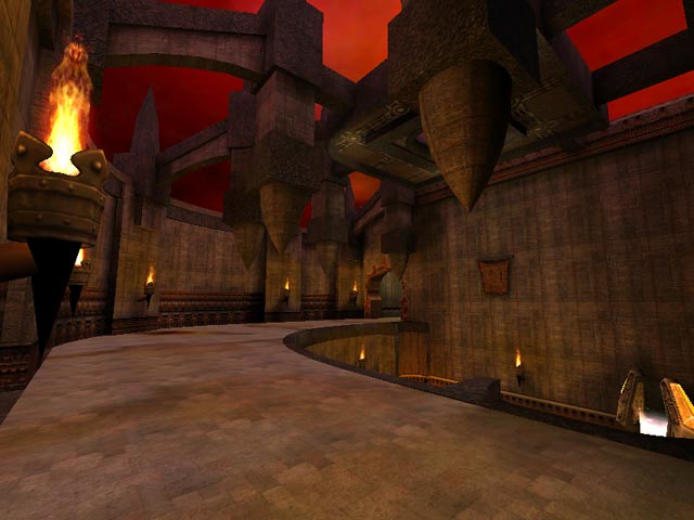
It is well build, good choice of textures well used through out the whole map. Good lighting, nice atmosphere, the fog of death is well done and also 'the mouth' is a nice touch. Bots play the whole map and may even surprise you once in a while. Connectivity is good, you need to watch your step here and there and in this map that is a good thing. I think the only thing this map needs is a bit more vertical action in the main hall (screenshot) Perhaps add a bit more height to the curved walkway and a small platform high above the teleporter. Anyway a very cool level that I will come back to once in a while but eventually it leaves me wanting for a bit more...
Agree (2) or Disagree (0)
Nitebeat
unregistered
#12 29 Jul 2002
Had my share of fun on this one, two years ago =-O
Remember the bots being somewhat "badass" here... or maybe it was just me being too slow ;)
didn't like the quad damage placement though.
Agree (0) or Disagree (0)
Tyre
unregistered
#11 21 Jun 2000
OK, so it's gothic, it's a bit horizontal, and rather much of a ring, but this is a really well-crafted map and I'm going to be keeping it for a while. I miss not having a GL, though.
Agree (0) or Disagree (0)
SiCdeth
unregistered
#10 20 Jun 2000
pretty good, traditional gothic map, (but i aint complaining :])
that spinemove texture is a little big. i like how u can jump through the window. didnt play with bots yet. its a nice small gothic map thats well done... no complaints. (maybe just because i didnt play with the bots yet >:])
it gets a 7
ps. lunarans ldbst map is too bright it hurts my eyes >:
Agree (0) or Disagree (0)
RedFive
unregistered
#9 20 Jun 2000
That's my type of map! Small, twisting, turning, up, down, etc. And yes, the bots have no clue when to r-jump for goodies. Having seen bots r-jump for stuff, i wonder if it isn't the map's .aas file that tells them to r-jump or not, not the bot file itself. So here's an 8 for a very nice map.
Oh, Tig? You are going to post Lunaran's Drink Beer map, right ??? :)
Agree (0) or Disagree (0)
rockN79
unregistered
#8 20 Jun 2000
My comment down there was pretty much bullshit. I was always jumping over to the megahealth, so I assumed you HAD to jump upo there to get it, BUT there are stairs. Oops..
Bots do get the Megahealth on this map. Saw it. If they don't take it, it's not the mappers fault.
Agree (0) or Disagree (0)
Variant
unregistered
#7 19 Jun 2000
I loaded it up with 3 hardcore bots, one of them kept getting the megahealth, but fell twice in the process.
Agree (0) or Disagree (0)
Sehlio
unregistered
#6 19 Jun 2000
Ive got a custom bot that i made using the id code that jumps the gap on lunarans new map to get the rl...
Agree (0) or Disagree (0)
rockN79
unregistered
#5 19 Jun 2000
Bots do not get any items if they have to jump on anything higher than (I believe) 32 units or jump over a gap in order to get it. See Lunaran's newest piece as an example.
The only exception I have seen so far is the RA on q3tourney4, so I believe that's a hack ( as the button-shoot hack on q3tourney6).
Nice map btw, I had alot of fun.
Agree (0) or Disagree (0)
Octovus
unregistered
#4 18 Jun 2000
Nup, they don't touch the mega. Likely the custom brush screwed that much.
That said, it (the mouth) was a nice touch, and it didn't even feel out of place in the basement. I wouldn't recommend this for anything other than FFA however, it would be too controllable.
In FFA this isn't a problem because even 3 people will provide plenty of things to distract you from control of the level. Everything was well done, it looked nice if mostly gothic, but like I said it was controllable, RL and ammo to Quad to Tele to MegaHealth to RG to YA, the RA is the only important thing not in there.
I liked it though, fast, and much more importantly, ENJOYABLE fragfests, 8 outa ten.
Happy Fraggin! Octovus
Agree (2) or Disagree (0)
Steinecke
unregistered
#3 18 Jun 2000
It's not the question: do the bots like the megahealth; -it's the question: do they go for it without being pushed by a grenade.
Agree (0) or Disagree (0)
micamica1217
unregistered
#2 18 Jun 2000
bots play well here,and yes they like the mega helth.
item placement is ok.needs to get rid of one YA.
or have quad be replaced with YA alternativly.
not much new to see here,but well made and fun.
Agree (0) or Disagree (0)
Steinecke
unregistered
#1 18 Jun 2000
Bots not interested in megahealth. Map (as a whole) looks average. Even bots on nightmare-skill are just unable to win a match, if you misuse this map for 1:1.
I love those moving tentacles!
6 points.
Agree (0) or Disagree (0)

