Added 08 Feb, 2012
Comments
Add a comment
**Preview only**
Be sure to submit your comment
Be sure to submit your comment
Submitting comment...
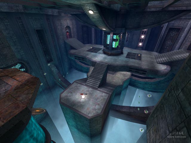
This map is excellent. It has a unique atmosphere, like a living industrial complex with cyan blood circulating throughout the place. The connectivity of the map is superb. Right balance of weapons and items too. The only minor point are the odd bounce pads and jump found in some places. One for instance just pushes you across the room. But this is minor. Gameplay is very absorbing!
Edited 13 seconds after the original posting.
Edited 11.5 hours after the original posting.
Edited 13 seconds after the original posting.
Edited 11.5 hours after the original posting.
Agree (1) or Disagree (0)
Excellent one for sure and it really comes true as mentioned in the review: when you play the map more often, you get more and more familiar with the map and the fun becomes a multiplier :). The epic feeling and eyecandy does the extra plus. It's both, pleasing the eyes and absolutely playable.
Agree (3) or Disagree (0)
Map looks very newbieish: there is no visual theme besides the blue goo/glow, but an experienced mapper knows that it was added simply because without it visuals would be even more dull. Such "theme" was used way too many times to create immersion. Details of the environment look like they were added very randomly simply to create visual complexity, and various scales do not stick together. Again, huge scale of things looks very amateurish, like mapmaker didn't know how to work with smaller brushes. Reminds me Duke Nukem 3D maps that were made without realistic scale: huge doors, chairs, giant refrigerators.
Agree (0) or Disagree (4)
The area in the screenshot made me reminisce playing Halo 3 whenever I was in a large Forerunner structure with deep pits. I would have mentioned that in the review, but I was afraid of getting reprimanded I guess.
Edited 1024.5 days after the original posting.
Edited 1024.5 days after the original posting.
Agree (1) or Disagree (0)
@Kyall: The space in the baseq3 folder :). I just delete maps I dont use anymore and replace them with new ones. I found ENTE's new maps on a Q3 website. I'm trying to get it to work but sadly it seems to not work.
Agree (0) or Disagree (0)
@FragTastic: Do you mean they take up a lot of hard-drive space, or space in the baseq3 folder? If it is hard-drive space, then that isn't a real worry to me, if it is baseq3 space, I just make a secondary folder and put maps I don't usually use in it.
Agree (0) or Disagree (0)
@Kyall: Yes your right there Kyall. Various's map packs contain more than 20 maps :o. It takes up a lot of space but they are cool. So I deleted Various's WTF map pack and I had so much space.
Agree (0) or Disagree (0)
As for me, I don't like 3 things in the multiplayer levels: mazes, acids and abysses. I like to concentrate on shooting rather then on watching my steps or wandering "Where am I?" :/ But it's my personal preferences, maybe some ppl just can't live without slime or lava =)
Design is beautiful and attention to details is amazing. Good job!
Agree (1) or Disagree (0)
@FragTastic: I don't usually delete maps unless they are full of bugs. Most of the maps I have tried are very good, and not worthy of the Recycle Bin :D. But I have found a solution; just take the WTF map pack out of the baseq3 temporarily, it shows an extra 48 maps lol :P.
Agree (0) or Disagree (0)
@Kyall: If you cant play maps you want, Just delete some old maps you dont like. It's much easier and plus saves so much time
Agree (0) or Disagree (0)
@Tig and DaEngineer: Thanks, i tried this and it loaded. I usually type in
the name of the pk3 file with /devmap, and it would load. But thanks for
telling me.
@FragTastic: Haha i think this might be the case. My baseq3 folder is 1.33GB,
and most of it is maps. Thanks too for telling me about this. I kept thinking
that i was installing the maps incorrectly for all these years, but now i
know.
@spirit: I agree with you. After 13 years of map making, a lot of quake 3 arena
enthusiasts will have hundreds, even thousands of maps by now. And it isn't
easy finding that one particular map you want to play when you are searching
in a folder through thousands of maps, mods and models. And it makes it
harder when you can't even just look at the image of the map, and know that
is the map you are looking for.
Agree (0) or Disagree (0)
The IOQuake3 guys should really patch q3a to support as many pk3s in baseq3/ as you want. ;)
(I know you can start them without them showing up in the in-game list, but I like the pics and I browse the pics to see which map I'm gonna play instead of reading file names in Windows explorer.)
Agree (2) or Disagree (0)
Tig's right. The BSP's name is lffd.bsp, so /devmap lffd will do the trick.
Agree (1) or Disagree (0)
@Kyall: Maybe you put to much files in the baseq3 folder. This happens to me many times. I sometimes overload the baseq3 folder by downloading and adding map files to the game. It's because I have more than the files I am supposed to have in the baseq3 folder. If you want to play the maps you want, Delete any map that you dont play anymore or you dont like and replace it with the map you do want to play. It's really useful to :).
Edited: 08 Mar 2012 AEST
Edited: 08 Mar 2012 AEST
Agree (0) or Disagree (0)
This map looks really good, judging from the comments and rating. Unfortunately I can't load the map. I can't find it in the skirmish section, and i couldn't get it working by typing it the console either. I typed in "/devmap lookingforfreedoom".
Agree (0) or Disagree (0)
@CZGhost: The blue slime is like the best bit of the map. I used to be so addicted to touching it although it used to take a bit of my life away :P.
Agree (0) or Disagree (0)
Wow, cannot believe my eyes... LFFD is really amazing map! The blue slime is also great. I like the slime rivers and slimefalls :)) The vortex under grider is well done, well protected from getting to wrong places (not the fog pits - the rooms behind windows with caulked behindwall, no items here) The fog pit is well constructed, I like the slime pool on the top of floor... Well, who wants to play it online? I want ;)
Agree (1) or Disagree (0)
@ Anonymous: May I ask how long you played the map? And with how many players? As said by SW12 and Tigger, the map's layout is not that easy to learn when you play the first time. You could try getting used to it by playing alone and then adding a couple of bots. There's always more than one route to get to the place you want. The RL ammo was capped for a reason. When I tested this map over and over, I felt the RL was too dominant. There was no real reason to go for other weapons, as there are two RLs and even some ammo. So I capped the ammo the weapon itself gives to force players to use other weapons. Also, in the map's center area are no weapons at all. This was done to compensate what happens automatically on a map of this size with that many routes: everyone meets in the center. Previous versions had a massive amount of carnage in the center, while the outer regions were empty. By using fewer weapons and putting them to the outer rings the gameplay improved.
Agree (1) or Disagree (0)
Great architecture. but gameplay sucks. Why? Because I'm looking for weapon for a 1 minute! Not enough weapons, armors too. And limiting ammo inside RL - totally not funny :(
On such open maps, RG should be limited!!!
On such open maps, RG should be limited!!!
Agree (0) or Disagree (1)
