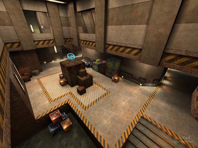
foolish legacy
foolish legacy by swelt
Comments
Add a comment
avatar
**Preview only**
Be sure to submit your comment
Submit
Preview
Cancel
Submitting comment...
avatar
JADscratch Rep. 487
#15   02 May 2013
I've had this on my hard drive for a while, and it still is a pretty good map. I didn't quite enjoy the feeling of how the rooms were connected. Also, the bots aren't very bright when they move from place to place. It's a pretty decent map, but not quite there to reach "keeper" status. A good job, swelt.
Agree (0) or Disagree (0)
Madan unregistered
#14   16 Oct 2003
Massively overrated.
Yes, it plays well. Yes, it looks nice. Innovative in gameplay?
No way. Others have already said it. People have tried everything swelt has before. I think some have done it better, btw.
Aesthetically, there are maps that murder this one.
Perfect?
Perfect is subjective and trust me, this ain't "perfect" even if it weren't.
7/10.
m.
Agree (0) or Disagree (0)
not entered unregistered
#13   24 Mar 2003
"Even if gameplay is what you are mapping for, there is no excuse for making buttugly levels. "

Hah. Yes, i agree. Gameplay is primary, but why not put the extra effort in to make your maps look presentable? Ugly maps that play well are like a fat chick whos really good in bed. Fun to mess around with, but not much to look at.

Anyway, this map, and the other one that swelt released, both play extremely well, and look good also. Im glad to see that swelt is putting some time and effort into making his work aesthetically pleasing :)

Agree (0) or Disagree (0)
sdfsdf unregistered
#12   23 Mar 2003
"...Promode mappers dont map for aesthetics."
But unlike many promode mappers Hubster made his maps very nice and stylish.
Even if gameplay is what you are mapping for, there is no excuse for making buttugly levels.

Btw good map swelt ;)

Agree (0) or Disagree (0)
Pure Imaginary unregistered
#11   13 Mar 2003
The texturing in this map is adequate for navigating the level. It's just that the layout is hard to learn, period; any great 4v4 map has this problem.

I believe xfoo was instrumental for some of the original construction, so he deserves credit as well.

This map owns, and it'll only get better once it's tweaked and integrated into CPMA.

Agree (0) or Disagree (0)
Mr. Lake unregistered
#10   13 Mar 2003
I dunno Hubster...I think lighting and asthetic really do have an affect on your ability to focus in a game.

If architecture is organized and layered well enough into a colague that your eyes will recognize as a wall or hallway more easily, then it enhances your ability to make quick decisions in battle. Texturing, lighting, and consistant patternization help you to pick apart the doors from the windows. This map does a fantastic job using the asthetic as a way of guiding you. So consistancy and architectural design subconciously help a great deal when you play. You wouldn't necessarily play a map that only used 3 textures just because the dynamics are good...you need patterns or familiar markings to guide you, so you're not standing there like a llama pondering "which way to the quad?"

Agree (0) or Disagree (0)
swelt unregistered
#9   13 Mar 2003
thx peeps :)
Agree (0) or Disagree (0)
[acid] unregistered
#8   13 Mar 2003
i added this one to the planetquake.de mapbase and it had more than 2000dls in the first 24h.
this map rocks ass, but unfortunately i never had a real game on it :(

who cares about gfx.. make the spots look different, thats all. and you get nice r_speeds besides that :x

Agree (0) or Disagree (0)
Paragon unregistered
#7   13 Mar 2003
Perfect! a "mustplay" in every cpma-tdm-league
Agree (0) or Disagree (0)
DruZli unregistered
#6   13 Mar 2003
The Hubster speak the truth.

This is a wery well designed map and to me it´s one of those "perfect" maps out there...made to be played in competition and is allaround fun for pickupgames.

I recommend you all to download this map and give it a run.

GJ Swelt :)

Agree (0) or Disagree (0)
The Hubster unregistered
#5   13 Mar 2003
<|3FG20K>, incase you havent realised, Promode mappers dont map for aesthetics. Geometry in our maps has more to do with gameplay, not looks.

We make maps for people who want to PLAY.

Agree (0) or Disagree (0)
arQon unregistered
#4   12 Mar 2003
"nodm5 is the future of TDM" - a|citizen

:P

Agree (0) or Disagree (0)
hannibal unregistered
#3   12 Mar 2003
Ahhhh crates! I've missed 'em for so long. :) ace map, Swelt.
Agree (0) or Disagree (0)
<|3FG20K> unregistered
#2   12 Mar 2003
Dude, this map is cool. Most areas seem a little flat to me (not a whole lot of brushwork going on, but it's good anyway), but it enhances the gameplay factor. I could imagine that this map would totally rock ass cause it feels like it would be perfect for a q3dm12 sized ffa game--- actually, quite bigger than that. Gameplay is rockin, texturing is sockin, but cmon on man, the geometry is lacking.

8/10

Agree (0) or Disagree (0)
Mr. Lake unregistered
#1   12 Mar 2003
Best-looking Q2 style map for Q3. Honestly, in terms of originality (and this isn't slamming the author's artistic approach by any means) this style has been done in may flavors...this one just happens to look much better.

Gameplay is really a different story all together and this map has tons. It's already one of my favorites not just because I really dig the "new-brutalism" theme, and the Q2 reminiscence factor...but also the secrets. Bells and whistles really help make a map special...ad to the adventure aspect so to speak.

This of course is coming from the "what, think you can do better?" corner...I know I probably couldn't. I don't think it's for everyone, but give it a try and surprise yourself.

Agree (0) or Disagree (0)
Clear