Comments
Add a comment
**Preview only**
Be sure to submit your comment
Be sure to submit your comment
Submitting comment...
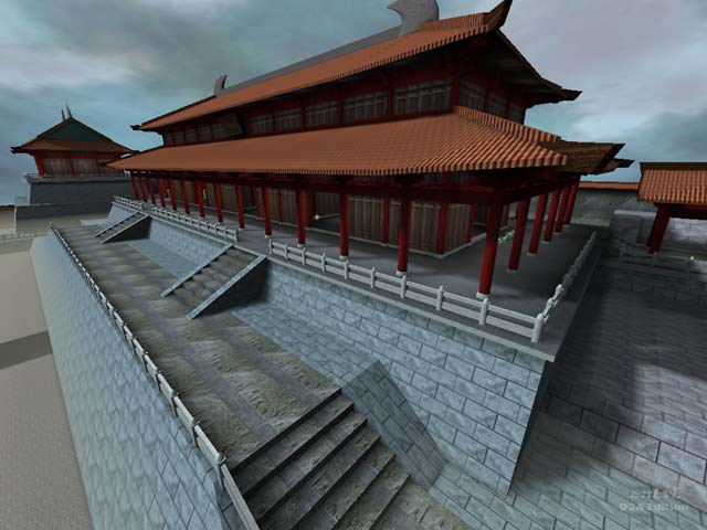
This map is great. It shows the characteristics of Chinese traditional culture.
Edited 6.75 minutes after the original posting.
Edited 6.75 minutes after the original posting.
Agree (2) or Disagree (0)
A lot of the items require you to RJ to get them.
(Armors, Mega Health and BFG)
It is a pretty nice map though! 😎👍
(Armors, Mega Health and BFG)
It is a pretty nice map though! 😎👍
Agree (0) or Disagree (0)
Is my machine powerful enough to play this? yes.
Did I end up keeping it? Uh. No.
Try Iron Raiden by ChucK
Agree (0) or Disagree (1)
Very cool architecture "test map", that seems to just happen to have some items placed in it. With this real-world architecture and layout, a lot more clever work would have been required to achieve good gameflow, IMO. I am not really sure it is actually possible.
Anyway, well worth the download, just to enjoy complex, well implemented brushwork.
Agree (0) or Disagree (0)
japang what? :P i actually love this....what i can see of it anyway. is it just me or am i missing textures? is that supposed to be fog or water? its hard for me to comment unless i can see everything.
Agree (0) or Disagree (0)
a very good map, from the editing point of view. Sure you can have some serious dm matches in there also. An amazing chinise-wise made creation.
Agree (1) or Disagree (0)
i liked walking around looking at the map to dunno what it plays like tho but theres nothing wrong with the frame rate
Agree (0) or Disagree (0)
I enjoyed walking around this map and looking at stuff on my own. A lot of work has gone into this map and it shows. There's a lot of little cool touches like the floating semi-transperant teleporter exits that hover above the power-ups. What a shame about the frame rate though. If the map had been half the length that it is I think it would have solved the problems. As it is, it's just too big for the amount of brushes :(
5 from me
Agree (0) or Disagree (1)

