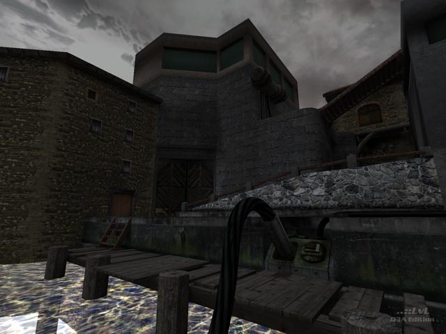
Update: This release has been updated and improved since it was reviewed and released. The latest version has a number of areas that look different to those in the screenshots. Also, a number of issues mentioned below have been corrected or are no longer relevant. (21st May, 2013)
Winner of the ..::LvL Experimental Single Player Comp, 2010
The Judges for the event were Bliccer, Anthem, Morbus, and Tig, so lets get started.
Lets see what Judge Bliccer had to say first:
First of all congratulations to you, D-Meat, that you took part in this competition and finished your project.
When I played the map the first time it was fun to see a background story being told at the beginning (the text banners should have been a bit faster, though). After the text, you spawn in a medieval, minish cave which fascinates already on the first sight with its texture details and the whole atmosphere, which can be hold up throughout the whole map. Thumbs up here.
The way itself is being lit but neatly designed lamp models, which are connected by hoses laying around on the floor. Moreover some of them are combined with target_speakers playing some electric sounds and adding more style to the atmo. Also the buttons and doors have their own unique sound effects which give a more realistic style to the whole theme. Thanks to D-Meat's friend's effort the sounds have never been heard before.
Nevertheless I really miss an appropriate music in the background which would finalise the sound part, like he has used for his first map. Of course not the same 8-Bit style. Maybe the author can go through some CC licensed music from jamendo.com and add it afterwards.
The transition between the caves and the industrial look is discussable, but since there is no really hard break in the texture style (dirty look on the whole level), it doesn't look as strange as it sounds. It views and feels more like a transition between some underground level (sewers) upwards to the upper surface (what is also described in the readme...). So the textures fulfil their functions greatly.
The machines and their functionality placed into the map are as interesting as the ones from a well-known single player map by Sock. D-Meat uses a lot of nice texture remappings to give the apparatuses the visual touch they are deserving. In the last room they are even being watched by a guardian. Really cool idea to implement a bot into this map. But 2 or 3 of them would deliver more tension. Maybe it wasn't possible due to the old engine or the deadline.
But here is also the big problem of the map, in my opinion. I think the implementation of the bot was such a hard work that D-Meat kind of forgot about the rest of the puzzles which are limited to the "press-the-two-buttons-to-go-on" scheme. Furthermore he put the buttons very near to each other what simplifies the puzzles even more. Since this is Quake3 a lot of freestyle tricks would have been possible (not the ones known from the fs maps, though, but some strafe jumping parts; I guess rocket jumps would have destroyed the whole atmo). For example in the second room, one of the buttons could have been hidden on the second platform.
Also very nice would have been a situation in which the bridge, you need to cross, suddenly falls into pieces. I missed some special feature between the first and the second button room.
In the last room one really graphical bug attracted my eye: the grey transition into the horizon. I know what the author wanted and I know that it's kind of hard to achieve (actually I've never got it to work), but D-Meat really should fix this before the final release. (edit: he has just sent me a -skyfixed version of the map and it works fine now, nevertheless the map we had to test wasn't compiled with the -skyfix parameter.)
In my opinion the small door between button room 2 and the armory room is too... small, or narrow, or the texture just looks too stretched. One more minor thing is the text displayed on the screen. Since Q3 uses those big letters the sentence leaves the monitor. Well, at least on mine. (resolution 1280x1024)
I don't know if the other judges have the same problem, but if I restart the map over the in-game menu or via the map_restart command, the bot at the end doesn't appear any more and furthermore the last machine doesn't work as it should. It displays all buttons as being activated, although I only pressed one or none at all. But I think it's more a problem about the engine.
If you play the map the first time (meaning, selecting over the single player q3a menu) everything should work fine. At least everything worked astonishing well on my pc. And it was fun to see a bot running around as if the game contains a single player game type.
Thus the map includes simple puzzle elements, it's still very recommendable and it deserves being a first placer (being only map back and forth).
Thank you again, D-Meat, for participating!
Bliccer
The following feedback is from Judge Anthem:
This is a very cool map. I really enjoyed the presentation of the story (from a third person narrator who is conveyed through words that come ominously from the darkness). The entire atmosphere of the map was brilliant as well. I really enjoyed the freshness of the concepts around which this map was built. This map is definitely well-deserving of praise.
From the first run, I felt the atmosphere of the map was interesting and compelling. I was able to complete it in about 10 minutes the first time because the puzzle is rather easy, but that doesn't detract from the complexity of the concept of the map. I enjoyed how linear the map was in its presentation. The differentiation themes seemed to work well together. It's interesting to start from the sewers and then end up on the upper level.
It's obvious a lot of work went into this map. The textures are spot on. The atmosphere (lighting, architecture, sound effects, etc.) are compelling and interesting throughout the map. I really enjoyed the "secret" path that is accessed toward the beginning. I like that there is more than one path on which to transverse the map. My only question is: Do the secrets lead to anything? I found... 3 I think. It took me about an hour overall to find them, and I'm not sure if there are more. Maybe I'll have to dig deeper.
One of my favorite parts of the map is the door at the end. I love its design (the lights and texturing) and how the bolts go up when the buttons are pressed. This is a very interesting feature and it is nice to see at the end of the map. The only thing that I don't like is that the next one isn't out yet.
Overall this map was very well put together. I really enjoyed the concept of this map. It is a lot like The Edge of Forever in that it is very mysterious as to why the player is there in the first place. Both maps are immensely well put together and interesting. I really enjoy how complex this map turned out even though the puzzles aren't complex. The map was fun and interesting. It is definitely worthy of the genre "Experimental Single Player". I believe this map has just made the standard rise.
Well done.
-Anthem
Judge Morbus included a bug report with his feedback, complete with a rar file of screenshots:
Concept:
Dmeat's concept of creating a mix of medieval catacombs and a industrial place turned out well. Swords, bucklers and chains add to the atmosphere of the map. The map is introduced by a short-story, followed by puzzles and a Guard-Bot that wanders around in the industrial part of the map - trying to kick your ass while you try to finish the last puzzle.
Gameplay:
The map is kind of fun the first time you play it but far too easy to complete. There are small puzzles but its more like "press those 2 buttons next to the doors to continue" or "pick up those items". The bot is standing around and is passive but I guess that's what guards do. :D The thing that I really enjoyed was, that there are actually 2 ways to finish the map. One way (the normal way) is to open several doors via buttons, the second one involves dexterity. Pillars lead you to stone-tunnels over to the industrial part where "Guardian" is waiting for you.
Visuals and Sound:
All textures are well done and go together. Especially the alpha-blendings make this map so beautiful. Sounds, the skybox, water and all kinds or remap-shaders grabbed my attention - well done! Here and there a well placed speaker adds to the feeling of the map. I was also amazed by the detail of some shadows and the idea of those lamps laying around - sweeeet.
Conclusion:
I did not expect such a fantastic map! Visuals, atmosphere and the level of detail is just stunning. In total the map is too easy to figure out and FPS could be better in the last part of the map. Otherwise this map is a keeper and a beautiful example of the capabilities of Q3map2 and the idtech3-engine.
Bugs: Requires this rar file of screenshots
I found some bugs that should be fixed. The biggest flaw is fps and botplay.
- \kill crashes q3 and mouse does not react anymore.
- you can reach the void in the last room - some clipping missing [shot2897, 2898]
- in the last room you can see the whole map which results in 50fps [shot2875 and 2876]
- you see parts of the map in the water [shot0032]
- [Shot0035] you get stuck there - no escape :D
- [Shot0036 and Shot038] brush not aligned
- player can see void after the door opens [shot0039]
- caulked surface [shot0048]
- last room: you can see parts of the map [shot2886, 2889, 2891, 2894, 2895]
- some textures + 1 soundfile missing [shot002, shot004]
- readme: scorelimit - no such command (its fraglimit)
- some of the bucklers could be clipped imo [shot0010]
Morbus
And finally, a little something from Tig:
A fantastic release. When you make it to the end, you want more - perfect!
The secret 2nd path from the start is very cool, again perfect for re-play.
The only very minor downsides are the initial intro text and the bot re-spawn.
A possible solution (that may not even work) for the text would be a remote skybox method. The doors could be loaded in the remote skybox (so no sound is heard). Check out Octagonal Overdose by sst13 - or just ask sst13 for some advice - that guy is a technical freak!
As to the bot, the only idea I could think of was to place the bot in a teleporter box. Once the player opens the outside door, teleport the bot to a point on the map where the bot will be able to see the player. When the bot dies, they will re-spawn in the box and be trapped. Again, this is has not been tested and may not work :]
Everyone should play this map at least twice.
-Tig
Ranked: 4.5 out of 5 (10 votes)
Download: Lo sota Olt by D-Meat

