Added 26 Feb, 2017
Comments
Add a comment
**Preview only**
Be sure to submit your comment
Be sure to submit your comment
Submitting comment...
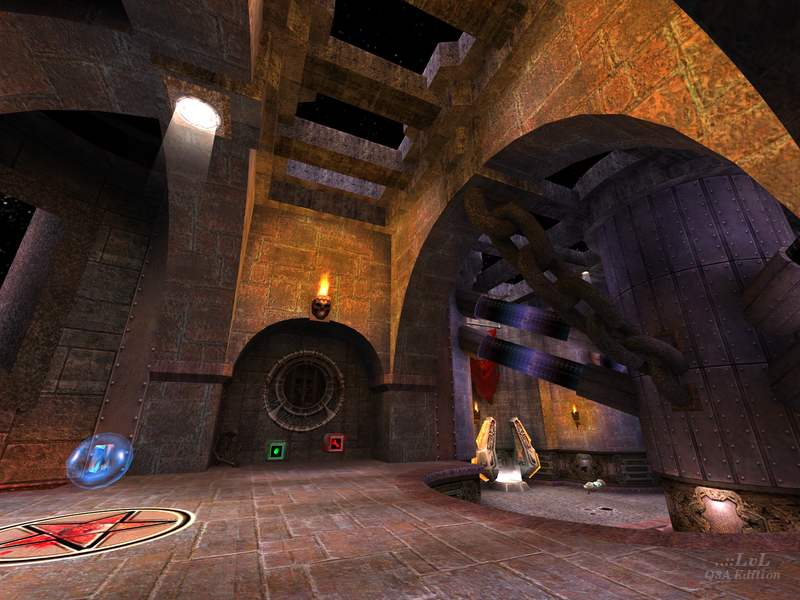
Confusing map. Odd choice of design, like the one in the picture. Teleport takes you... to the MH. You cannot jump from the MH platform to the other one in front. You cannot even PG yourself up because of the carved wall (pictured, bottom floor). Why not put the mega where the teleport is and just add some stairs on both sides? Very annoying. Kills the flow.
This map wasn't made for CTF.
This map wasn't made for CTF.
Agree (0) or Disagree (1)
Nice improvements compared to the original id map!
Agree (2) or Disagree (0)
@1v4n: If he should keep the original look, he should redistribute textures from Team Arena, which is illegal. And extending such an open space an large map is pretty much a dumb idea as it's already extended. Distant Screams is even larger map and thus this makes it not necessary to do such conversions. If you want to play these maps, get yourself a copy of Team Arena. How, it's all up to you ;)
Agree (1) or Disagree (1)
Hi, sst13! I really like your Quake III-ish maps, just because they are pretty much the same quality level! :D
I was just wondering... could you re-make/convert one Q3TeamArena map into Q3?... That would be awesome. I'm talking specifically about that one map that is really big and has an enormous open space (MPTERRA1: OVERDOSE).
I KEEP SAYING IT... YOUR MAPS ARE GREAT!
Agree (0) or Disagree (0)
Thanks for correction, Tig :) It was really a long time from when I played carnage :D
Agree (2) or Disagree (0)
Review has been updated / corrected in regards to the teleporter. I did intend to check the teleporter in the original (as I did not remember it) but assumed I had simply forgotten :] Thanks for the correction Tetzlaff.
Agree (1) or Disagree (0)
Sorry, too long I played original maps :D
Agree (0) or Disagree (0)
By todays standards of maps I just go bored of this really quickly.
Agree (0) or Disagree (1)
I always wondered how q3tourney1 could be turned into a more serious deathmatch map, whith more verticality and better connectivity. Since the orginal has a great futurist/gothic theme but an all too basic layout. Well, sst13 made it happen and it became a fun little map!
A side note to the reviewer: original q3tourney1 does not include a teleporter, the plasmagun room is a dead end there.
Agree (2) or Disagree (0)
