Added 25 Jul, 2012
Comments
Add a comment
**Preview only**
Be sure to submit your comment
Be sure to submit your comment
Submitting comment...
Ahhhh yes, the placing of the items. I should have had some beta testers for this map. The placement would have been improved easily. I tried to keep some logic but by the time I finished this map the layout of the map itself had changed many times, significantly... And the item placement changed accordingly numerous times.
A bit of shame.
Still thanks for the compliment on the other points. Perhaps the map is still good for a round of instagib or'slugs and rockets' ;)
A bit of shame.
Still thanks for the compliment on the other points. Perhaps the map is still good for a round of instagib or'slugs and rockets' ;)
Agree (2) or Disagree (0)
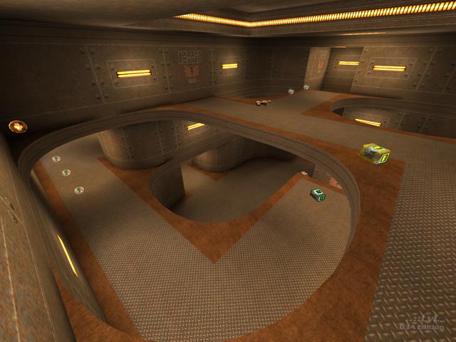
I had high expectations judging from the image. That round+squared design looks really great. The atmosphere of the map is cool. I love the lighting textures too, very clever. But I agree with the review. Item placement is not good. I also found myself many times grabbing the GL, moving on to a different floor which then took me back to the GL. Something in the map's connectivity seemed odd. I just couldn't get the hang of it.
Agree (0) or Disagree (0)
I like the sparse aesthetics of takkie's tourney/small ffa maps. good for sighting and the aesthetics don't get ruined if your picmipping the maps. I liked the mention of item placement in the review as well.
Agree (1) or Disagree (0)
