**Preview only**
Be sure to submit your comment
@raspatan I think
THEBASIN by @Martinus is even larger.
Agree (1) or Disagree (0)
Largest q3 map ever? In any case, difficult to enjoy, imo.
Agree (0) or Disagree (0)
Huge Map Indeed :). 8/10.
Agree (0) or Disagree (0)
DwInt
unregistered
#9 24 Sep 2011
@TheMuffinMan
@Meteorkid
Thanks for your help.
Actually it's working with CPMA. But I want to play it with original q3a.
I deleted some old maps in my baseq3 folder, and try to play this map, it's working =]
Anyway, the map is very huge.
Agree (0) or Disagree (0)
I have tested with a clean (up to date) q3a install and i have had no problems (also on other machines and severs). I suggest trying that as it may be your install having some kind of conflict. I dunno what however. Good luck
I have never tested it with ioquake3 or ever used it myself so i can not recommend it however use what suits you best and hope =]
Agree (1) or Disagree (0)
@DwInt:
I'm not sure what causes that, but try using ioquake3 instead since it seems to get around that error (according to the source code).
Agree (0) or Disagree (0)
DwInt
unregistered
#6 23 Sep 2011
Can anyone help me?
I can't play this map, because 'CL_ParseGameState: Bad Command Byte' =[
Any help will be greatly appreciated. =D
Agree (0) or Disagree (0)
thx thank means alot :D
Agree (0) or Disagree (0)
So who cares if this map uses basic textures? Its still awesome work!
Agree (0) or Disagree (0)
Meteorkid
unregistered
#3 21 Sep 2011
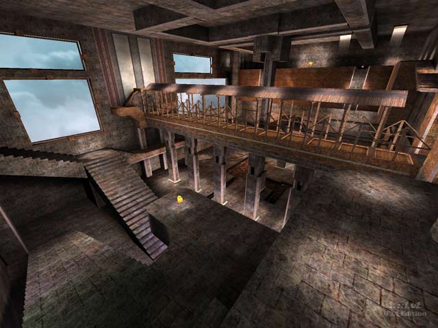
Hey thx for the review tiger :) yes the arena i have to agree is badly designed In layout and texturing could of been more diverse. It is more like a monster mutant arena made up all random ideas stuck together. However the main idea behind this project was to see how big a arena i could make (under my pc spec) it also allowed me to learn various things about performance and making should you start off with a neat (hull) design which i would say did not happen here. My current map i am working on now is thankfully smaller and will be more like a "normal map".
I had alittle problems lighting the map as i have a bright view screen making everything appear well, brighter. I tried to compensate as best i could.
Anyways I'm glad its over and i can move onto something less messy. Also I suggested e+ mod as the gameplay focuses around speed which allows the map to be traveled thru quicker so the size is not so bad.
Agree (0) or Disagree (0)
I love huge maps and this one has got some interesting ideas, could have been a lot better if properly textured (no need of custom textures, just the ones that come with the game) and with a little more work on some areas.
Agree (0) or Disagree (0)
This map for Clan Arena... lawl? I'd like to see the round draw after round draw when there's only 1 player left on each team!
I tried this map some time back while it was in the queue and it was decidedly 'meh'. This map is arkward to navigate. The size and proportions of each section of the map, and the corridor effect of some parts of it makes things far too linear. If the gameplay wasn't bad enough, it doesn't have good looks to score points on either.
The author should have focused his energy into a smaller map where he could achieve a more playable map in the same amount of time. It was interesting to wonder around in for a few minutes though. 4/10
Edited: 21 Sep 2011 AEST
Agree (0) or Disagree (0)

