Added 02 Dec, 2009
Comments
Add a comment
**Preview only**
Be sure to submit your comment
Be sure to submit your comment
Submitting comment...
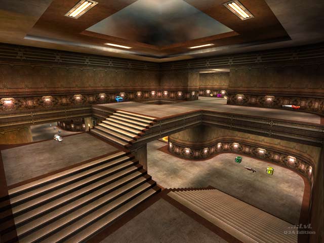
@sedawkgrep : In the main review screenshot you can see a Quad. In a Tourney match this is replaced with a MegaHealth.
Agree (1) or Disagree (0)
There's a megahealth in the entities but it doesn't appear in the game. @Takkie do you know why?
Agree (1) or Disagree (0)
@1v4n You propably wouldn't appreciate my choice in music...
@HelterSkeleton thanks for the elaborate comment :hugs:
@HelterSkeleton thanks for the elaborate comment :hugs:
Agree (0) or Disagree (0)
Takkie, U missed the MUSIC, without it, is pure BORING.
Agree (0) or Disagree (0)
Nice visuals. Gameplay needs some work though. 5.5/10
Agree (0) or Disagree (0)
taking a few simple textures and wallpapering them consistently makes for a very simple and classy effect. all weapons get used thanks to the geometry enmeshed within the map. as for the health - any true fan of takkie's work soon comes to realise that health is used very sparingly and often placed in the hardest spots to pick-up, but you know they are there for a reason and won't all be picked up in the same sweep by the same player, so it doesn't take long for the health spawns to become sporadic and dissonant until timing their pick-ups reinstalls a sense of balance to the game. so there never really is too much health on a takkie map - you can literally spend a couple of minutes on less than 20 health before another opportunity comes along. mh/rl/pg provides balance to ra/lg/rl in a tourney with the rg and gl functioning perfectly as they should: in counterpoint to one another from top-to-bottom. there is a definate art to sticking around for awhile on takkie's maps and he always seems to design his levels wonderfully with an instagib mind.
Edited 3378.05 days after the original posting.
Edited 3378.05 days after the original posting.
Agree (0) or Disagree (0)
