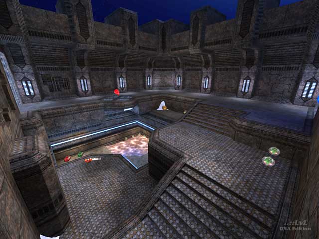
Cold Metal
by Geit
Cold Metal by Geit
Comments
Add a comment
avatar
**Preview only**
Be sure to submit your comment
Formatting help
Submit
Preview
Cancel
Submitting comment...
avatar
raspatan Rep. 4660
#10   09 May 2021
Cool map with beautiful design (curved edged platforms is a nice touch). Gameplay was ok but couldn't quite connect to it. Didn't like the teleports just taking you one floor up within the same room. Kind of breaks the flow imo.
Agree (1) or Disagree (0)
avatar
Takkie Rep. 1858
#9   02 Feb 2015
Great map. Good flow... After a round or two the map grows and the gameplay gets better and better.
At first it feel quite big but when you get to know your way it just shines :)
Agree (0) or Disagree (0)
avatar
AEon Rep. 810
#8   25 Aug 2009
Strange, you play the map and simply say "yes, it's all there". This quite detailed and beautifully textured map not only looks good, but even more importantly plays really well, also against the bots. Many "clever little" jumps give the casual vQ3 player a mild challenge, in-between fights to get that extra health or armor. The layout is interesting, in the sense that the player actually wants to learn it. Download it!

I am not quite sure if this is considered kitsch by old-school mappers, or if it simply was just not done back in 2002, but I really miss nice respawn pads for the weapons. Seeing them float over unmarked floors is a but of a disappointment.

Agree (0) or Disagree (0)
optional unregistered
#7   01 Nov 2002
file not found
Agree (0) or Disagree (0)
The Hubster unregistered
#6   25 Oct 2002
... perhaps a remix is in order Geit?
Agree (0) or Disagree (0)
wviperw unregistered
#5   23 Oct 2002
"I found the lower room where the 5HB's are to be a little useless. Perhaps placing a more important item into this room would have given it more purpose."

hehe, thats what I told geit when he was beta'ing it. Told him to move the RA/YA down to there in that water, but noooo he doesn't listen to me.... :D (j/k geit :))

Agree (0) or Disagree (0)
The Hubster unregistered
#4   22 Oct 2002
Nice piece of work, it really is. The only major gripe I have is that there seems to be too much space to move around. imho, the level could have utilised a tighter structure to increase speed of gameplay. The length of rooms and hallways makes the railgun far too dominant, and cooldown of armours can really be felt by the distance also.

I found the lower room where the 5HB's are to be a little useless. Perhaps placing a more important item into this room would have given it more purpose.

Aesthetically, the map is beautiful. I really do like the style, quite nice.

Overall, a good piece of work.

7/10

Agree (0) or Disagree (0)
The Hubster unregistered
#3   22 Oct 2002
How typical - no mention about gameplay.
Agree (0) or Disagree (0)
wviperw unregistered
#2   22 Oct 2002
This is one solid map. The reviewer talks mostly of the mapping details in it (aesthetic), but the best part of it is of course the gameplay. Makes for quite a good 1v1 or FFA.
Agree (0) or Disagree (0)
onegin unregistered
#1   22 Oct 2002
The only problem that I found is one of the grate textures on the second tier does not have a weapon clip brush over it so you can shoot through it.

This is for play reasons and nothing is wrong with that :)

have fun with the map!

/onegin

<a href="www.chickenteam.org" Target="_BLANK">www.chickenteam.org</a>

Agree (0) or Disagree (0)
Clear