Be sure to submit your comment
2023: Well, here is a video of tricks and secrets on DANTESCA :} Unfortunately, it
became somewhat grainy in some parts after YouTube processing. I am uncertain of the reason, because I'm pretty much sure I converted it to H.264 codec before uploading. It might be just an FPS issue or a conflict with the source port (Spearmint). Either way, here it is for anyone wondering or willing to call to mind what are some less or more hidden details on DANTESCA: youtu.be/kpJfG3khrC0
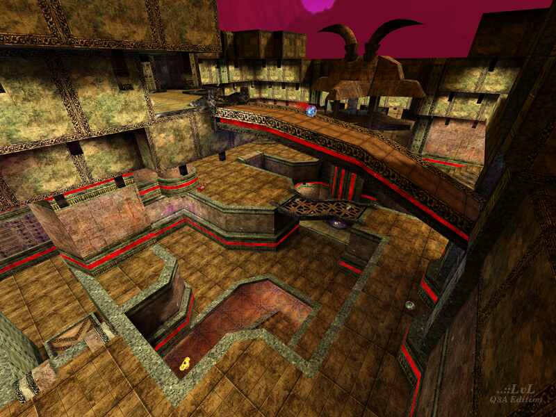
The rocket launcher pit is a truly unique architectural component which represents the map well and makes it memorable. When it comes to gameplay, it can definitely serve as one of the symbols of DANTESCA, as the pit can be used as some kind of camping territory, especially considering that it has the rocket launcher on the top of its “ceiling”. Another good thing to mention is that it lets you fill your health and ammo stack, as together it has 100 hp (25x4) and all the necessary ammunition. I think the health corners are at least half useful as options to hide there. The presence of the quad damage and the medkit makes it worth to begin a treasure hunt by jumping down into the pit (even if the sound of picking up the medkit can reveal the player’s current geoposition, hahah). I also appreciate the availability of the wall teleporters being close to the quad hall center, as well as the spawning places which could be used to benefit by spooking enemies from these shadier areas.
By the way, the wall teleporters is another pretty cool idea, in my opinion. I remember it taking me some time to figure out that the weird liquidish dynamic things inserted into walls are actually teleporters, hah. The one near the plasma gun provides another option to get to the map center while simplifying the path to that.
Speaking of the center, the red armor located in there brings even more combat to the table, as this is the only red armor on the map (it’s rare that there’s more than one, as for most maps, but still, the placement of the red exactly to the center makes the gameplay more dynamic).
The yellow armor on the bottom floor brings more challenge to the game as well because of the fact that it is put in an alcove whilst being located less or more near the rocket launcher and the SG. The shotgun has just a little potential to be popular on this map, but that’s why it can be found aside, I guess. Furthermore, some extra items are located near it to make the probability of grabbing the SG to be worthy higher.
The jump from below for the LG makes you feel like some 80s film main character, sort of a superhero; also it makes you less vulnerable up there after the jump on the jump pad, if you just grabbed the lightning gun.
As for the railgun tower (or the Cerberus statue, as mentioned in the readme file), design wise it is also a very memorable map element, and being visually distinctive can serve as one of the map symbols. If so, then it is definitely a level symbol in terms of gameplay, too, thanks to the RG trap. On such a large map, the railgun can for sure be one of the most useful and practical weapons, so many players (and maybe bots) may want to go for the RG, which is why the risk to get into a trap can be worth it. Kudos to Quint for thinking about this.
I find the mega health bridge and the rail tower to be quite balanced relative to each other because of the mega’s bridge openness and the RG tower trap. Both the button and the player on the bridge are reachable even with the LG. Btw, the fall down after an attempt to grab the rocket launcher (the one near the mega) always got me lost in space when I was a child, haha.
The trap on the bottom floor also gives an opportunity to master jumping skills and makes it possible to let an enemy take an unintentional trip to the quad hall by falling down into the famous pit C:
As for those big hands, I think it is quite a creative architectural decision, too. Personally, it reminds me of excavator claws because of their form, lol, and it is indeed a memorable element on this level. For me it is a landmark that points on one of the two lateral areas and beckons to the LG and PG path.
The map has all the weapons excluding the BFG, which I think is a very good feature for larger levels like this one. The availability of the grenade launcher makes it possible to spam the yellow armor alcove, and the fact that the weapon is located on the upper floor gives an intention to do so :) The presence of the mega health provides an opportunity to compensate the hp that was lost after several falls, as vertically this map has several levels.
Bots play well, except slightly above that double arrow jump pad near the plasma gun and jump pads that lead to the mega’s bridge where they sometimes get stuck. At the same time, bots standing a little bit above the big jump pad near the PG often tend to camp (and you can camp there as well), and those constantly “dancing” on the pads near the bridge are easier to be caught, especially when you’re being up there. However, they can block you the way if you’re low hp and running from someone from one side of the bridge to another one if there’s some bot stuck just behind that other side’s exit :D
Other than that, amazing map, it’s very suitable for TDM, in my opinion. The jump pads design is also truly on the level. Quint is known for his opened space maps (which some of them I find brilliant, by the way), and I’m usually not a big fan of gothic elements, but for me this partially gothic and enclosed non-space level is with any doubt one of the best Quake 3 levels ever made!
Therefore, I do recommend carefully jump inside Cerberus and “have some funny railtime” just like the author says in the readme file, as well as play this map and enjoy it in general :) Thank you Quint very much for this level and big shout out to everyone who participated in its creation!
there is a lack of texturing on a polygone below the right "dragon"mouth when you shut this mouth!
I think also that some architectural details are too complicated (the hands)
good work I wait for Book 2!!!
In any case 5.22 is very good... think on it: it's not 0, but muuuuch more...1, 2, 3, 4 ... a lot of numbers more than zero! Isn't it?
-Octovus
The jaw trap is the nutz!
Octovus, may I have your mail, I'd like to ask you one thing privately.
cya
The textures show also a lot of effort, it is just that i dont really think they are harmonically placed/selected. I Don't know, prehaps it's just not my flavor.
Anyway I always dowload his maps to jump around and take a look at the brushwork.
-Octovus
