Be sure to submit your comment
One of the signs of a really great map is that the action, especially when 1v1, happens all over instead of being focused in one area. That's definitely the case here.
Edited 14 seconds after the original posting.
I enjoyed the couple of floors that you could see the ground beneath. Added another element of depth.
The layout was okay, very horizontal with almost no vertical play except in one or two areas. The items however were laid out well and had a good balance.
Over all, I liked it. I gave it a seven overall.
The novelty steps are very SP and rather out of place in a DM map.
As for the texturing, we're not all texture artists so we have to use what resources we have at our disposal or regard as most convenient. Besides, custom textures make for chunky dl's.
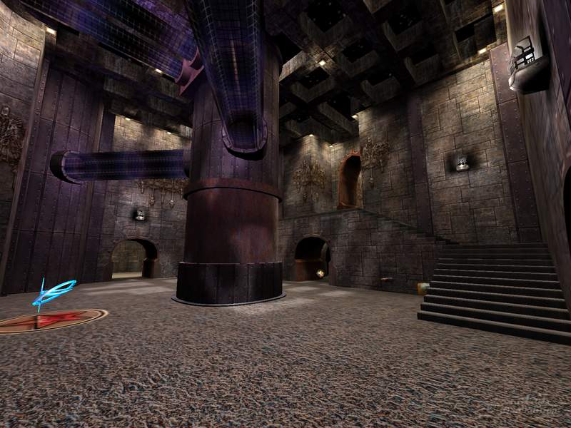
I would've said the lighting was a little dark.
Ignore Knight Cloud (aka Arabian Knight and who knows how many other nicks). He's just some annoying 13 year old from one of the Gulf states. I think he wants you to pretend that your next map is for Q4 or something like that.
Bots get litterally stuck in the stairs and the top of the doorway- just hanging there, like "Elvis on a hook".
If you said, the original Q3 textures are tired...yes, of course, but I like them.
the lighting, hmm... yes could be more.
Vertical action ? - This map is created only for a plain fight with a few stairs and second levels.
But Thanks for your ideas - and your vote!
Things I liked:
- The gimmicks
- The layout (sort of)
- Most of the item placement
- It´s big!
Things I disliked:
- The texturing (good for what it is but those standard Q3 textures sure are tired)
- The lighting (too bland)
- Lack of vertical action in the map (a mortal sin!) :o)
Gave it an 8 (more like 7.5 though).
Knight Cloud: whah?
Timmy!!!: Thank you !
Whene Masafi oasis will review?
http: Also Thanks for your opinion; I'm not amused, but its your taste and I respect it.
I use it for Q4dm1.
nolimit: send a mail to me, I will tell you about the tricky stairs.
Knight Cloud: why not night skybox ?, I think -for my taste-it give me the optimal light for this map.
UncleFester: Thank you!
Octovus: Thank you for all your critical comments. About the armor shards and small healths: I like it, and I need this items. Nobody is perfect...
The Loader: Thank you; yes I have played with the bot "sarge" and he play it well, but I dont like him...
And why the map in night skybox? :o
nice lvl
gets a nine from me
Well, I must say (and for anyone reading the comments on Dead Cells I tried the right map this time :-p) that I disagree with the review.
It works well, for the most part. There are some very cool gimmicks, the shoot through floor to the red armor area being the biggest/best one; seeing those moving stairs reminded me of the many hours spent looking for secret areas in good old SP Q1.
Having a floor panel over the personal teleporter jumppad was a good idea; at first I thought it ought just to be exposed, but it would have gotten in the way. However, in my opinion it would have been even better to place the PT up on the little, empty ledge that was nearby. There were already enough buttons in that area if you asked me :-)
The powerups were just way too close together. If you grabbed the quad first, gibbing the person who grabbed the haste with either the LG, SG, or RL (in those confined corridors) was easy as pie.
My other thought was the insane abundance of small healths & armor shards. I don't know whether q3freak doesn't realise the power these have to change a game, or does and thinks lots of them is a great idea. To me, there were way too many in this map. There is a line of 8 small healths around a teleporter, which leads to a line of 4 small healths and 4 armor shards in a little alcove. Elsewhere in the map armor shards and small healths are scattered liberally. To me, this gives too much of an advantage to people who have over 100 health. If you spawn in the right place, you can have 150 health really quick. Other players who need health only have a few places to find the larger denominations that can't be taken by players who have 100+ health.
But anyways, it was fun, and if you ask me I'd give it a 7 ;-)
-Octovus
good adaption = 9 from me !!
