**Preview only**
Be sure to submit your comment
Close to the
St. Vitus Cathedral (
en.wikipedia.org/w...Vitus_Cathedral) in 🇨🇿
Prague there are a couple of windows that allow you to see some of the stones of the base of a nearby historical monument, at that they are illuminated at night. This map makes me think of that place directly :)
Yeah, it's tight. but 3 entrances to each flag room leaves options open for a return path. Even the bots will use all the pathes.
@undeaddemon While that is true, the problem is that the level is also quite dark and has many twists which makes it easier to get lost in.
I am really curious whether or not people like the grenade room or not.
thanks.........undead
I liked the room with the grenade trap because it definitely brings some more diversity and dynamism to the gameplay, and it is what made my vote for the release higher. I think, without that trap being present I most likely couldn't have considered playing GSCTF1 on regular basis. I appreciate the fact that both triggers are placed away from the trap but are still next to it. The fact that while the attack from one end is directed at the entered player, the attack from the other end is aimed at the entering player, brings more balance. In my opinion, the presence of the BFG as a reward makes it worth dealing with this trap even despite its difficulty.
Edited 25 seconds after the original posting.
Agree (1) or Disagree (0)
I'll gloss over the obvious problems of visibility and scaling already mentioned (although they do have a HUGE impact on playability), and focus my criticism on the asymmetry between the bases. While the most direct routes do not particularly favour either team, the other routes strongly favour the red team. There is nothing wrong with introducing asymmetry into base structure as long as the author tests the layout to ensure there aren't any team biases resulting from the asymmetry. Having said that, I still voted this level up. On the positives, there is obvious creative potential on display here, as well as some thought into item placement, layout, and hence strategy that can't, for me, be denied the author.
Agree (1) or Disagree (0)
I_like_quake
unregistered
#20 07 Feb 2012
this map reminds me of the haunted halls a little....
totally agree with SW12, would have been a great single player map
Agree (1) or Disagree (0)
This amateurist map would have made an authentic Single Player map.
Agree (0) or Disagree (0)
to small and dark, though i like the part with the bfg!
Agree (0) or Disagree (0)
PREDATOR :-}
unregistered
#17 09 Aug 2002
GOOD MAP NOTE TO ALL MAPPERS DONT UCE SONIC1 USE THE MUSUIC FROM THE LOST WORLD MAP
Agree (0) or Disagree (0)
PogoJoe
unregistered
#16 27 Jun 2000
1 person wide hallways makes it different from all the other maps, different is why we even download new maps, right!? I think it's way cool! Sometimes when I have the flag and my teammate is blocking the hallway, I pummel them out of my way! Muahahahaha!!! I got quad, I got flag, I go a rampaging with my chainsaw on!
Agree (0) or Disagree (0)
undeaddemon
unregistered
#15 23 Feb 2000
Hehehe! Grunt Funny! But really, thanks Grunt for your feedback. Keep an eye on my website in a couple weeks. I'm workin' with my brother on a really cool...BIG map!
cu!
Agree (0) or Disagree (0)
Grunt
unregistered
#14 23 Feb 2000
Well, today, the day after, I read through my comments that I posted yesterday I saw that I had wrote wrong. I misunderstood "curious" (I am swedish and 15 years old and aren't the best in english) Now I understand that word and want to say what I think about the grenade room. I think it is good, I haven't played this map so much so I can't tell further than this. But I have played and I think it seems to be ok. Read my earlier post to get more information =) Cya!
>The Swedish Grunt<
Agree (0) or Disagree (0)
Grunt
unregistered
#13 22 Feb 2000
Undead,
This map is pretty cool though it is kinda tight (never heard that before huh?) I can't understand why the other guys complain. I think you should continue mapping 'cause you're doing it well. I was thinking about to rank this level as Fool did but I think my words is enough (aren't they) The gameplay feels ok but there isn't so much stratey and team play as I hoped (my first complain) It's like to run and shoot and well, as ctf is all about, to get the flag (nothing wrong with that) And as you said that you didn't care if people disliked the grenade room or not I am not gonna say anything about... keep up gibbing... I'll cya!
The Swedish Grunt
Agree (0) or Disagree (0)
undeaddemon
unregistered
#12 21 Feb 2000
Fool,
Thanks for your input. That was very constructive(even though i"ve been hit over the head with"halls are too small!". Ive been really looking for more specific likes and dislikes rather than just "too small, it sucks." I am really curious whether or not people like the grenade room or not.
thanks.........undead
Agree (0) or Disagree (0)
Fool
unregistered
#11 21 Feb 2000
This map is way more fun when you turn the bots on and set it down to Hurt Me Plenty. Sniper possibilites out the ying-yang. In no time flat I had 400+ points. Grenade room is a GREAT touch. First time I ran in there, I thought I had run into an ambush. Scared the...well, scared a couple of rockets out of me. (How's that for the kiddies in the room:-)
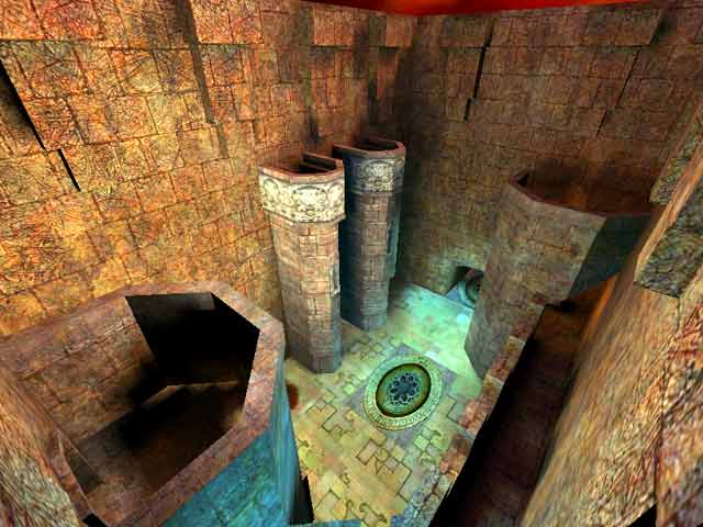
I love the length of hallways this place has. When you look at the screenshot, you think "This place is 30 sqare feet tops!" Until you find yourself in the middle of 3 miles of winding, blinding, grenade poppin' fun!
A couple of complaints, however. Hallways, must-I say must!, be at LEAST two wide for CTF play. Also, Rail would have been nice in a little easier place to get to. Maybe one for each side.
Overall, it made me feel like a kid playing in one of those old mansions with tons of secret passages. Very Kewl. Gameplay 3/10. Atmosphere 8/10. Strategy (including item placement) 4/10.
Agree (0) or Disagree (0)
undeaddemon
unregistered
#10 17 Feb 2000
heheh reguading the granade room...
I can run right through without takin any damage....
course thats cause i know how...
thanks for all the feedback guys..!
Next map will be better..I promise.
undeaddemon
Agree (0) or Disagree (0)
Octovus
unregistered
#9 17 Feb 2000
And this is a
map ? More like a miniature escape tunnel. It took me 10 minutes to find the other friggin flag and I sure as hell never found my way back. And wtf is with the BFG room, the grenades are way to hard to avoid. But hey, for a first map (which I'm assuming it is) it had a good idea at least.. just maybe enlarge the whole thing so the tunnel's dont feel so cramped and it could work.
Happy fraggin! Octovus
Agree (0) or Disagree (0)
RC
unregistered
#8 17 Feb 2000
Some rough-hewn beauty in here, but the cramped scale of the corridors made it unplayable for me, too. If there is no room to dodge, the game loses most of its flavor. Definitely go with the "titan" scale, undeaddemon, but just be sure titan means at least two players wide. :)
Agree (0) or Disagree (0)
Sundown
unregistered
#7 16 Feb 2000
A good foundation to build on, but its not ready for prime-time yet. Needs serious structural adjustment to be a place worthy of killing others in CTF format. If you get some pleasure from just wandering around on your own and eyeballing rock walls, download it immediately and turn your fantasy into reality. Unplayable as an arena for serious competition, but hey, it did make me want to take up copper mining as a profession.
Agree (0) or Disagree (0)
Oneofthecoolestq3maps...
unregistered
#6 16 Feb 2000
This is the most intricate and creative map I have seen for q3 so far besides Gummo's "House By The Graveyard"...but it's alsothe most unplayable,sadly enough...and definately no good for ctf!!!!
Agree (0) or Disagree (0)
SgtRock
unregistered
#5 14 Feb 2000
Could have been a fun level if the halls were wide enough to let two pass. I myself don't mind a tight(uh,huh huh huh) level or two but this was a little extreme. A bit dark in areas as well. Jump pads you don't notice until you're hurled through the air and tiny lifts you barely fit on. Although if this level were remade I would consider trying it again.
Agree (0) or Disagree (0)
Dude
unregistered
#4 14 Feb 2000
Too small!!!
Frenchy (captured.com/frenchy) was generous with this map and gave it a 4. I would have given it a 2 at best. Way too cramped.
Agree (0) or Disagree (0)
undeaddemon
unregistered
#3 13 Feb 2000
I just dont get. Yeah, it's tight. but 3 entrances to each flag room leaves options open for a return path. Even the bots will use all the pathes. Play this level on a lan. Learn it. I think youll learn just how much stategy can really be employed in this map. But, thanks for constructive criticism. I'll tell you now though, my next map is actually extrmely oversized. A titan theme! Oh and the best pathes to capture are not obvious!
Thanks and check out my website geocites.com/undeaddemon for my up and coming maps.
undeaddemon
Agree (0) or Disagree (0)
AssBall
unregistered
#2 13 Feb 2000
The structure and archetecture are nice. However, I walked around by myself for about 30 minutes through the map and was STILL lost. This is way too convoluted.
Agree (0) or Disagree (0)
RocketFodder
unregistered
#1 13 Feb 2000
I really liked the way the map looked, it has a very tight gothic feel to it, unfortunately this makes for a bad ctf map. Cool to check out, but play it a couple times, then delte it.
Agree (0) or Disagree (0)

