Menu..::LvLForumExploreSearchProfile avatar

Use of Weapons
Decker

Write a comment
Bold
Italics
Small
More...
Preview only
Simplepatcher0
18 Sep 2012 #25
The Map Looks Great -)
Reaction ~ Reply ~ Report
Good map!
Reaction ~ Reply ~ Report
GONNAKILLYA!
4 Oct 2000 #23
Be seeing you!
Edit ~ Delete
Number 6
3 Oct 2000 #22
Decker: Doh! my bad.

Gonnakillya: You are the first person EVER to pick up on that!

Edit ~ Delete
Corrosive
3 Oct 2000 #21
maiden rawks =)
Edit ~ Delete
not entered
3 Oct 2000 #20
or Iron Maiden. ;)
Edit ~ Delete
GONNAKILLYA!
2 Oct 2000 #19
Number 6?

A fan of "The Prisoner"?

Edit ~ Delete
Johnny Law
2 Oct 2000 #18
If you're using v1.17 of Q3, make sure that Pure Server is OFF when you try to run the map.

Edit ~ Delete
Decker
2 Oct 2000 #17
Number 6:

It shows up in the "Tournament" menu for me and everyone else I know who has played it... perhaps you are looking for it in the FFA menu? It does have an arena file, so don't worry, I don't expect you to remember the .bsp name :)

rockhard:

use Single Player - Skirmish - Game Type Tournament. It should show up in the list of maps.

Edit ~ Delete
Number 6
2 Oct 2000 #16
Does'nt show up in the in game menu. Great map, but I can't be expected to remember the .bsp name of every map I have. For me, this is as big a no-no as a missing texture. Deleted.
Edit ~ Delete
rockhard
2 Oct 2000 #15
I cant get this map to run :(

I have the 1.17 point release and when i type map deckt1 in the console it starts to load then kicks me back! :(

Any ideas?

Edit ~ Delete
DruZli
2 Oct 2000 #14
nice map and ligthning if fine in my opinion.Good gameplay!

Keep up the good work

Edit ~ Delete
Decker
2 Oct 2000 #13
wang_chung:

My next map is going to be called "Excession"... does that give you any hints? ;)

Edit ~ Delete
wang_chung
2 Oct 2000 #12
Could it be that someone else has read Ian M. Banks?! If so, "yay". If not, go read the novel Use of Weapons. word.
Edit ~ Delete
GONNAKILLYA!
2 Oct 2000 #11
This is a first map?

Holy fkin shit!

This map smokes!

This one stays put on my hard drive.

Kudos!

Edit ~ Delete
Decker
1 Oct 2000 #10
Thanks for the positive comments. I hope my next map gets the same response.

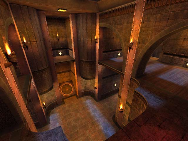
By the way, the lighting is exactly how I wanted it... it's supposed to be night, therefore it has "blue light from the night sky blending in with the warm reds and oranges from the torches". :)

Edit ~ Delete
Johnny Law
30 Sep 2000 #9
Lighting looks good to me too.

A couple or three of the paths may be a bit narrow or cramped. In at least one case, there may be a reason though... the narrow stair to the YA rewards strafejumping to get it instead.

The level could perhaps be tightened up a little (viewing it as a duel level - as FFA it's fine), since there are a few sort of "dead spots".

I'm REALLY nitpicking though. This is good work... great work for a first map. And, like many good CPM maps, it also works fine in base Q3 if you're a heathen like Niptlar.

This map's a votable on the Mothership Duel server. See the server section here at LvL for details.

Edit ~ Delete
not entered
30 Sep 2000 #8
Funny, I think this level has some of the best lighting I've seen yet. Nice blue light from the night sky blending in with the warm reds and oranges from the torches. Excellent.

Gameplay is way, way above average too. I've been able to play this one online agianst humans in 1 on 1 and in about 4 player FFA and it's a truly great playing level. One of my current favorites actually.

Not to jump on the bandwagon but, I'm giving it a 10. The only thing I could nitpick about is that I would have made some of the torches no clip as well as the head ornament over the ledge that leads into the upper teleport room. When you do a pad+rj up that ledge, sometimes you'll hit the ornament and fall. Easy solution for this though is simple. Don't hit the ornament. :)

Great work Decker. Hope to see more mid-sized tourney maps from you soon.

Edit ~ Delete
DusKer
30 Sep 2000 #7
10

Lighting is fine

Edit ~ Delete
Niptlar
30 Sep 2000 #6
The level may have used more armor, but the Megahealth makes the health and armor layout work. The rest of the item placement is solid, the visuals are appropriate, and the bots play well.

Good w/o CPM. ;)

Edit ~ Delete
AgenT
30 Sep 2000 #5
A definite 11 (hehe)! So get the map and play it in CPM ( <a href="www.challenge-worl.../promode/" target="_blank">www.challenge-worl...mode/</a> ) and live happily ever after 'n stuff :P

P.S. Lighting is fine for me. Im guessing you guys are using some low form of r_gamma ;-/

Edit ~ Delete
Lupo
30 Sep 2000 #4
MP
Edit ~ Delete
Excelsiore
30 Sep 2000 #3
A definite 10. The lighting is spot on. Must be something wrong with my graphics card cause it looks great.
Edit ~ Delete
Corrosive
30 Sep 2000 #2
10
Edit ~ Delete
RedFive
30 Sep 2000 #1
It's been a while since I posted here but it's nice to come back with such quality maps as this. The only thing that bugs me a big is the very small footprint, compared to the vertical height. And I find it a bit dark but that's IMHO. So CPM or no CPM, this is a fine map.
Edit ~ Delete
Theme:
Bots:
Textures:
Not set
Comments:
25 comments (14.02 yrs ago)
Ranked:
Downloads:
4,978 & 343 LiveViews (daily avg. 0.56)
File:
deckt1.zip, 1.24 MiB
PK3 date:
28 Aug 2000
..::LvL ID:
NewerOlder

Map history:
Clear
    ..::LvLExplore
    Search history
      ..::LvL Markdown
      The following syntax can be used to format comments.
      Close

      Loading...

      Map Search

      Search for a map.

      Results will appear here.

      Map peak