Be sure to submit your comment
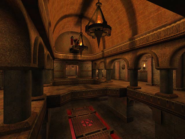
very beautiful map...
some clip-brushes needed around the RL area...
i wish i could give it 9.9/10
nice map d00d... sokky like arches...
arches + nice lighting = jizzmatic
Man wolfendm2. Thats an old school map of mine heh. Surprised anyone on this planet aside from myself even played it heh.
Id like to thank lvl team for such well rounded review site. Good comments section, honest reviewing, its just an all round great site for the readers and the mappers who are reviewed. Kudos to you guys.
30 Aug 2000 22:16
lol you have blown your tenner we actually write all the reviews together but in this case its probably more Tig than me.
As for the "trans" surface parm being an error. Thats not the case. It seems a "trans" surface parm will take over a whole brush if its on only one face.
Thanks again!
Start in the RL room. Run thru the door, run down the left hallway and then again hang a left. Walk down the hall towards the room with the Jesus md3 on the wall. When in the room, where you can see the Jesus md3 and the haste powerup, look down at the lower level. Those are the grates I fell through. Man, I just tried falling thru again and couldn't do it.
Maybe it was one in a million or I stepped on a brush with no surface parm. I had that problem during beta testing on my map where if any one of a brush's 6 sides had a texture on it that had no surface parm (non-solid), then I could fall right thru it, irregardless of the fact that the upper side (the one I'm walking on) of the brush had a surface parm set. I just figure it's a bug of using Build 199. Check all yer shaders in notepad to make sure they're all solid. I don't know, maybe there was enough room between the grate brushes and I just happened to hit it right.
I hope my directions thru the map aren't confusing. If you still can't find it, my ICQ #is 83204985. We'll run thru the map and I'll show you.
Hope this helps.
Im taking alot of the suggestions ive recieved and implementing them into my next map. I even have ambient sounds in the new one ; )
Thanks for the compliments. Posts like yours and Stoneds' are motivational to me and is what keep me mapping.
Anyways. Thanks again. It is greatly appreciated.
Except for the caulk textures in the RL room (on the top of the statue mount as stoned has previously mentioned) and the grating in the floor. My gripe with the grating on the floor has to do with the room just off the haste powerup (you grab the haste, the jumppads to yer right and the floor grating's on the left). Anyway....I was running across it and I FELL IN! It was hilarious! My only beef is that I didn't die as expected. I had to /kill my player to get back in the game. (I tried to fall through again but I was unable. It still doesn't mean I didn't fall through.)
I think you could either place a trigger-hurt in the pit and set the dmg key to 100 or use brushes to clip off the grates completely. (I don't know if you were trying to let guys fall through)
Anyway, the rest of the map is beautiful. I love the chandeliers in the Red Armor room...the shadows are wicked. Your texture selection, with the use of the goth textures blended with cool wood trim and the generally clean placement really finish off a cool map.
The flow of the game could have been quicker with the addition of a teleporter, I thought. Just a brain fart.
Kudos on an excellent job.
Ill email the team here and let them know where to grab it so they can post it.
Heh, anyway. Please do us modem using bastards a favor and make the large music file optional. We really appreciate it when people do that. ;)
/me goes off to pass out for the night.
Oh and your comment on the sound file. Your right on the missing sounds. I cant believe I didnt even think about them. <--Smacks his forehead-->
Next project on list is a map pack with a friend or two. Were shooting for new music, textures, maps, yadda yadda. Wish us luck hehe.
I been using radiant since its beta days (ravages of radiant qer.com are my old baby's i started heh) So I know my way around the editor its self at least haha. Cant say much more about my mapping skills though haha.
Anyways, thanks again. Appreciate the feedback and the compliments.
I am looking forward to your next map though. You've obviously got some radient skeelz.
Next map will have more enviro sounds, Thanks for the honest feedback. Unlike others who like to call people llama off the bat, ;)
My advice to Wolfen would be to ditch the 8 meg sound file next time and put some effort into actually putting some good sounds in the map itself. There is not ONE single environmental sound in this entire map anywhere. For those of us that play with music turned off (and I bet that's a big percentage), this map feels horribly unfinished because of the lack of in-map sounds.
Oh yeah, 10 bucks says it was Mandog that wrote the review and not Tig. Just a hunch. :)
I would like to know for which q3test map you are being called a "llama"??
