Be sure to submit your comment
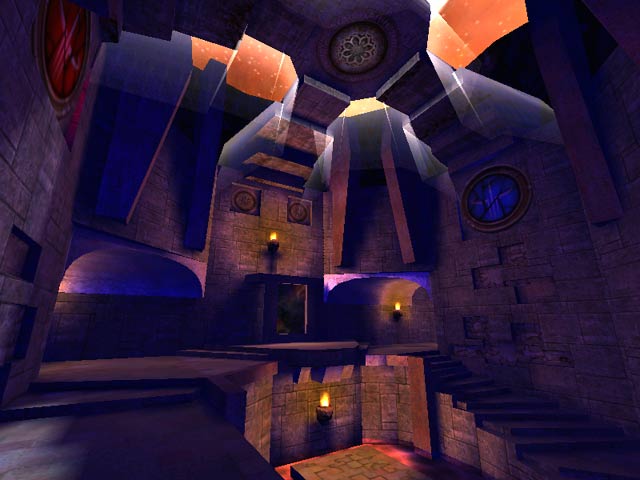
I think the lighting/texturing is very well don't. I don't know of another map that looks like it. Plays smooth, and you never know who can be hiding in the shadows by the BFG. Grab it now. Hurry along, please...
I do have the ideas down for the Tripple death from above style of level. Some maps will have that some wont.
this map was meant to be a slightly cramped FFA map.
Small and very connected.
lots of people can join and the map becomes faster not unplayable. I love you can jump right over the mid hallway and land in the other window. A window to window jump is easy to do and it gets you on the other side of the level instantly. heh
I wanna see what Casdm4 gets if they review it.
The best feature of the level has got to be the outdoor area, it looked stunning with that awesome sky and green slime below, though I was a bit disappointed that I couldn't descend onto the ledge beneath without getting squished. It might have been interesting to do battle along this narrow legde, and would have been fun to bounce people into the slime with rocket splash damage.
Now to what I thought of the interior section. Well it is obvious that Castle spent time creating this arena and some of the high ceilings, and structural design looked quite good. Unfortunately the map lacked a sufficient amount of vertical gameplay and so has a rather limited appeal - for me anyway. Most of the rooms felt rather cramped and I think the excessive inclusion of staircases probably contributed to this feeling. Overall the general layout of the map is above average and I have to compliment Castle on the surprisingly high degree of connectivity that the map has, given it is of a medium size.
Castle you have potential, so do continue mapping, but do try to include vertical play in your levels as this really helps to improve gameplay, and promotes more diverse battle tactics. Also, do remember to include accelerator and bounce pads, as they speed things up and allow gladiators to engage in aerial combat which is great fun. Hero's Keep perfectly illustrates the fun factor that accelerator and bounce pads add to an arena.
Score: 6
I freakin review. I dont even care if it was a bad one either. Hell Im just happy I got something up. You might not notice at fist glance but a lot of work went into this little map.
i loved the outside part with the slime, and the light shines coming off the edges of stuff.
the slime outside doesnt kill you instantly though..and it should, not like your gonna swim out and climb back up >=)
if it was less cramped in certain spots it would be alot better.
6
