**Preview only**
Be sure to submit your comment
This map is fun, but it's rather cramped and getting around it is a chore, with a lot of focus on just trying to camp the RA or quad.
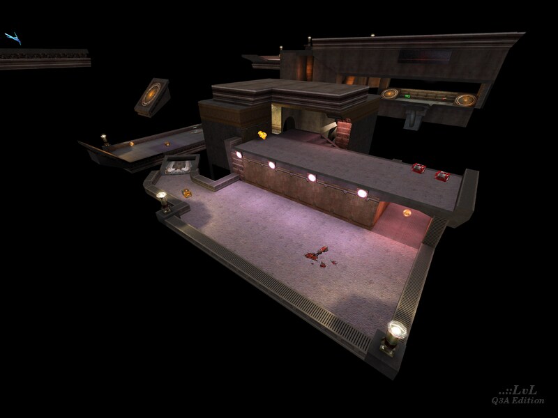
We haven't played this map in several years, and now we use quake3e and high FPS. We discovered some areas of the map don't render properly for one of us, and that the jumppads - specifically the one hidden below the two rocket boxes in the picture - launches you slightly too high into the wall instead of at the right-hand jumppad shown in the picture, causing you to fall to your death.
You may need to play this with the 1.32 point release and/or lower fps to get the rendering and physics right.
Edited 42 seconds after the original posting.
Agree (1) or Disagree (0)
This map is not for me. The different sections are too small. Spawnpoints face in akward directions. Almost no game flow...
Agree (0) or Disagree (0)
Yeah, whats with that?
Agree (0) or Disagree (0)
The link is broken.
Edited: 17 Jul 2011 AEST
Agree (0) or Disagree (0)
Ygdrazil
unregistered
#11 06 Feb 2000
Word from designer: Just wanted to say i've created a new version of this map. I have adjusted the jumppads and polished on the texture selection. The download also includes a new "railgun" version. You can find the new version here:
w1.498.telia.com/~...els/reine10.zipAgree (0) or Disagree (0)
Kurupt
unregistered
#10 01 Feb 2000
I downloaded it, gonna take it to school to get some friends opinions. Hopefully you got some railguns in this baby. :)
-Kurupt (The Rail Whore)
Agree (0) or Disagree (0)
Timothy 11 Black
unregistered
#9 19 Jan 2000
Great map...great layout...great item placement...great alignment!I didn't find myself nit-picking at all,too busy having fun....great map "Ygdrazil"
Agree (0) or Disagree (0)
Triga -Mappa
unregistered
#8 06 Jan 2000
Killer, your just clumsy :)
I had no trouble with the map.
And it played well. Just didnt seem to be what i had expected.
Enuf said :|
Agree (0) or Disagree (0)
Killer
unregistered
#7 06 Jan 2000
Not a bad map, but I found myself banging off the walls in places and falling to my doom a bit too often. The trigger_push's need a little refinement. I like the layout though although I'm not too keen on the double jump pad to the Quad, I reckon one would have been nicer. On the whole a pretty nice map.
Agree (0) or Disagree (0)
ROLPH
unregistered
#6 06 Jan 2000
I think it is pretty
novel to have a map with the space feel with more complex levels connected by jump pads rather than just a flat box sitting in the middle of nowhere. Perhaps to make it a better map, you should do some
layered terturizing like
zoid talked about in his post at
quake3worldwww.quake3world.co...TML/000179.html
Otherwise I thought it was a good and innovative map.
Agree (1) or Disagree (0)
-=ZorK=-
unregistered
#5 06 Jan 2000
Not much has been said about this level yet so i'll have my say,
Not bad really, but yea, bland, why done more people use new textures? there not that hard to make surley? :)
Agree (0) or Disagree (0)
Dr. Feelgood
unregistered
#4 05 Jan 2000
Apperance: space level with a twist. put together well but a little bland. not much else to say here.
Playability: excellent. jumpy space style map just seemed more fun than others of its kind, and I don't really like the bouncy bouncy maps.
Bots: functioned ok
Overall for a space bouncy map I really liked it. Just kind of bland all over. Might want to take a few days to polish /add something but I don't know what that might be. Maybe just shoot for a different theme.
Agree (0) or Disagree (0)
Lord Imric
unregistered
#3 05 Jan 2000
If not great, this map is good. Worth a play, and the bots seem good at it. :)
Agree (0) or Disagree (0)
etweaker
unregistered
#2 05 Jan 2000
good map very well done. no changes need to be made
Agree (0) or Disagree (0)
Ygdrazil
unregistered
#1 05 Jan 2000
A note from the map designer:
Nice that you liked it. I agree with that it misses something. I, like everybody else, feel that right now quantity has a little bit higher priority than it should. This will hopefully change as Q3A becomes a little older..
Agree (0) or Disagree (0)

